Subeta CSS Compendium
Replies
INTRODUCTION Since I often see the same questions repeated all over again (and the current coding guides don't seem to really update themselves), I figured I'd make my own guide! As the title insinuates, this thread focuses mainly on CSS, but there are notions of HTML as well. The topic is divided into multiple sections: General purpose, pet profile & user profile codes (eventually I'll also add shop, journal, custom CSS & maybe cult codes). For your viewing ease, all subsections are hidden between spoiler tags. There are 2 difficulties, basic & advanced, which are noted in each spoiler tag. If you have any questions or comments, feel free to ping me!
GENERAL
BASIC -- First time profile making
If you've never coded a profile or anything else before, I'd like to direct you to the W3Schools Website. Here you can learn how to use HTML & CSS. This is not a requirement for the basic stuff of the thread, as you can simply copy&paste the codes with minimal adjustments, but it is handy knowledge. If you don't want to spend the time, that's fine to me, but it makes understanding the advanced (and cooler) codes a lot more difficult.
Anyway! The first thing you should know is where to go to edit either your pet or user profile. This section does not cover how to organise your user profile, but simply how to get to the box where you input your codes.
For a pet profile, go to the pets overview page. Click on the "Edit description" link of the pet whose profile you want to edit and then we can get started!
For a user profile, go to your profile options. You'll also need to have the profile box on your user profile for any of the codes to work. To do so, go to edit profile > add content > profile.
Now, before you can start copy&pasting codes around, you need to know that any and all codes for CSS (which is the styling of your profile) must be put between style tags. You only need to declare them once and you can then put all CSS codes between those tags. That's done like in this <style>All CSS codes must go here.</style>
Done? Okay, now we can get to the codes! Choose one of the (sub)sections below to learn more! ;]
(though it's easiest for you if you go on to "BASIC -- Selectors" and then choose after reading that part)
BASIC -- Selectors!
If you've read the articles on W3Schools Website, you can probably skip this part. If you haven't, you're probably wondering what a selector is. A selector is that which you select (duh) to have the code work upon. Before I go on, you should know that CSS code lines usually look like this {property: value;}
.tag {property: value;}
tag {property: value;}
See? You have the selector, a property and a value (in that order). An example of this would be this body {background: ;}
This code would make your body background black. "body" is a selector, "background" is a property and "" is a value (it is the hexadecimal representation of black, for more colour codes you can visit this CSS Color Chart). A tag with "#" in front means the item you're selecting has an id, while a tag with a "." means you're selecting an item with a class attribute. The difference between the two is that an id can only be used once in your whole page, while a class can be used multiple times.
An example of this can be found in the coding of the pet profile. You have the Pet Treasure section, which has the id , and you have the items. There is a possibility of there being multiple items, so they each have the class .treasure_item. This means that if you use as a selector, the code you input next will only apply to , while if you use .treasure_item as a selector every item in your pet's treasure chest would be styled the same.
Lastly you also have the selectors without any character in front of them, like "body". "body", like "p" (paragraph), is an element type. This is an item that either doesn't have an id or class, or an item that you don't want to use the id or class of. For example, if you would like each and every link to be white, you'd use this a {color: ;}
However, if you only want the links in your pet description to be white, use this a {color: ;}
There are different ways to use selectors, and the most common are my two examples above. If you want more information on more advanced selectors, you'll have to go to... You guessed right, "ADVANCED -- More on selectors".
Anyway. The examples above illustrate the principle I'm trying to explain (not sure if I'm being clear though). To select every item of a tag on a page, use the first type. For items from a specific section, use the second type. Another example would be this b {text-decoration: underline;}
This would make all bold text (text between bold tags, at least) be underlined.
Another is this p b {text-decoration underline;}
This would only make text in bold tags, that were put in a paragraph tag, underlined.
Note: If you want to give the same properties to multiple selectors you can do that by adding them one after the other, separated by a comma. For example, if you want both links and bold text to be white, you could do it like in this a {color: ;}
b {color: ;}
But it's easier like in this a, b {color: ;}
This comes really in handy when you want to hide stuff, like the header, sidebar, ..., of a pet profile (for example). You don't have to type the same code multiple times, but instead add all selectors in front of the same code.
Got that? No? Ping me and I'll try to explain better. Yes? Good for you! Now let's continue on to another section!
BASIC -- Hover tricks (hover sections, scrollbars and images)
There's a pseudo class called "hover" and you can do some fancy things with it! Basically, every element has a hover pseudo-class and you can select it by adding ":hover" to the tag, like in this :hover {property: value;}
There's a whole array of possibilities this gives you, but we'll talk about four of them here: Hover sections, scrollbars, images and tooltips!
First of: SECTIONS!
Those fancy hover things you see on pet profile (and user profiles) aren't all that difficult. Basically, you put something's opacity to 0 and then make it change back to 1 on hover. That can be done like in this {opacity: 0; filter:alpha(opacity=0);}
:hover {opacity:1; filter:alpha(opacity=100);}
Just replace the tag with your selector!
Next: SCROLLBARS!
These share the same principle as the hover sections, you hide the scrollbar in its normal state and unhide it on hover. Here's the {overflow: hidden;}
:hover {overflow: auto;}
And finally: IMAGES!
You know, when you see those profiles with images that are semi-transparent, and then you hover over them and they become completely opaque? That'd be this img {opacity: .5; filter:alpha(opacity=50);}
img:hover {opacity: 1; filter:alpha(opacity=100);}
Another example is swapping images. This is done by setting an element's background to one image and then swapping it do a different one on hover. To do this, you'd use something like this {background: url('enterYourFirstImageUrlHere') no-repeat; width: 100px; height: 100px;}
:hover {background: url('enterYourOtherImageUrlHere') no-repeat;}
Of course, you'll have to change the width and height properties to your images'.
Note: The "opacity" property works in most browsers, except IE prior to version 9. You can set its value to any number between 0 and 1. If you want your opacity changes to work in IE prior version 9 as well, you'll have to use the "filter: alpha(opacity=)" property. The range there is between 0 and 100 though, instead of 0 and 1. I've seen some people add a "-moz-opacity" property, but that's for FF browsers version 1.6 and below (and according to W3Schools statistics, most FF-users have at least version 3.6).
That was it, folks! Remember, feel free to ping/comment/mail me with any questions you have about this!
BASIC -- New text areas
Adding new text areas to your profile (both pet and user) is pretty easy, simply add this
But replace the "abox" with the name you want to give your box. Then, to add mark-up to the box, use it's name as a selector, like in this {background: red;}
You can add as many boxes as you want, you can nest them, you can style them as you wish, ... Go forth and be creative!
Note: For user profiles, you can either add the boxes in your profile section or in a new blank section.
BASIC -- What not to do
There are things that you can do, things that you can't do but can get around, and things that you simply should not do. One of these is making your code look like in this <style> {property: value;}</style>
While this probably won't cut on loading times or anything, it does serve to make other people's life a bit more difficult if they take a look at your code. That's fine if you want to make thieves' lives more difficult, but not so good if you ask help in the forums. As I've pointed out in the first section above, you only need those style tags once, and then you can put all of your CSS-code between them.
The second thing you should avoid is putting a background image in your HTML-tag, like in this html {background: url(imageUrlHere);}
Do not do it. Some older browser may not render it correctly and it is better to use the body tag as a selector instead. For those interested, here is the W3C article advising against it.
BASIC -- The !important tag
You've probably seen it before, this little add-on tag. If not, here's the {property: value!important;}
The !important tag makes the property-value pair that you coded have more importance than other pre-declared pairs (or inline styles). For example, in Subeta coding you might sometimes see something like this
Remember, though, that things don't always malfunction because of Subeta's existing coding. Sometimes it might be because you declared a certain selector's property twice, but gave it different values. This causes conflicts and thus a wrong display. :]
ADVANCED -- More on selectors
So you want to know more about selectors eh? Good for you! There are 4 types of advanced selectors: Combinators, attribute selectors, pseudo-classes and pseudo-elements.
COMBINATORS
These are like two of the examples from the basic selectors section. When you combine selectors, you narrow down the range the code has an affect on. The most basic is by simply putting two behind each other (like "p a", which selects only links that are contained in a paragraph). A bit more advanced are adjacent & child selectors, which look like this:
a + a {color: ;}
p > a {color: ;}
The first line will only make a link, that came after a link, white. The second line will only make links, that are contained in a paragraph, white. I'm already hearing you think "Well why don't you use "p a" for that?". In this case, you can use that, it's easier. However, I want you to take a look at the coding of a shop that has multiple pages. Yes, it's probably a bunch of confusing codes, but basically (I stripped out some of the codes), this part is the important
That's not the point though. The point is that, as you can see, there are multiple sp-table and sp-sub classes. The first sp-table is an actual table, which contains the navigation to the categories for a shop. The second sp-table is a table row in the category-table that contains the actual categories. Does that confuse you yet? :P Then there's the links in the table, they are each contained in a table cell with a sp-sub class. After that, though, you can see that there's another table (without a class or id) that has sp-sub declared as the class of two table cells as well. Those cells are the page-navigation (page 1, page 2, ...).
Now, knowing that... What if you want the category links to be white, but the page links to be black? Tada, child selectors to the rescue, .sp-table > .sp-sub a {color: ;}
.sp-sub a {color: ;}
See? The first line tells the browser that only the links, that are direct children from .sp-table, should turn white. Links in an .sp-sub section that is not a direct descendant from .sb-table should turn black. Now, the shop example is also great to demonstrate adjacent selectors. Imagine if you want the first item's background to be red, the second item's to be green and the third item's to be blue. If you had id's or classes, that'd be easy, but you don't so you have to mess around a bit. Here's a td {background: ;}
td+td {background: ;}
td+td+td {background: ;}
The code above will make all cells that are first in a row red, second in a row green and third in a row blue. If you want to make the first cell of the first row red, the second cell of the second row green and all other cells transparent, you can do that like in this tr+tr td {background: ;}
tr+tr+tr td+td {background: ;}
tr+tr td+td, tr+tr+tr td, tr+tr+tr td+td+td, tr+tr+tr+tr td+td {background: transparent;}
See how it works? This doesn't only work for cells, but also for rows, see the tr+tr {opacity: 1;}
tr+tr+tr {opacity: .9;}
tr+tr+tr+tr {opacity: .8;}
tr+tr+tr+tr+tr {opacity: .7;}
tr+tr+tr+tr+tr+tr {opacity: .6;}
And of course it works for just about everything else as well. However, the elements have to be siblings. That means that they follow directly behind one another, without any different elements in between. If, for example, you have two images with a paragraph in between, using img+img won't work.
Lastly there's the universal selector, and here's an example this bold text would be white* {margin: 0;}
This one selects every element, as it name suggests. You can combine it with other elements, like a link, to select every element of that type on a page, like in this * a {color: ;}
It doesn't seem very useful but it can be, when you combine it with child selectors, like in this p>*>b {color: ;}
This code will affect bold text in all elements that are contained within a paragraph, but not bold text that's contained in elements in other elements in a paragraph. To explain it with an HTML example
this bold text would NOT be white
ATTRIBUTE SELECTORS
Advancing along! Attribute selectors, as implied by the name (coding terms are rather simple, thank god), select elements based on their attributes and even the values of said attributes. An example a[href="www.subeta.net/"] {color: ;}
This code will make any link, that points to the address in the value field, black. The double-quotes are important, don't forget them, and it has to be an exact match.
There are some more selectors (with explanations, on what they select, next to them instead of properties) in this a[href~="subeta"] Any link that contains the exact word "subeta" somewhere in it.
a[href^="www"] Any link that begins exactly with "www".
a[href$="net"] Any link that ends exactly on "net".
a[href*="sube"] Any link that contains "sube" somewhere in it (not-exact).
a[href|="and"] Any link that has "and" on the left part of a hyphen.
There's also this input[type="submit"] {background: ;}
When you use that code it would make every button, that has "submit" as a value to their input type, red. And as with all CSS codes, you can combine any of these to form really long and complex lines. :P
PSEUDO-CLASSES
Some stuff can't be picked by a selector, like a pseudo-class. You've probably already heard of hovers. Who hasn't nowadays, what with all the fancy profiles that win the spotlights? That's a pseudo-class at work. Pseudo-classes are probably most used with links (:link, :visited, :active, :hover), but as aforementioned profiles prove, they can be used for a variety of things. Example time! First a {color: ;}
a:hover {color: ;}
{opacity: 0;} :hover {opacity: 1;} The first two lines are your basic link pseudo's. The first one makes you link white, the second one makes it black when you hover over it. The last two lines are how people make those fancy hover comment-sections (the column number might vary though). You hide a section by setting its opacity to 0 in their normal state, and make it so that the opacity is 1 (which is visible as opposed to invisible) on hover (those of you who read the hover tricks section already know this though). Easy, right?
:link, :visited & :active are only used with links, but :focus can be used with other things as well. See the next p {background: ;}
p:focus {background: ;}
This code sets your paragraph background to black and makes it white when you focus on it. Focussing on an element means clicking on it or going to it by way of your keyboard. This is especially handy for people who use their keyboard more than their mouse, so that when they tab to a link with said keyboard the link style also changes (as opposed to only doing this on hover). And yes, these can be combined as well (i.e. a:focus:hover)!
Even more advanced (yay) are the pseudo-child selectors, they combine the idea of child selectors and pseudo selectors. Here's some p a:first-child {color: ;}
And even more advanced (wow!) are the CSS3 :last-child & :nth-child. Those don't work in all browsers though, since CSS3 is still in its experimental phase and not every browser implements the updates. :last-child is simply the opposite of :first-child, so not a big advancement there, but :nth-child allows you to pick a numbered element (i.e. a certain row in a table). That makes things even easier for you (the code for changing background colours of table cells from the combinator section above would be a lot shorter) but, like I said, not every browser supports it. There are 9 ways to use it:
table td:nth-child(2) {background: ;}
table td:nth-child(2n+1) {background: }
table td:nth-child(odd) {background: ;}
table td:nth-child(even) {background: ;}
table td:nth-last-child(2) {background: ;}
table td:nth-of-type(2) {background: ;}
table td:nth-last-of-type(2) {background: ;}
table td:first-of-type {background: ;}
table td:last-of-type {background: ;}
Using the shop table as a base, here's what the codes would do:
The first line would give all second table cells in a row a black background.
The second line would give every other cell in the table a black background. Change the 2 into a 3 and it becomes every three cells. Logic is fun!
The third line would give all odd numbered cells a black background.
The fourth line would give all even numbered cells a black background.
The fifth line would give all second table cells, starting from the last row, a black background.
The sixth line would give all second-sibling table cells a black background.
The seventh line would give all second-sibling table cells, starting from the last row, a black background.
The eighth line would give the first cell of its type a black background.
The ninth line would make the last cell of its type a black background.
Remember the code where I made the first cell of the first row red and the second cell of the second row green? Here it is again, but rewritten using the above selectors. It makes for a much shorter table tr:first-child td:first-child {background: ;}
table tr:nth-child(2) td:nth-child(2) {background: ;}
Easier, no?
PSEUDO-ELEMENTS
As with pseudo-classes, pseudo-elements don't exist in your HTML. And similarly to the :first-child class, you have the :first-line and :first-letter elements (again, however, these are CSS3 and not compatible with all browsers). Using them really isn't difficult and I'll explain by way of an example p:first-line {background: ;}
p:first-letter {background: ;}
p a:first-child:first-letter {background: ;}
The first line would make the first line of your paragraph have a black background. How long the first line is depends on your design: If you make the width of your paragraph box smaller, then the first line will be shorter as well because the rest of the text moves to the next line.
The second line would make the first letter in your paragraph have a black background.
The third line would make the first letter of the first link in your paragraph have a black background.
Lastly, there are the :before & :after pseudo-elements. Here's where the line between content and design kind of blurs though. While you should use HTML only for content, and CSS only for design, :before & :after can also generate content through their "content" property. Some argue that you shouldn't use these tags because it disrupts the clean cut separation between HTML & CSS, while others (myself included) think you can use it but you should use it rightly. That means only use it for content that isn't important to the rest of your site/profile, like numbering or little symbols in a list.
One of the most used applications for :before is the styling of a list. Those with prior experience might know that you can style a list's content easily, but styling a list's numbers? Not so easy. Unless you use :before! This pseudo-element can generate a counter, and you can style it because it's its own element. Here's an example {counter-reset: li; margin-left: 0; padding-left: 0;}
li {list-style: none; position: relative; margin: 0 0 5px 0; padding: 4px;}
li:before {content: counter(li); counter-increment: li; background: ; color: ; position: absolute; top: 0px; left: -20px; width: 20px; text-align: center;}
Breakdown of the code:
In the first line, there's a counter-reset to li. This is to initiate the counter object. Also, the default margin and padding are removed in this line.
In the second line, the default list-style is set to none, this is to remove the default numbering. Also, the position is set to relative so that you can position the generated numbers from the next line.
In the third line, :before's used to create the automatic numbering with it's "content" property. The counter-increment is set to "li", which is 1. Background, colour, positioning and text-align are also set in this step.
So now you have some fancy numbering!
And that was it for advanced selectors! Wow, I hope your brain isn't dripping out of your ear like the first time I learned about these (hint: Never try to learn them all at once by heart. References make your life easier).
ADVANCED -- Tooltips
Another neat trick you can do with HTML & CSS is to make tooltips. This should work for both pet and user profiles. First, you need two span tags nested inside one another. The first tag contains your normal text, the second the tooltip, like in this normal texttooltip text
Then you simply style them, like in this span span {display: none;}
span {position: relative;}
span:hover span {display: inline-block; background: red; position: absolute; top: -12px; left: 5px; padding: 0 5px; border-radius: 5px;}
The first line hides the tooltip.
The second line sets the position to relative. This is a neat trick that makes positioning the tooltip a lot easier, which is done in the next line.
The third line displays the tooltip on hover and positions it. It also adds some padding, a background and some nice rounded corners.
You only have to declare this style once, but you can have multiple tooltips without having to style them all individually! Isn't CSS such a nice thing? :3
ADVANCED -- Scrollbar overlays
Scrollbar overlays are those custom scrollbars that you see. They look pretty and work (as far as I know) in all browsers. I know that Internet Explorer had a scrollbar changing trick in the previous versions, but that one wasn't compatible with any other browser and the only thing you could do was change the colour of it. Overlaying a scrollbar is like having a pet overlay: Basically you just cover up your scrollbar.
First of all, you need to make a new div, like in this
After that you simply style it, like this:
{background: url('insertScrollbarOverlayUrlHere') no-repeat; width: 0px; height: 0px; position: absolute; top: 0px; left: 0px; z-index: 2;}
Now the only thing that's left to do is adjust the values (all the zeroes should be replaced by your values) and you're done! The z-index is to tell your browser to put the div above and out of the section it's contained within.
ADVANCED -- Anchor links
Subeta gives you a lot of freedom when making a profile, such as the ability to add a new div and new styles. However there are still some things that are a bit restricted but, with some creativity, you can get around that.
Here I'll be talking about anchor links. For those who don't know what this is, an anchor link is like a normal link but differs in the fact that it does not link to an exterior page, but to a different section within the current document (here is a link to the W3Schools article on it). To clarify with an example: You've probably all seen those web pages where there's this link that says "back to top", right? And when you click it you actually go back to the top? If you've ever looked at the web address bar of your browser, after you clicked that link, you'll have seen that it says something along the lines of "page.html#top". This is an anchor link. You click it and you go to a different place within the same page!
"unfortunately", anchor links use a "name" property instead of "href" in the html code and, Subeta does not allow this. You can get around that, though, by linking to a div instead! You HTML would look something like this
I know that this doesn't look very useful (except if you have a ton of text), but it can be very neat when you combine it with CSS. If you've ever wondered how people here do those pet profile where you click a button and a different section appears? That's the magic of anchor links combined with CSS! Going with the HTML above, the CSS to make it like one of those click profiles would be like this {width: 400px; height: 300px; overflow: hidden;}
, {display: block; width: 400px; height: 300px; overflow-y: auto;}
See what I did there? First I made the container surrounding the two divs have a set width & height and then I hid the scrollbars. After that, I set both sections' display property to block and the vertical scrollbar to auto. This means that you'll be able to scroll within each section, but not beyond (you'd have to click on an anchor link for that).
See how amazing CSS is?
:P
ADVANCED -- CSS3 Transitions
If you've ever wondered how people did those fancy fade in/out tricks on hover, that's a hover trick combined with CSS3 transitions! Now, the thing about CSS3 transitions is that it only works for the most recent browsers (for example, IE doesn't support it, and older versions of other browsers might not either). If that doesn't bother you, though, then read on!
Transitions aren't very difficult to use, but you can get really creative with them. There's a transition property and all you need to do is give it your wanted value. The transition value consists of 4 parts: Property, duration, timing-fuction & delay. Property is which CSS property you want the transition to apply to. Say you only want opacity changes to fade, but not size changes, then you'd put "opacity" here. If you want the transition to apply to all properties, simply put "all".
Duration is how long you want the transition to take, in seconds. So if you want the transition to take 3 seconds, then you'd put "3s". If you'd want it to take half a second, then you'd put ".5s".
Timing-function is the most "difficult" part of the transition property and is how you want the transition to happen. There are 5 pre-set functions, but you can also define your own (though I won't go into that here). The 5 functions are ease, ease-in, ease-out, ease-in-out and linear. I can't really explain their differences, so I suggest you take a look at this page for a demonstration of the different functions.
Delay is like it says on the tin, the delay of your transition. Say you don't want the effect to happen until the user has hovered for 2 seconds on your link, you'd put "2s" here.
You can use the transition property the shorthand way, or the long-worded way. Personally, I prefer shorthand because otherwise you get a lot of text. You see, the transition property is a CSS3 one, and like I said not supported by all browsers. This also means that almost every browser needs a special prefix to the transition property. Mozilla's is "-moz-", webkit browsers use "-webkit-" and Opera has "-o-". That means your code could look something like this a {transition: all .5s ease-in-out; -moz-transition: all .5s ease-in-out; -webkit-transition: all .5s ease-in-out; -o-transition: all .5s ease-in-out;}
(imagine having to write all of that out in separate properties!)
Anyway, now that you know the theory, there are 2 tricks that I want to show you! First is a really simple one, for fading in/out boxes on your profile, and it's a combination of CSS3 transition & opacity hover. Here's the {opacity: .2; transition: all .5s ease-in-out; -moz-transition: all .5s ease-in-out; -webkit-transition: all .5s ease-in-out; -o-transition: all .5s ease-in-out;}
:hover {opacity: 1;}
Just replace the tag with yours!
The second trick is where you have a tab, then hover over it and it slides out! This is a bit like the previous trick, only instead of changing the opacity, you change the width or height of the object. See this {width: 20px; transition: all .5s ease-in-out; -moz-transition: all .5s ease-in-out; -webkit-transition: all .5s ease-in-out; -o-transition: all .5s ease-in-out;}
:hover {width: 300px;}
There are tons more things you can do with transitions, you're only limited by your own creativity! The last thing I wanted to say about transitions it that you can easily have them apply to everything on a page, instead of having to write down tons of selectors. Simply use this * {transition: all .5s ease-in-out; -moz-transition: all .5s ease-in-out; -webkit-transition: all .5s ease-in-out; -o-transition: all .5s ease-in-out;}
That was all folks! Feel free to check out a different section, if you're hungry for more knowledge on CSS!
PET PROFILES
BASIC -- Resetting
When you start on a profile, you might want to get rid of a lot of stuff before you go into specifics like moving boxes around. I'll give you my reset block of code and then explain every line. Here's the * {margin: 0; padding: 0;}
, , , , , , {display: none;}
body, , {background: ;}
.prototip {display: none;}
The first line removes all margins and paddings that have not been declared inline (inline declaring is where one specifically declares a property in a HTML tag instead of putting it in the CSS). This insures some browser-compatibility of your layout. Some browsers add their own margins and paddings to some elements, like Internet Explorer. And that tends to mess up stuff.
The second line hides everything around your pet profile. gave a code for that in their thread, but it's rather long and has a lot of repeated tags. BTW: If you want the bookmarks visible, just remove them from this line.
The third line is in case you want everything to be the same background colour instead of 3 different ones. I put black here, but you can chose any colour you want by changing the zeroes to the hexadecimal value of your colour.
The fourth line is to hide the box that pops up when you hover over the user name. Remove this line if you want to keep that, of course!
BASIC -- Styling your pet profile
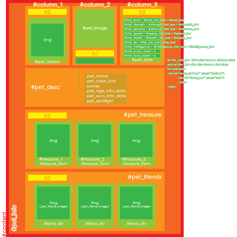
This section contains some codes for basic pet profile styling, so nothing fancy yet. First though, here is an image of the stuff that goes in a pet profile. If you read the section on selectors, you'll know that all codes from this section can be used on any part of your profile, simply by adding a different selector. If you didn't read it, well then, now you know.
CHANGING COLOURS
There are two colour types that you can change, background and text colour. To demonstrate, here's a h2 {background: ;}
h2 {color: ;}
h2 {background: ; color: ;}
The first line gives your headings a black background.
The second line makes your headings' text black.
The third line sets your headings' background to black and your headings' text to white.
HIDING STUFF
If you want certain sections from your pet profile gone, use the following h2 {display: none;}
But replace "h2" with the sections that you want gone (if you have multiple things you want hidden, then separate them with a comma). Remember, do not remove , or unless you want your whole profile to be invisible! This is because , and contain your whole pet profile. In short, if you remove sections that surround other sections, those will disappear as well. For example, if you remove , then your will disappear too, because is contained within .
POSITIONING STUFF To move things around, there are 3 methods: Position, margins and a combination of the two.
Position is where you use the "position" property to move something. This property has 3 possible values: Absolute, relative & fixed. Normally, unless otherwise declared, an element's positioning is static. This means it's positioned according to the normal flow of the page and that it's not affected by top, right, bottom & left properties.
Let's start with position: absolute.
This positions relative to the element's first parent that is not static-positioned. If there are no non-static parents then "html" is the containing block (so that would be your browser window). For example, if you've absolute-moved to the bottom right of your screen, then will not extend past 's boundaries. It will never get to the top left of your screen, unless you made as wide and tall as your whole screen, or unless you play around with z-indexes (but that's something for later). Example {position: absolute; top: 10px; left: 20px;}
This would move your pet's image 10px down and 20px to the right starting from the top left of your browser viewing port. It disregards the positioning of any sibling elements, so if you move the minion box then the pet image stays where you put it. Got that?
Now, next up is position: relative
This positions relative to the element's normal/current position. Example {position: relative; top: 10px; left: 20px;}
If has not been moved, then will simply be 10px down and 20px to the right of where it normally is. However, if has been moved, then it will be 10px down and 20px to the right of where it is, after you moved .
Lastly, position: fixed
This positions relative to the browser window, and it takes an element out of the normal flow. That means that if you scroll down, a fixed element will not scroll with the page. It kind of sticks to your screen. Example {position: fixed; top: 0px; left: 0px;}
This makes the pet image stick to the top left of your screen and it won't scroll with the page. This is handy when you want to make a menu, or something like that, but DO NOT use it for positioning your whole layout. It sticks stuff to your screen, which means that if you you stick everything to your screen you won't be able to scroll down properly (rather, you will scroll but nothing will happen).
Margins are the spaces surrounding an object. To clarify, here is an image of an element. As you can see, a padding surrounds the element before the border, and the margin wraps around that. You can use this space to move an object around. I don't recommend positioning elements purely using margins (you're better of with positioning in that case), because of browser standards and general messiness.
Combining positioning and margins can give really interesting effects. Basically you move something using positioning and then fix it by using margins. For example, you can position an element exactly in the centre of you screen both horizontally and vertically with this combination. However, you need to know the width and height of your element. If we take the (which is 200px wide and high), then in theory you'd use this {position: absolute; top: 50%; left: 50%; margin: -100px -100px;}
It would make your pet image's top left corner move to the middle of your screen, and then it moves half of your image back up. This positions it perfectly in the middle! At least, it should. In practise, you can notice that Subeta's 100% is a bit off and that you'll have to adjust the margin values.
Did that make any sense to you? If not, feel free to ping me!
BASIC -- Pet & minion overlays
I know that there is an existing thread on this subject, but the codes are a bit lacking. Pet & minion overlays aren't that difficult though, they both employ the same code, just with a different selector. Here's said {background: url('insertYourOverlayImageUrlHere') no-repeat; width: 0px; height: 0px; padding: 100px 100px;}
For a minion overlay, simply use instead of . Adjust the padding to half of you image's width and height! So if your image's width is 120px and the height is 60px, then you'd use "margin: 30px 60px" (first height, then width).
BASIC -- Sample Pet Profiles (in progress)
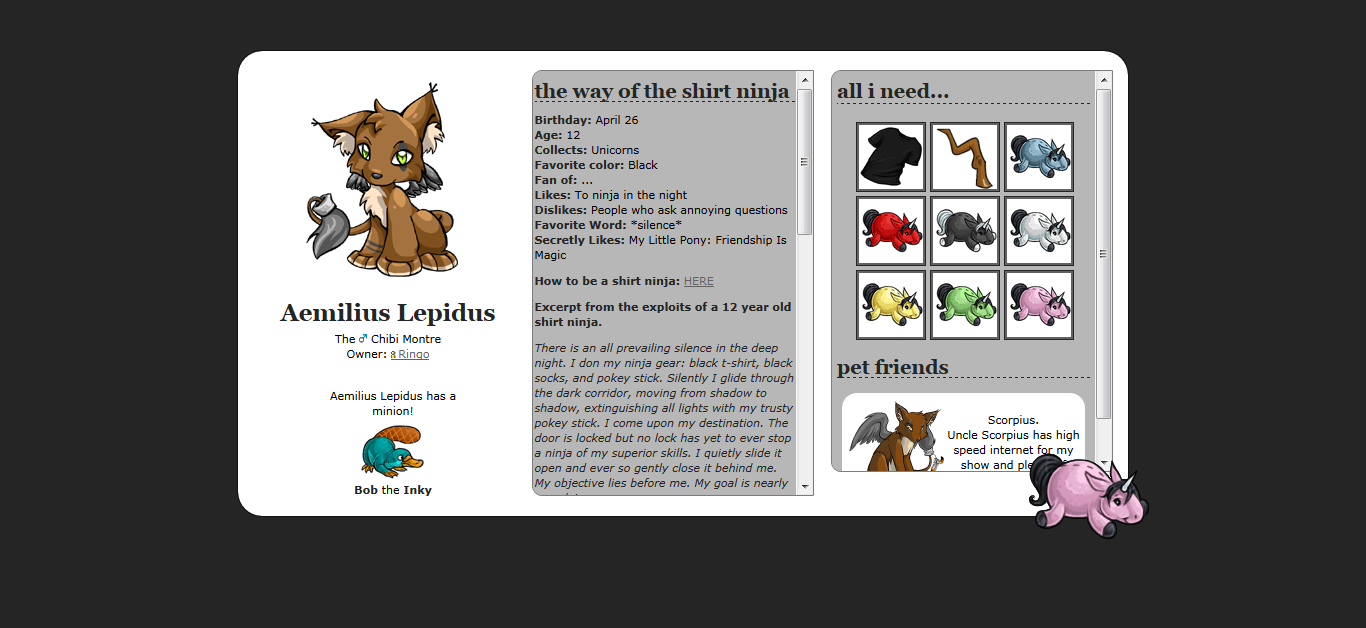
The first sample pet profile is by courtesy of (they beat me to the punch), an image preview of how it looks can be found here and the live version here. Code still has to be commented though, please be patient.
ADVANCED -- sCode tricks in Pet Profiles
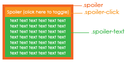
Just like in the forums, you can use sCode in pet profiles! You can do it for basic stuff, like making text bold or underlined, or for adding an image... But you can also do some neat tricks with it, like adding a spoiler and using it as a playlist. Since Subeta doesn't allow the use of javascript/frames/flash/... on pet profiles, you cannot embed a flash playlist, but you can make one like this. First of all, here is an image of the spoiler tag and its HTML components. Now let's get on to coding!
You'll need to add your spoiler in a div, like in this
You can put links to youTube videos, so that your visitors can still go to the songs even though there's no flash player. After that, you simply style it with CSS like this in this .spoiler {width: 100px;}
.spoiler_click {background: url('imageUrlHere') no-repeat; width: 100px; height: 30px; font-size: 0px;}
.spoiler_text {width: 100px; height: 100px;}
The first line is to set the width of the spoiler object itself. You can change this to whatever size fits your fancy.
The second line is to first set the background colour and then image of the spoiler button thing (the thing that you click on to make the spoiler appear). Notice that the background repeat is set to none here, but if you have a pattern instead of a playlist image then you might want to remove that value. Also, there's a width and height set here for the button. The font-size thing is to remove the text ("SPOILER (CLICK HERE TO TOGGLE)"). If you set the spoiler to a custom title, maybe you don't want to remove the text so take that property out in that case.
The third line is to set the dimensions of the spoiler's contents. That's pretty basic stuff, but you can go wild with it and add borders/patterns/etc.
Another thing that you can do with a spoiler is combine it with the anchor link section above and make a menu. You can skip the anchor linking and use the menu for links to Subeta pages/whatever instead of sections within your page, but the principle is the same. Example
And then use CSS to style it! Nice, no? Again, if there are any questions, feel free to ping/message/comment.
[/spoiler]
USER PROFILES
BASIC -- Resetting
When you start on a profile, you might want to get rid of a lot of stuff before you go into specifics like moving boxes around. I'll give you my reset block of code and then explain every line. Here's the * {margin: 0; padding: 0;}
{display: none;}
.block, .info_block {background: transparent; border: 0; border-radius: 0; -moz-border-radius: 0;}
.header {background: transparent; padding: 0; border: 0;}
The first line removes all margins and paddings that have not been declared inline (inline declaring is where one specifically declares a property in a HTML tag instead of putting it in the CSS). This insures some browser-compatibility of your layout. Some browsers add their own margins and paddings to some elements, like Internet Explorer. And that tends to mess up stuff.
The second line removes the navigation. Remove this line if you still want the navigation (obviously).
The third line sets the background-colour of the boxes to transparent, but you can replace that with a colour if you want. Either way it removes the gradient from the boxes! It also removes the borders and rounded corners. Delete all properties you want to keep as they are.
The fourth line is to make the headers transparent and to remove the borders underneath them. Usually your header is now a bit wider than your box, so to fix it either remove the padding as in my code or make the width of your header smaller.
BASIC -- Pet headshot overlays
So you've got an overlay for your pet, and updated its pet page to show that, but your user profile still displays the old headshot? That's normal, because your overlay isn't the image selected by Subeta to be set as the headshot. There's a workaround to that though!
First, you'll need to know the id of your pet on your user profile. To do that, go to your profile and start counting! The first pet has id 0, the second id 1 and so on. Now, use this * .avatar_head {background: url('imageUrlHere') 120px 145px!important; width: 100px!important; height: 50px!important; border-radius: 0; border: 2px solid ;}
Replace the zero in the "pet_0" selector with the number of your pet. Then replace the url with the one linking to your pet overlay. The next part is will require some trial-and-error on your part: See the numbers after the url? The "120px 145px" ? Those are the numbers of the background position. The first number is the horizontal position of the image and the second one is the vertical position. Next up are the width and height. You can stick with the standard 60x60 pixels (in which case you should remove the width and height properties from the line), or you can make your own custom size. And lastly are the border properties. The border-radius one is to remove the rounded corners (again, remove this property if you want to keep it as is) and the border one is... You guessed it, to set your border!
Now rinse and repeat for your other pet overlays! Just remember to change the number and to leave the !important tags, otherwise the code won't work.
CUSTOM CSS
BASIC -- Pet Overlay image
If you want your pet's overlay image to display on the pet overview page, there's a simple code for that. Only problem is that it removes the pet leash thingie. Here's the td > a[href$="petid=petIdHere"] img {background: url('urlhere') no-repeat; width: 0; height: 0; padding: 100px;}
.petinfo_leash {display: none;}
Just replace the "petIdHere" with the ID of your pet!
HANDY TOOLS Firefox
- Here's a link to the web-developer toolbar, a handy tool which not only enables you to view an element's CSS, but also to edit your CSS in real-time.
- An alternative to Web Developer is the Firebug add-on. The benefit of Firebug is that you can not only edit your CSS in real-time, but also your HTML.
- There are 2 colour-pickers (tools to get the colour of a specific pixel) that I recommend, you can pick any of the two: ColorZilla and Rainbow Color Tools. ColorZilla gives a bit more options, but if all you'll ever do with it is picking colours and getting the code of it, then Rainbow is a bit simpler to use.
Chrome
- Chrome has a handy build-in element inspector. Right click on anything and pick "inspect element" to see information about it's HTML & CSS code! :]
- There's a great colour-picker tool for Chrome, called Eye Dropper.
Links
- W3Schools keeps statistics of the most used browsers and screen resolutions, which is handy to know when you're making a layout.
- has a great thread on designing tips for your profile. I'm not much of a designer (more a coder, really) so this has helped me out a few times.
MANY THANKS TO: , , , , , and every commenter for the help & support!
PS: This guide is still a work in progress.
I knew that it was only a matter of time before you made this thread. :D
: Haha, I'm that predictable eh? There's a lot to be added though. xD
You my dear are awesome!
[tot=Fern] [egg=Fern] [tp=Fern]
: Thank you. :]
I'm going to add some more to the advanced selector section and then will continue the rest tomorrow.
[edit]Finished the advanced selector section, added the reset codes for user profile and fixed some small things (like commas and stuff).
you might want to direct people who use firefox are new to CSS to this toolbar. It makes everything 100 times easier.

: Thanks! I use that one too, but I completely forgot about linking it. Added the link now though. :]
This is looking great so far. I love the way you 'talk' to the reader :).
One thing I would add is a complete simple sample code. I starting playing around with coding with absolutely no knowledge and while outside tutorials and snippets of code are extremely helpful, there were times where I simply didn't know where to put the code. I learned enough to make a simple HTML page with CSS styling, but with no idea how to integrate that into Subeta.
Perhaps a section on stuff that is unique to Subeta? Like being unable to add text areas to user profiles, but they can be added to pet profiles, or that you can change font, size and decoration, but can't change the words "Pet Treasure" - and show ways to get around the restrictions.
In loving memory of Need posting achievements?Then join Posting Frenzy Achievement Items - searchable list List of Borders and cutouts New at Fresh and Flavorful Ping Group
- It's a good start! :D The descriptions on positioning are really great and seem to be one of the areas people have the most problem with.
So what to do next... maybe more on pet pages since they are such a big thing? And often difficult and diversified... lol! I've seen some great profiles that are mostly CSS and very light on the graphics, like maybe just a background tile. Those kinds are great for people who don't have graphics programs or just aren't very skilled in that area but want to still make their own profiles.
Do you want any help?

: Thanks!
And that's a great idea, I hadn't thought of adding a complete sample code yet, but it would indeed be very handy for starters. And the unique-to-Subeta stuff is kind of what I was planning to add. I started it with the "Basic -- Styling your pet profile" section, but I'll add a new one with some tips and tricks!
: Thank you! :]
Good idea, I'll add some more on backgrounds and things you can do with CSS that you don't need a program for. I was wondering wether I should add CSS3 codes though? They do a lot design-wise, but when you use them a lot in your design then it tends to look bad in non-compatible browsers...
As for help, I appreciate any tips or hints you can spare (considering that there's a lot to be said)! :D
- CSS3, I wouldn't. That's getting too difficult when most people who are looking at these guides for help only have a really basic knowledge of any kind of coding.
I want to try out making an uber "graphics free" pet profile now! I think that'll be my goal for the week. lol! I'll send you the code to post when I do. ^_^
: True, but the little things like rounded borders or shadowed text do make for nice "graphics free" profiles. :P
That sounds awesome! Now I feel like making one too. xD
Would you consider a "best practices" section for this? That would be really useful for people looking to get a profile coded, as they'd know what to ask for. I'd be glad to help =)
- Forgot that included rounded corners. XD Those are my favorites! ;)
@ Hongske
Eee! I love the "sample profile" even if it is progress XD You can steal any pet code of mine if it would help out at all. I think the best way to learn is to start playing with other's profile code and figure out what the heck it is doing. If you think of any of my pet profile (like profit's) would help for a basic profile I'd be happy to comment the hell out of it, same with user profiles. Great job :)
Edit: And I know designing is my weakness XD but I love code!
Edit2: I see you mention the web-dev toolbar, awesome! I also use Firebug for Firefox, or Chrome's builtin Inspect Element. I also love Colorzilla, it's a color picker you can use in the browser! ^^
Edit3: It's so awesomely descriptive--would the "important!" tag be worthy of mention? :)
What about adding a section on how to do buttons? They're so simple, but I've received a lot of questions about how they work/how to code them. Also, what about adding how to hide scrollbars? I know you've already covered scrollbar overlays, but I've noticed that a lot of people just want their bars to appear on hover. In the pet profile section, maybe add a small note about how the bigger divs that sections are in are important? I'm not sure if this is too trivial or not, but for example, sometimes people will hide column 3, and wonder why they can't get their stats to appear. Ooh, or why !importants are important sometimes ;)
Annnndd, another extension that I find very useful is "MeasureIt", a pixel ruler. Just some suggestions! Other than that though, a very very great job :) I'm looking forward to seeing it when it's all done!
: I'm not sure what you mean with "best practices"? And any help is appreciated!
: Those are mine too! They're so simple yet can add so much to a layout! :D
: Thanks for the tips! I probably won't take your code (since I'm such a nitpicky person and like to write my own codes), but thanks for the offer! Also, I'll add that about Firebug/Inspect Element. As for the colour picker, there's also Rainbow Color Tools (which is what I use), so I'll add all of those to the list! :]
And as for the !important tag, that's a good idea too. I'll put that on the list as well. :D
: What do you mean with buttons? Image buttons or button buttons? And I'll add the scrollbar thing. :D And I'll also add that warning to the hiding section. And Virtual also suggested the important tag, so I'll definitely add it.
Ah, I used that one in the past as well, but as Web Developer has a pixel ruler as well it's maybe a bit redundant?
[edit] Added everything! :]
-poo: You're welcome, I'm glad to have been of service! :D If you've got any questions, feel free to ping me! :]
Whoops, sorry, I meant image buttons that possibly change on hover? They've become really popular! Things like "mail" "trades" "friend me". For example, the image buttons/links on 's profile or 's profile. Does that make any sense? X:
Edit:// Ohh, I use Chrome now so I no longer have the Web Developer toolbar.. so that's why I use MeasureIt :)