Main Shop Icons Way Too Small
Replies
Oh GOD the main shops icons are absurdly teeny! Actually thought that something was wrong with my vision for a moment 💀 Please change them back? I'm old and can barely see them!
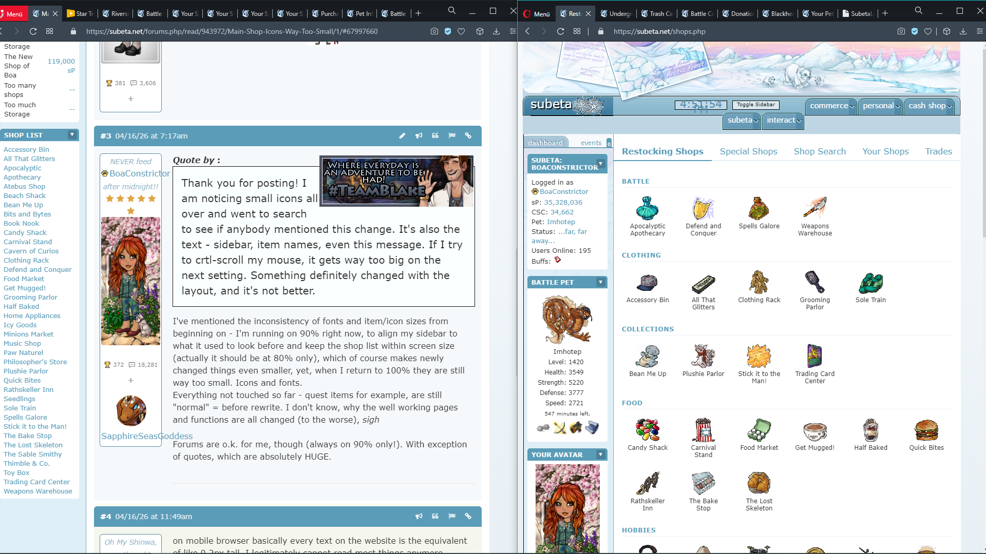
Thank you for posting! I am noticing small icons all over and went to search to see if anybody mentioned this change. It's also the text - sidebar, item names, even this message. If I try to crtl-scroll my mouse, it gets way too big on the next setting. Something definitely changed with the layout, and it's not better.
[img align=center]https://www.imagecoast.com/images/brokensafety/brokenav.gif[/img]
Thank you for posting! I am noticing small icons all over and went to search to see if anybody mentioned this change. It's also the text - sidebar, item names, even this message. If I try to crtl-scroll my mouse, it gets way too big on the next setting. Something definitely changed with the layout, and it's not better.I've mentioned the inconsistency of fonts and item/icon sizes from beginning on - I'm running on 90% right now, to align my sidebar to what it used to look before and keep the shop list within screen size (actually it should be at 80% only), which of course makes newly changed things even smaller, yet, when I return to 100% they are still way too small. Icons and fonts. Everything not touched so far - quest items for example, are still "normal" = before rewrite. I don't know, why the well working pages and functions are all changed (to the worse), sigh
Forums are o.k. for me, though (always on 90% only!). With exception of quotes, which are absolutely HUGE.
on mobile browser basically every text on the website is the equivalent of like 0.2px tall, I legitimately cannot read most things anymore without zooming in super close, which as I'm sure you can imagine gets pretty obnoxious :'<
[egg=roadkill] | | [tp=roadkill]
I just came on and noticed the tiny sidebar font. I'm already wearing my glasses, come on!
Comforting to know I'm not the only one who was annoyed with the sudden sidebar tweaks. :'D I'm sure the sidebar is still a WIP, but it was grating enough for me to go and faff around with. I know there are CSS wizards on Subeta that can do a better, cleaner job with the sidebar fixes, but I hope this tides you (and any other folks who might need it) over for now. Adjust font size, borders and colors as preferred!
customCSS for widget tweaking
/adjusts colors, text size, borders and padding for the sidebar/
, , , , , {font-size:1.0rem!important;
border:1px solid !important;
border-radius:0px!important;
}
.sidebar-widget-contents {background-color:!important; font-size:1.0rem!important; padding: 5px 5px!important; }
.sidebar-widget-header {background-color:!important; text-transform: capitalize!important; color:!important; font-size:1.0rem!important; border-bottom:1px solid !important; padding: 5px 5px!important; }
a.sidebar-widget-arrow {background-color:!important; }
Thank you! Maybe this will save me some squinting while we wait for tweaking to be done!
Thank you for posting the CSS tweak! That may stop me from breaking out the magnifying glass.
[img align=center]https://www.imagecoast.com/images/brokensafety/brokenav.gif[/img]
genuinely why are we actively making the site even more microscopic???? and also adding more pure white elements that apparently can't be changed without custom code injected into the website? I hate to say this but these changes are actively making subeta anti-accessible to users like me who were already having issues especially with the bright white border around the entire layout and now simultaneously having to zoom into the sidebar to read it even more now, but having to rely on the good nature of other users in the thread to fix it?
genuinely what are we doing here 😭 the delete notification button is now the size of a freaking period in normal sized text
Click to reveal

[egg=roadkill] | | [tp=roadkill]
In the new Rock Paper Scissors game your pet is an inch tall, and in the upper left corner. Can't it be centered and as big as it is supposed to be? I love looking at my pet full-size, especially when I'm supposed to be interacting with it!
When you try and play Bones, Bonesy McBones is even smaller! So is Nightshade at Dark Matter Dice. I like the illusion of doing things with the NPCs. The Recycle Beast is also very small now . . .
I've been asking this for a while now... it's 2026, I thought teeny-tiny text went out years ago :/ Like I tend to think I have pretty good eyesight but I'm squinting to use the site half the time now. Everything's either tiny and/or white... it's really uncomfortable. So much of the site is becoming increasingly unpleasant to use :/
Thank you for the CSS!!! That definitely helps.