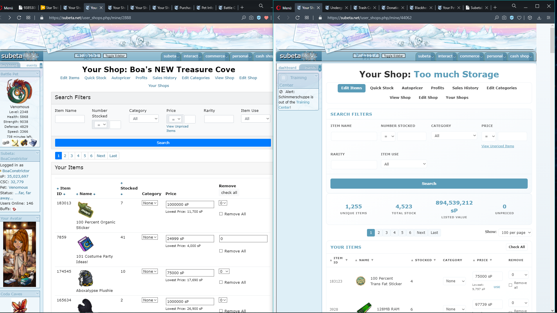
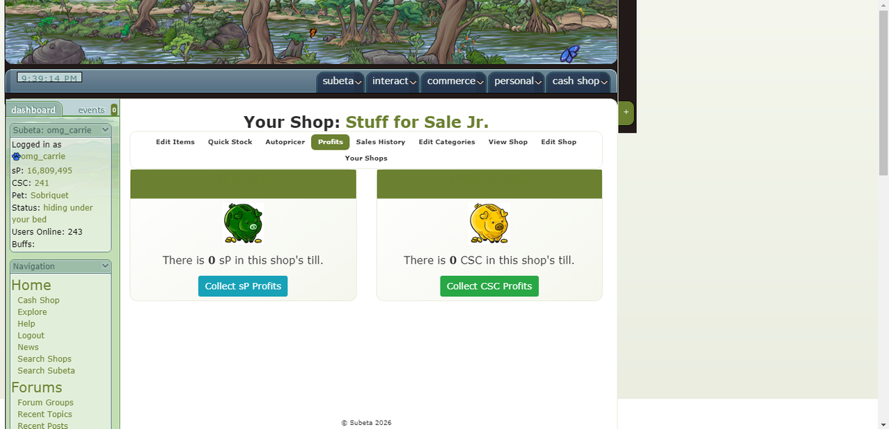
User Shop Layout "broken"
Filter
Show Official Posts OnlyReplies
everything too big, out of order, too much info, Kumos like spread apart, thus items moved to bottom of the page with less items viewable! Yet item infos (amount, price,...) shrunk. seperating lines missing.
I'm looking for info on this particular item. So why is it that small juuust hardly within view at the very bottom? Hardly detectable drowned under all that needlessly widely and prominently spread stuff. image
UNIQUE ITEMS
TOTAL STOCK
LISTED VALUE
UNPRICED
doesn't interest me the least while pricing, whatever. And is has no entitlement nor need to be far bigger than my item, its description and enter price field. That belongs on a different page or furtherst down.
So glad someone else posted about this, I was just on my way to do the same - I realllllly do not like this layout D:
To wit, this is what it looked like for me before the big site downtime/layout editing: https://i.postimg.cc/wTPxz616/sublayout2.png
This is what I've had since the layout alterations (except that the sidebar has been fixed for a while): https://i.postimg.cc/DyDfh2Sz/sublayout1.png
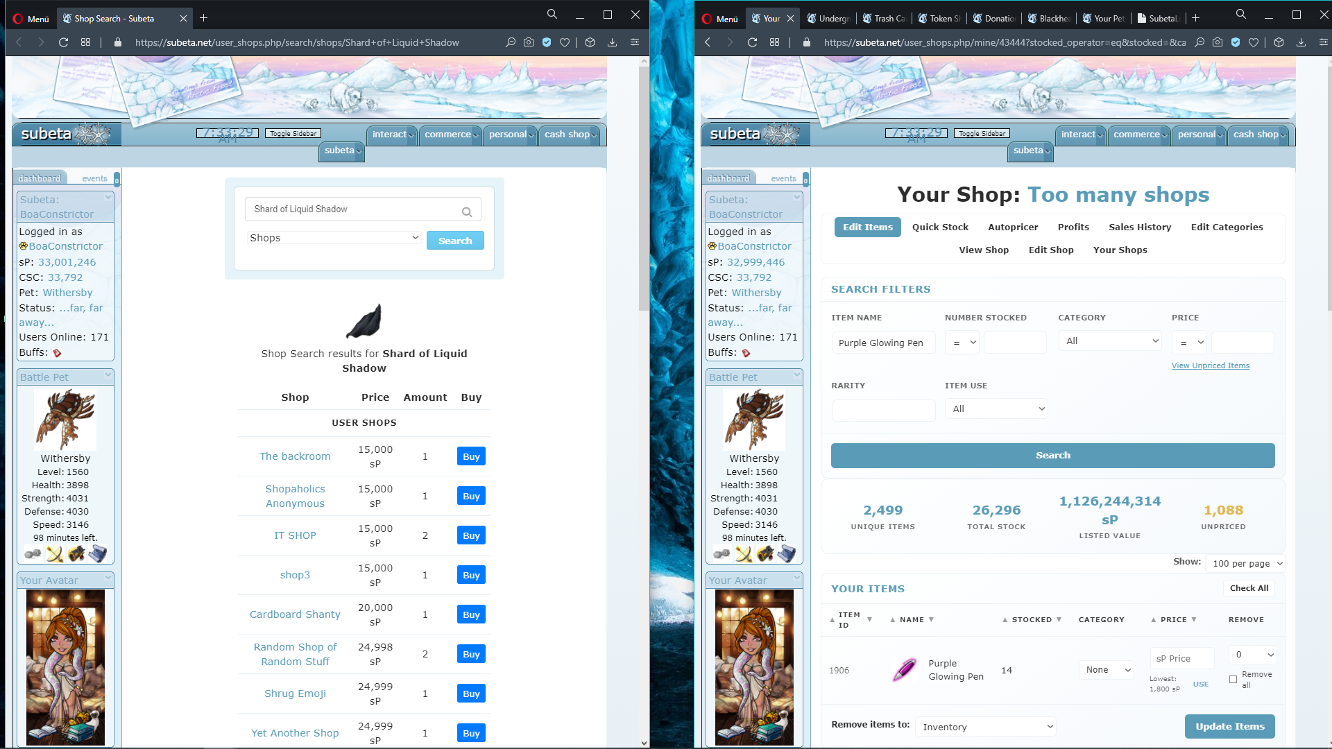
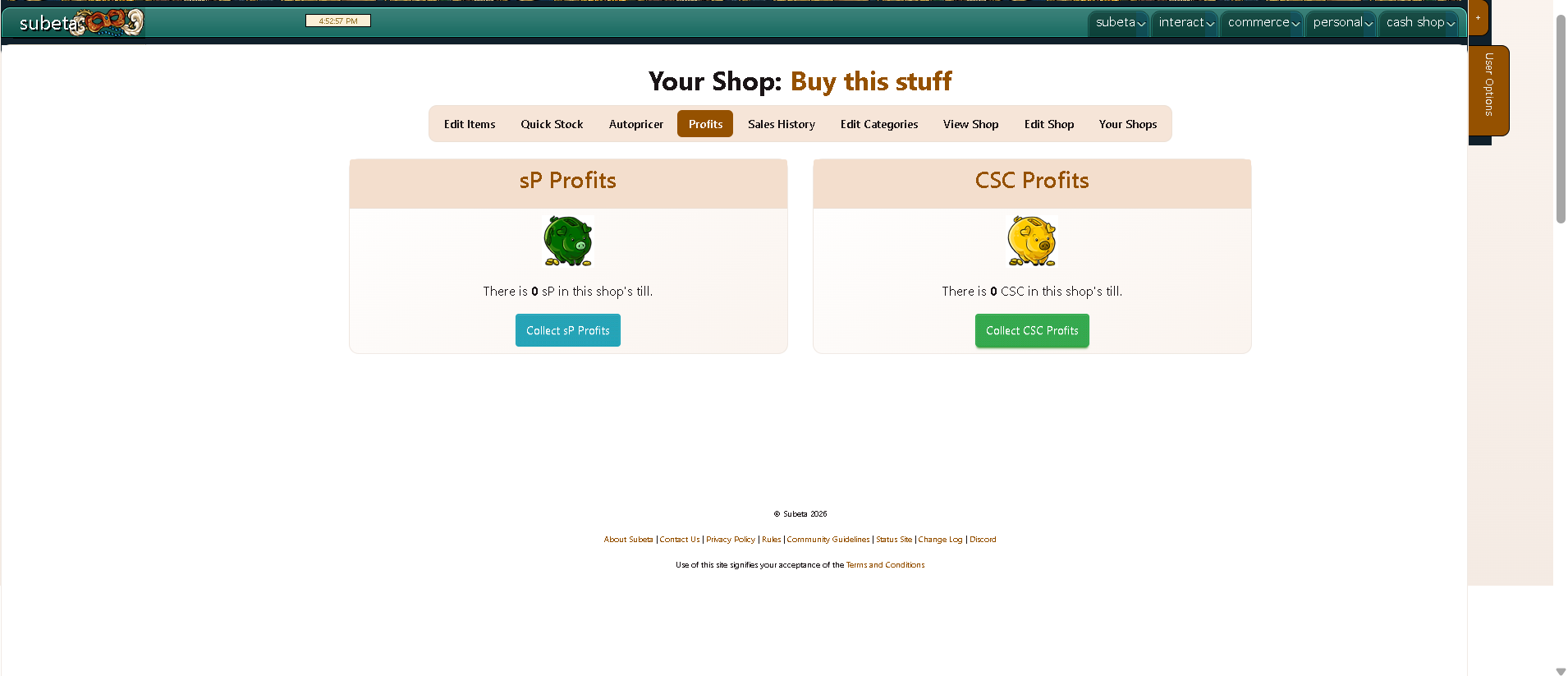
And now I have this: https://i.postimg.cc/R0hkPkVg/sublayoutagain1.png
I STILL have the "invisible text" problem with the headers (and still missing my brown background... sorry, I know I keep bringing that up, but it's really bothering me T_T) and just... why is the shop name suddenly in colour, and WHY are the links so tiny?!? And the edit stock page that Boa posted a screenshot of is just a trainwreck, sorry, it's such a mess now... inconsistent font sizes all across the board (mostly teeny-tiny but then the new "unique items, total stock, etc" is huge, then the editable text fields have normal-sized text), the new bar in general I think is unnecessary? Or at least doesn't need to be on THIS page, it's just too much clutter and an extra obstacle before I get to the items themselves. "X Unpriced" seems repetitive too since there's already a link to view all unpriced items.
Really... really not a fan of these Kumos-style "let's cram as much into one space as possible" layouts that keep getting rolled out.
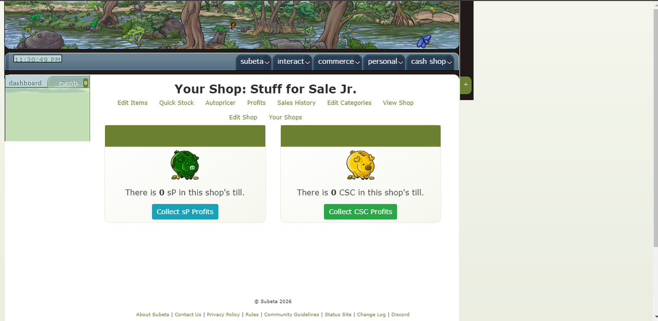
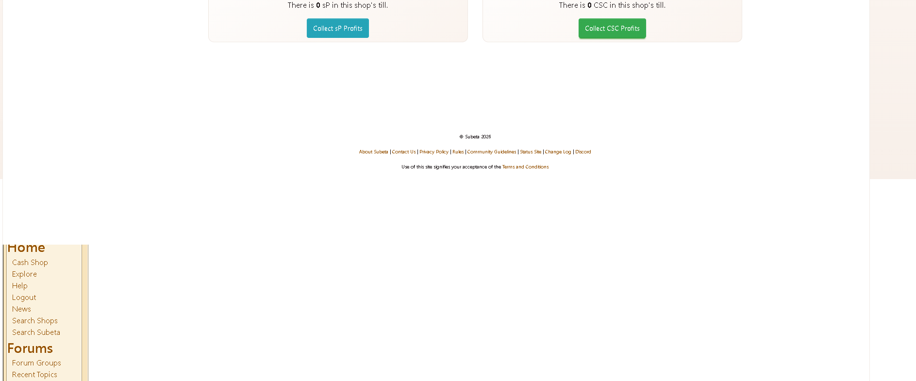
Came here to say virtually the same thing. Today, I got the notification of sales in both my shops. Clicked on the links in my sidebar and was met with a HUGE spread out shop page when I view the "Sales History", or "Profits" tabs. The layout is so out of whack that the normal sidebar info is completely gone. All that remains is a blank column of dead white space on the left side of the page where you would normally see "Dashboard" info displayed.
This underscores the reality that not all change is for the good. I am a longtime Subeta player that comes here to relax and enjoy myself, but this endless litany of bugs and glitches is only offering up stress and frustration. :(
To add to this-The top whitespace is spreading across the side panel
Chrome Version 146.0.7680.155 (Official Build) (64-bit) Not using any CSS that I think would effect it (the only custom CSS I have are things that deal with items (WL and floating items,), shop search (labeling which year from seasonal shops an item is), the leviathan hunter fix,...I might be forgetting something tiny, but I don't think so. I'm REALLY picky about what customCSS I use )
Oh, thanks for posting that Jamileigh - I don't have this problem on my Chrome but I DO have the white exploding onto the sidebar in Opera. Hope that helps with troubleshooting!
Oh good thought, I updated my post to include browser. I also saw some people complaining on discord about it which is what made me think to check it, so hopefully they'll chime in too.
Sidebar should be appearing correctly again, and removed a bunch of padding!
💖 ✨ 🤗