Feedback on first CW idea, and icon help??
Replies
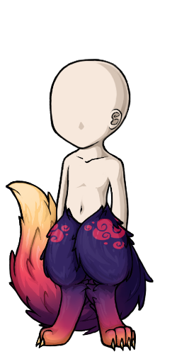
Hi there! Been working on my first CW and would LOVE some feedback on it. I decided I wanted to make themed anthro legs instead of going for plain/natural-coloured ones, just to help bring something new to the table~
SPOILER (click to toggle)
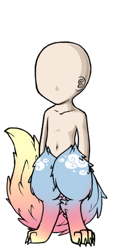
Finished possible CW, and idea for a recolour!
Now my next point is, I don't know how to go about exporting icons. I've tried twice to export my icon as a .gif file but it horribly decreases the quality and I'm not sure how people are achieving their clean icons. I use Krita for art but I also have Photoshop (which is better for exports but I'm not finding how to get the best quality). I would really appreciate help here. <3
SPOILER (click to toggle)
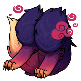
My current icon attempts... I have an original 320x320 file which I use to resize but, how do I save the quality? The right one is better, but I feel I could make it cleaner.


A huge thank you to anyone who drops by to help out. <3 Also my first forum post so I hope I did alright!
event stuff
❤ ❤ [egg=artichao] ❤ [tp=artichao]I don't have a ton to add here about the overlay, as animal anatomy and stuff isn't something I'm skilled in, but I may be able to help with the item image.
It might be that you're simply working with too large of a canvas. That's 5x the final size you want, so it's going to eat the quality a lot. The other part could be saving technique. Do you mind posting or smailing me the working size version as a PNG so I can see if I can get it to resize differently?
Yeah, I figured an issue could be the large canvas. I just simply find it easier to work with larger spaces, but if the issue boils down to that I'll try to recreate the icon I have with a more suitable canvas size.
Here's the original PNG:
SPOILER (click to toggle)
Thanks in advance, even if it doesn't work out in the end. ^^
event stuff
❤ ❤ [egg=artichao] ❤ [tp=artichao]Okay so I took a look at it, and even with my usual tricks, I'm getting the same results. I think that what is happening, is that the lines are getting too sharp as they're resizing, and in areas where there are a lot of details (the toes for example), it's becoming too complex to distinguish.
I've been drawing in this particular method for over a decade. (This kind of pet site style, resizing into tiny image method.) And from my personal experience, the smaller the canvas you can work on, the better. It will save you a lot of time not fussing over details that might get lost on resize anyways. I personally recommend practicing on a 128x128 canvas. What this does is: It teaches you how to decide which details aren't as important as they might be in a regular piece of art that isn't going to be shrunk this tiny. It's kind of a weird switch going from "As many details as I can." to "Less sometimes is more", but that's kind of the learning curve that I found with item images. And sometimes your shading will be more important to the details than line art, as the shading can give the same effect without making an area so heavy.
And for an example;
 These are both items I have drawn about 10 years apart and while the first one doesn't necessarily look bad or anything, you can probably see there is a bunch of very busy detailing that's really hard to figure out. For example, who even can tell what the pattern on the bag is supposed to be now that it's shrunk? On the newer version I used very minimal inner line art, and instead used shading to make the shape. (First one was drawn on a very large canvas, second one was drawn on a 128x128.)
Let me know if anything doesn't make sense / you have questions / want more advice / etc.
Ah alright, I see! Thank you so much, I'll get right onto recreating the icon!
I'm still learning the shading of Subeta style; I'm not experienced in cel-shading and honestly don't know good ways on how to do it. I've sort of been making it up as I go, as well as trying to reference from Subeta items with similar textures. Are there any tips you might have on how exactly to go about it? I'm used to chaotic, haphazard waterbrush-blend shading. ^^;
event stuff
❤ ❤ [egg=artichao] ❤ [tp=artichao]
Cell shading can sometimes be a little unforgiving if you're not entirely sure how to shade certain things, for sure.
I learned how to shade in a really strange setting, so I'm not entirely sure how to translate that to you, but I can recommend looking at the basics, rather than specifics when it comes to tutorials. Get used to the basic shapes and you'll realize all things consist of basic shapes, just sometimes with new textures. Things like this; LINK I also recommend learning from high contrast or black and white photographs as they (at least for me) make it much more obvious where the shadow is on something. A lot of low light / lots of color at least for me, make it hard for me to tell most times.
Chiming in to agree that 128x128 is best, the final size will only be half that and it's easier to foresee how it might look and what details are unnecessary. My first couple cws I made the mistake of using 256x256 and had a hard time trying to translate the details to be visible in onsite icon size 64x64. Namely this one . Truly icons need to be simplified as possible. Compare to which I drew later in the proper size.
he/him / 31 / EST |  | My best friend is |