Vibrant Potion!
Filter
Show Official Posts OnlyReplies
Another colorfill, which is really flashy, really 80's aesthetic! It's not something I would personally own, even if I love colorfills, but I can see the appeal, and it's absolutely unique in its execution.
:D
still waiting for a magenta colorfill pink is love dawn is not love
Woooow that's an eyeburner! :O Can't wait to see how the other pets look in Vibrant.
HONK!
I kinda wish there were more colors in this colorfill. I know they have a base and a few accent colors, but I can't help but think of the missed opportunities to mash up orange and blue and yellow and every eye bleeding color imaginable lol. Not all on one pet, mind you. Just maybe one has blue and purple, and another green and blue, and another purple and orange, etc.
Anyways, looking forward to see what else comes out. Anything even remotely close to the 80's is a win in my book.

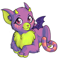
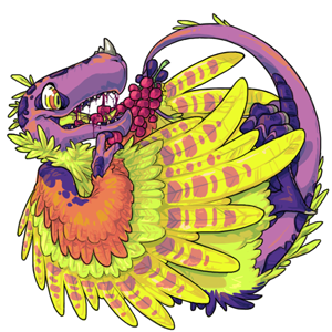
The colourfill is definitely based off of Fruit Punch and Fruit Salad, which makes me happy!
But I wish the colourfill itself was more consistent.
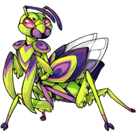
It looks stunning on already detailed pets like the zasaba and the zentu, but the less detailed and less intricate pets kinda look like someone took a neon highlighter to them.
I feel like a bit more of a gradient transition between the colours would make it better? Or a few simple patterns/new markings? And more consistency. Shifting around between a neon green base and a purple one is probably going to end up with a situation similar to the old "is dawn supposed to be light pink or hotpink" discussion.
The palette isn't very "vibrant"to me. But other than a poorly picked name, I like it!!
I love the Zentu and the Zasaba You can actually see here the difference between new/revamp pet and to the old ones..
That's bugging me, too. The kerubi and dragarth almost feel like a different color right now.
I like the palette though, and I think it's vibrant enough. If it were any brighter or had extra markings, I think it would be too overwhelming and not very popular.

I love it! I do enjoy a nice colorfill :D I think the only one that is throwing me off as far as inconsistency is the Dragarth, but it's still nice.
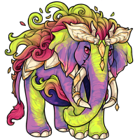
Nothing I would like to own but beautiful indeed. I especially like the Feli and the Kerubi so far. Cannot wait to see Irion, Legeica, Telenine and Paralix.

I wonder if we'll get more location-themed colorfills this month. Like Sacred Lands and that mocha/gingerbread one. :o
I'd armwrestle Shinwa for a Sacred Lands colourfill based on the common neela and bhakoru colours.
I'm not usually one for bright colors, but I like this one a lot! :D The pink is really pretty to me and I like the hues that were chosen for the shading. I know it's meant to match Fruit Punch/Fruit Salad, but it reminds me a really vivid sunset with some lime green thrown in or a lighter version of the one fungus strain we had during Survival.
I'm not sure I have a name that fits this color yet, but I'm all for more opponent-inspired palettes. ❤️
I really dislike this color. The shading on a lot of them just looks terrible, as if the artists just fiddled with the colours without making sure the shading still looks nice. Compare the shading on the kumos to the shading on the priggle or the shading on the kerubi and the zasaba, for examples. These colours also really strain my eyes and just make me want to NOT look around at other peoples' pets for fear of running into them again and getting another massive headache. They REALLY need to tone down the colors and fix the shading.
It would defeat the purpose of the pet's color if it was toned down though. It's meant to be bright, thus the color name.
That said, I actually like the colors personally.
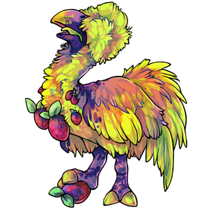
Tone down the colors? But the bright colors are the entire point? And I think the shading looks off on some of them because they have older art. The shading looks really nice on the Zentu, Dragarth, Zasaba, and Kumos. But you can really tell ones like the Wyllop and Feli are showing their age lol
I would have loved the pink to have been more hot pink, like the inside of the kumo's ears *but not shaded with purples). But I still love it. Hot pink + lime green = love.

It's an interesting color to say the least. I'm all for bright and flashy, gives more uniqueness to Subeta. That said, I look forwards to seeing the Neela, Noctoa, and Irion in this color.
| [flower=Damon] | [tot=Damon]
The new Zentu is so beautiful I want to vomit rainbows. ❤ ❤ ❤
there is a different between 'bright' and 'so bright it hurts to look at'. I'm not saying make them so diluted they look silver, but site art shouldn't hurt to look at. These are the first images on this site I had to block because looking at them honestly gave me a headache. And the art being old isn't the problem. The problem is that the shading looks way too dark. It looks like what you get when you up the contrast on an image.
i think the weird shading is intentional, though. it's supposed to make them look odd and glowy and neon and kind of iridescent. shading with different colors is a stylistic choice, one that i think really emphasizes the vibrancy of the pets and makes them stand out from the norm.
