Currencies page was updated
Filter
Show Official Posts OnlyReplies
Love everything about it. It looks great. I think this is especially great for new people (the explanations).
It has three words, but the poet has scratched them out.
You cannot read Loss, only feel it.
I don't like it. There's too much...stuff. It's good for newbies, but unnecessary for people like me. I preferred the way it was before and hope there can be an option added to change back to that version.
That's a good step in the right direction for the new people who don't know what's what and get confused easily (Subeta can be very complex to newbies). For older members, I don't think it's too much hassle (and the quick links there are handy imo).
[flower=SEA]
I don't get the argument that there is now too much on the page. It is not any harder to navigate.
It has three words, but the poet has scratched them out.
You cannot read Loss, only feel it.
I like it. Everything's neatly laid out, there's links, and it's broken down in a reasonable way.
edeeet: I got a forum point ? IS THIS NEW TOO, NEAT !
 collecting
 On my screen it looks messy and cluttered. The images should be centered above the Bold header of the currency type and then the explanation of what they are centered below - Right now it looks like this for me and I'm not a fan.
[Center][Url=https://www.youtube.com/user/ShutupandLetsPlay4]Shut up & Lets Play! Youtube Channel[/url][/center]
I think it looks and works great now that everything is centered. :)
The link to Blackheart Hollow doesn't work. Apart from that I love the changes :)
I think it's generally fine, although I do miss the simplicity of the older version. I'd like it a lot better if the main links associated with each currency were more obvious (such as having the title or currency amount also serve as a link), rather than having them in the block of text. It always takes me a couple of seconds to work out what I'm doing when I go there now.

I'm ambivalent. I think it looks kinda cluttered and disorganized and full of too much stuff, but at the same time I really really love that there's a description of the currency and when/how it's available plus a link to the pertinent shop now.
I wouldn't mind bigger titles or something above each currency type to differentiate them a bit more (or something), they do kind of all blend together.
Yeah I'm feeling the same. Kinda wish there was a ? symbol under or next to the currency name to toggle the explanation on and off (or to show it on a bubble/hover, like the new item hovers whose contents can be clicked). The collapsed look would help bringing back that "neat list" feeling for seasoned users, I think, while still giving newbies the information they need.
I like the titles, but they're kinda disappearing there... bigger font and bolding/underlining pls?
it'll take some getting used to on my part, but i'm hardly opposed to anything that'll make this site's absolute slew of currencies a bit more straightforward for newer/returning players. the division between active/seasonal/retired i think was an important one to make.

I think it looks nice. Really colourful and the explanations are great too c:
I like it. The explanations are nice and I like that they are separated by type now. Before, while it was nice and simple, but I always kind of struggled with finding the currencies in the table, just because they didn't seem to have much order to them. Honestly, I don't use the page much anyway, but it looks nice. Probably could tweak a few things, like the font in the headers seems small to me, but otherwise, I like it.

I love the update, but I agree the organisation could be a bit clearer.
On the below examples, left is how I currently see it, right is how I personally think it would make things look a bit more organised. Basically just putting the currency amount near the item and currency name. And below that, split up the "given for" and "spent in/on" in separate paragraphs. (they could still be centered as well)
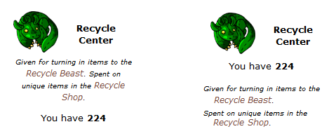
(forgive me for the bad cut and paste in paint...)
Most of the currencies are listed by the name of the currency (ie Wizard Tokens), but three of them list the name of the shop instead. The inconsistency bothers me.
Recycle Center -> Recycle Points Steamworks Menagerie -> Steamworks Trinkets Libertine Lounge -> Lounge Trinkets

Also, if the token shop didnt link to the ticenter, that'd be great. (I know it redirects, but might as well link the right one)
- Fixed the links for Token Shop and Blackheart Hollow (thanks and )
- Edited the titles for Recycle Points, Steamworks Trinkets, and Lounge Trinkets (thanks !)
- the images are now smaller
- the images fit better next to the text, rather than wrap around