Scratchcard Revamps
Filter
Show Official Posts OnlyReplies
Scratchcards got revamped a month ago, but there was never a feedback thread. I love the Kumos and Golden Glory cards, but I don't really like the NPCs. I think a big part of that is just that the art styles are all over the place, and I wish the artists would find one style for NPCs and stick with it. I think some people like that variety, but I've always thought it should be more cohesive.
I also want to get into a few specific points of criticism:
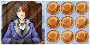
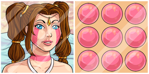
Firstly, Maleria doesn't look like Maleria. Her NPC image was revamped recently, but her image on the card looks like a very different character. I think it's mostly the nose. I know the nose was hugely controversial, but it's almost entirely gone here. Her face shape and eyes seem different, too. The shading and color is nice, otherwise.
Two things stand out to be on Saggitarius. The first is the lack of shading on his neck. Without that shading, his goatee is basically the only thing defining his jawline, so his chin kind of flattens out and blends into his neck. I also think his head is tilted at a strange angle, but I don't know how to explain that. His clothing looks fantastic, though.
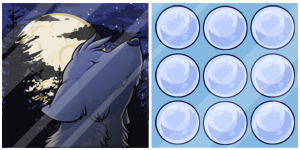
And then there's Shinwa. This is my least favorite scratchcard. I think the biggest issue is that, stylistically, it looks like the artist was going for a sense of realism that just doesn't work for Subeta. I think that had the unfortunate side effect of emphasizing all the anatomical and shading mistakes.
The face is distorted in a funhouse mirror sort of way that I can't quite pin down, so hopefully someone else can explain what's wrong with it. It might be that her forehead is too small, jawline too sharp, and right eye (from our perspective) is too small? Her hair also seems to fall in a strangely unnatural way and its shading makes it look both chunky (the bold shading between strands) and flat (the overall shading) at the same time. I'm just not feeling it. :(
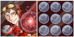
I think the Calvin Blackmoon card has the same sort of issue with the eyes. The left eye (his right) looks too small, so it looks like his face is turned more than the rest of his head. It doesn't quite line up right.
The revamped item images:
And the full size cards look like this:

Old scratchcard images
I couldn't find them all, but here's everything I was able to find:


What a vast improvement from the old scratchcards.

Forum Art by
Signature Art by
Shinwa looks a tad blank compared to everyone else, but I think the art is a fine improvement

- Looking at these two images next to each other, you can see the difference.

i honestly lold hard at the old shinwa scratchcard image.
The scratchcards are really shiny. Must make them hard to scratch.
But art-wise, everything is a massive improvement. I do agree that the nose is noticeably flat in the scratchcard (maybe the editor for the scratchcards had a little bit of fun in photoshop? not the first time to happen to celebrities :P), but the old ones are so laughably terrible, I'm pleased overall. I like Blackmoon's gun. The charge on it has a really cool effect.
first thing I noticed about the maleria scratchcard when it came out was the fact that her nose was... gone. Everyone made such a big deal about the nose when it was revamped, but the artist proudly stood by what they'd done. I was surprised to see it was back to almost nothing in the scratchcard.
he/him / 31 / EST |  | My best friend is |
For whatever reason I like the new Shinwa Scratchcard, the style is special of course but maybe that's why. The old card on the other hand makes me laugh each time I see it. XD
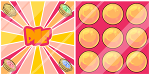
My personal favorite however is the Kumos Card, I love the colors. Oh, and Saggi's face is priceless, so cute!

Maybe this art was drawn super long ago before the Maleria revamp...
Holiday Things
...Sebastian Phoenix kinda looks like he just bit into a lemon. It's an oddly cute, and stiff pose...like the kinda thing you do at the RMV in hopes it looks halfway decent on the card. xD I do love all the revamps though, I mean...there's odd bits (can poor Maleria have her nose back? She needs it to smell when her cookies are burning.) to a few of them sure, but it's a huge improvement over that old art.
I also really like the Shinwa one for some reason...and that Kumos Moon card is now one of the most beautiful things I've even seen on here. <3

I love the Kumos scratchcard c:
The only thing that bothers me is how much revamped Saggi's face reminds me of Postman Pat. It's all I can see now, and it's not an association I wanted to have to make.

The art is good overall (I like the kumos), but I agree with twocents: they're... so shiny? What the heck kind of scratchcard is glossy like that?