Help Me Pick a Clock!
Replies
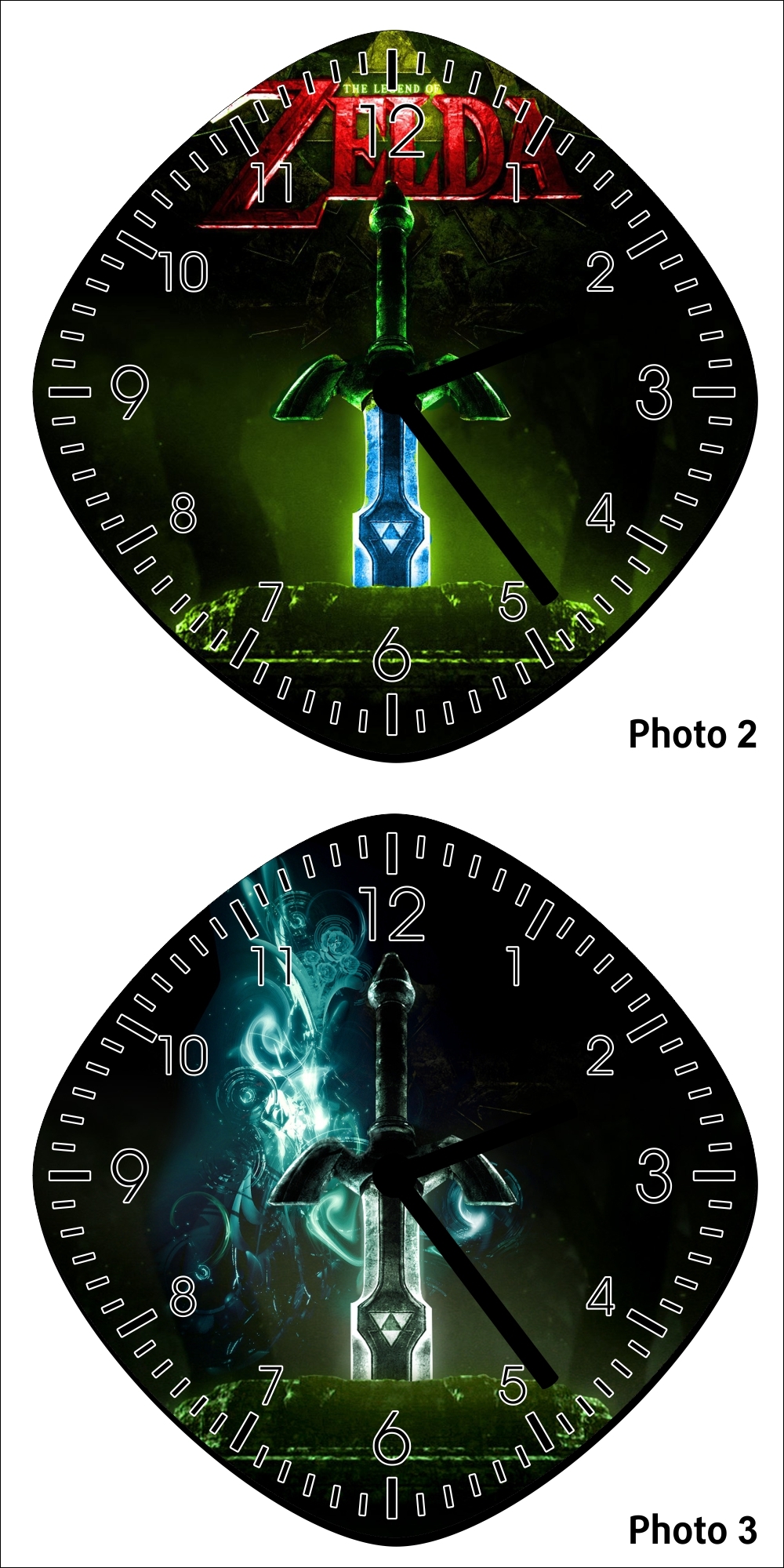
I'm getting a custom clock made by someone on etsy. Problem is I don't know which one to choose! I like the colors on clock 1 (called Photo 2 in the pic) but I don't really care for the logo being in the way and I do like the flourish on clock 2 (Photo 3).
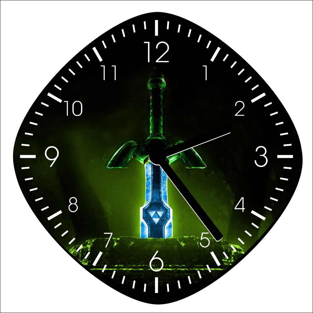
EDIT: I really like the first clock but the logo is kind of in the way so I put it in PS and edited it out. I think it's much better. Anyone else agree? CLICK
I can't decide for the same reasons as you! I suppose I slightly prefer the second one, because the logo does make the top look messy.

Wow, that's really cool! I like both clocks, but I think I prefer the bottom clock more. I like that glowing effect in the background.
The only thing that bothers me are the minute/hour hands. I'm not sure if it's just the picture, but do they seem a little hard to read from the times 12-3? Not too bad at the center of the clock, though. Maybe it's just me xD But that's just being picky. It's a pretty freaking cool clock!
i would definitely choose the bottom clock if i was in your position. the blue pattern in the back is awesome.
The bottom one, definitely. Both are nice but the glowing blue pattern is really cool.
I like the bottom one better. The logo in the first one makes the design look a bit busy.
Yeah I think that's jut the pic. I'm sure that I'll be able to see em fine in broad daylight.
I really like the colors in the first one. If it weren't for that dang logo! Maybe I'll upload the original pic into Photoshop and see if I can edit it out.
I would say the bottom one, although I think it is simply because I like blue :P
I altered the pic in Photoshop and got rid of the logo. Better?
The bottom one for sure. The logo kind of makes the first one look tacky and too busy.
; Those clocks are really cool! I prefer the clock 3/Photo 3, though :3 I mostly agree with what everyone else is saying about the logo making it look too busy/messy. I also looked at your edited version of clock 1, and it looks super plain to me (though I tend to like more decorative things, so there ya go.. xD)