
December 31, 1969, 7:00 pm by
moonstone


 Ariel...!!
dies laughing
December 31, 1969, 7:00 pm by
Sistine

Luxe: I used to have cats, but now I just have dogs and a rabbit. Is that a hip? In my experience hips don't jut upwards above the spine. o_o Cats are pretty dang flexible though. XD Either way, in the pic you posted, that cat's haunches are more rounded, whereas the Feli's are very angular. I think that's why the pose looks so cramped.
December 31, 1969, 7:00 pm by
NIKKI

Quote By Quickfox:
; border: 1px solid ; font-family: georgia; font-size: 10;">Hmmmm I don't like itHmmmm I don't like you
December 31, 1969, 7:00 pm by
lorkhan

I think this one is a nice improvement from the last, and a MAJOR improvement in quality from the current feli.
However, as with others, I have a problem with the head. Firstly, the shading detail is a bit more lacking than on the rest of the body and the head is overall too large; makes it look very top-heavy. I have also always had a problem with how the feli's muzzle attached to the face: the top of it should blend more into the head, not round off like that, in my opinion. It's also too small compared to the rest of the head. The ears are looking a little detached from the skull, but it's not something that bothers me, personally, too much. Also, I believe the eyelashes should point downwards; not only does it look better but it's how felis have always been. I believe the neck should be more defined so it doesn't look so fat in the face, as well.
The body on the feli looks amazing, though. The feli's anatomy reminds me more of a domestic cat mixed with a big cat, so the leg makes perfect sense. Perhaps the neck ruff does look a bit like a boa, but I think that could easily be fixed if less definition was given between the two ";halves"; of it; maybe a little less fluffy, but personally I love the fluff myself.
December 31, 1969, 7:00 pm by
Ariel

I don't know why you furries see boobs. These are boobs:

December 31, 1969, 7:00 pm by
LazyKat

Clockwork's kitty hips are a bit odd and square. I still prefer this revamp, the head isn't ridiculous really (honestly nothing is crazy out-there for a more or less magic kitty), and it has more flow.
December 31, 1969, 7:00 pm by
Nebulae

Hmmmm I don't like it
December 31, 1969, 7:00 pm by
NIKKI
I think my feli overlay is the best feli we could ever have. Jag, realease it pleaseplease. http://www.subeta.net/petinfo.php?petid=570275
December 31, 1969, 7:00 pm by
Ringo


It's alright, though I honestly preferred the ";phase one"; revamp. I voted old.
December 31, 1969, 7:00 pm by
Deleted User
That was was great, Kyokou. I'd forgotten. And ClockworkReverie's mock-up is pretty much all that it needs.
December 31, 1969, 7:00 pm by
Deleted User
I agree with some things said, the Head is a bit too large and the hind leg is a bit too far back. The 'boa' is just a tad too poofy for my liking. But I like the pose, especially the front legs.
December 31, 1969, 7:00 pm by
Jag

Luka_Pooka, no, I din't get fired. I'm sorry I can draw better than this now, though. Seriously.
December 31, 1969, 7:00 pm by
Luxe

: Do you own a cat? The part on the hind end that you flattened out are actually its hips.
December 31, 1969, 7:00 pm by
moonstone
oh i'd forgotten about that version Kyokou...i loved that one so much... 
December 31, 1969, 7:00 pm by
Sekhmet


I have to ask, what on earth is wrong with these Felis? They are lovely, proportionate, and have minimum chest fluff.


Did the Artist/s of these get fired or something? Because any of these styles would make fine revamps.
December 31, 1969, 7:00 pm by
Templar

I agree with everyone else. The head looks quite strange and too large, almost deformed. The top of the head is pushed back too far, while the back end looks squished, and the hind leg looks too thin and small, as if it has some sort of problems with it's hind legs, making it paraplegic.. or that it's just a real long cat that got into a tube of mascara. The only good thing about it, to me, is the 'boa' chestfur.
December 31, 1969, 7:00 pm by
Koki


PS, the mockup that ClockworkReverie did, I think it should be more like that.
December 31, 1969, 7:00 pm by
Hosui


I like this pose a lot more than the original revamped pose we were given to vote on a while ago. Good job.
December 31, 1969, 7:00 pm by
Koki
The head looks weird on the new one but other than that it's fine.
December 31, 1969, 7:00 pm by
robotHEADBUTT

I think the head is too big (mostly the forehead) and the tail too thin. And it looks like the chest fluff is shaded very detailed, but not everywhere else. I do not like this at all. 
Those are my opinions.
December 31, 1969, 7:00 pm by
Sistine
I think the reason this new pose looks sort of 'squashed' is because of the way the haunch sticks up so much. The head does seem a bit too big and oddly-shaped and overall it does suggest 'big cat' to me more than 'domestic cat'. I think the wing position wouldn't look so weird if it was rotated-- that is, if we were seeing the front edge of the wing rather than the whole 'palm' side. I did a little mockup, trying to blend some features of the first revamp and this one:
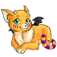 Used the head, wings, and front paw of the first revamp, and rounded out the haunch. Wing placement isn't perfect here, but it's the best I could do with a mouse. I do like that this new revamp isn't so feminine though!
December 31, 1969, 7:00 pm by
Luxe
Where were all the people who loved revamp when it was being criticized to death for being a hooker feli, and too flirtatious?
December 31, 1969, 7:00 pm by
Jag
Kyokou, we will never go back to that version. It's been said a LOT of times before, so there's no need to bring it back.
December 31, 1969, 7:00 pm by
LazyKat
I saw featherboa, not boobs. Everyone wants to say 'Ohemgee, it's feminine!'. I don't know why.
I like it a lot better than the previous poll of it lying down. I'm still very fond of the original, but I suppose it's due for a change wistful sigh. I think the fluff could be toned down, but it's not lethal to the pet's appeal for me.
The hind leg seems thin and small. It could be foreshortening, but it is a little odd looking to me, along with the shading along the side? The lightsource is to our right, but the side is shaded like it comes from the top almost. That throws me off too, but I could be reading the image entirely wrong.
I think it's a marvelous job on the whole, really zeroing in on it, if you're not dead-center already.
December 31, 1969, 7:00 pm by
Selene

I liked to two before this, personally.  Anyways, I voted the old one since this one's head seems by far to big to me; and I'm not very fond of it's angle.
December 31, 1969, 7:00 pm by
Evastia

I like the old revamp more. 
December 31, 1969, 7:00 pm by
Levi


I think this one is uh... well I hate to be picky but it's head is a bit too big and the chest hair is a bit to FLUFFY. I personly like the first ever revamp.
December 31, 1969, 7:00 pm by
Teri


I very much like this one, the only thing that bugs me slightly on this one is the head. to me it seems a bit.......squished, on the one side. the top does. maybe it's the angle of the eye and the horn in relation to the end of the face...but something seems slightly...off about it. other than that though, I like it very much. :]
December 31, 1969, 7:00 pm by
Deleted User
I'm really sorry but that one looks like garbage.The new one looks like some fanart thing. Not a real pet for subeta. The proportions are off and the shading and such....not my style. The wing looks off and the hind legs too small.
December 31, 1969, 7:00 pm by
Remedy

oooh! Now this is a better direction.  My only constructive criticism is that I feel like the tuft of hair on the neck looks a little weird. Almost like a boa. If that was tweaked it'd look better, I think!
December 31, 1969, 7:00 pm by
Ritual

I really want to like it, but the proportions look all wrong. It looks squashed. I'm sorry, I really am. The last revamp, except for the tail coming out of its head, was perfect IMO.
December 31, 1969, 7:00 pm by
Poet


Ah, I loved that one, Kyokou! It was so cute.
December 31, 1969, 7:00 pm by
Poet
I feel so sorry for the artist drawing this pet. It's going to be absolutely hell making people happy. u_u Good luck!
December 31, 1969, 7:00 pm by
Deleted User
This one is very cute =] However, the body looks....squished. Maybe the head's too big, I don't know. I wish that the tail was up like the last revamp, not down. And the back leg was closer to the body. However I actually really love this one ^^ Much better than the last one, personally.
December 31, 1969, 7:00 pm by
Allishinca

Luxe, thanks for posting the other revamp side by side.
I would of liked to have seen it in this poll along side the newest one, but ah well.
I love both of the revamps (I don't mind that the first one looks human-ish) but in comparison this one is much, much cuter.
I hope the revamp goes through soon!
December 31, 1969, 7:00 pm by
Kyokou

Hey don't forget this one:
 I think this one was the best. The new one is too big, like a tiger or something, and I think a standing or sitting feli would look better. But a fluffy feli looks cute too.
December 31, 1969, 7:00 pm by
styn

simply awful.
December 31, 1969, 7:00 pm by
Deleted User
Another 2 cents for me - I think the chest fluff is too detailed in relation to the rest of the body. The shading on it is a bit confusing...
December 31, 1969, 7:00 pm by
KEN


It's nice art, but I preferred the 1st Revamp.
December 31, 1969, 7:00 pm by
Zeppelin

I thought the old revamp was like 100x better, but this new one is alright. I would prefer it if the snout was somehow different. And if the ears were a little more cat-like. But otherwise it's okay... but not the best. :K
December 31, 1969, 7:00 pm by
OtakuOokami

Personally, I don't like this latest proposed revamp. For me, it's all because the front part of the body looks much too bulky to me due to the size of the head and the way the chest floof seems to give the impression of huge, broad shoulders...not a very feline trait. I have had many cats over the years, a few of whom have been quite bulky. But when a cat gets bulky it does not extend to the shoulder area. Rather, it centers around the belly while the shoulder area remains relatively slim. If the chest floof were to be toned down on the left shoulder (the viewer's right) that would make the proportions much more appealing, balanced, and feline and would make the head size less awkward because now it would be more an effect of perspective than a strange anatomical quirk.
December 31, 1969, 7:00 pm by
Capybara


Very nice! The chest looks a little too fluffy,though. I liked the older pose,though.
December 31, 1969, 7:00 pm by
PRADA_922

Is it just me, or does the pelt resemble more of a boa; and the tail remind you of a clip-on?  Other than that, I find the new Feli more appealing.
December 31, 1969, 7:00 pm by
Sekhmet
The pose is excellent, I especially like the tail and feet. But it looks like the wing is coming out of its cheek, and its head is too big and oddly proportioned. The ears don't look ";catlike"; and the nose is really tiny. The chest fluff is annoying, kind of like it has a feather boa between its paws.
December 31, 1969, 7:00 pm by
Babbzi

I think that the chest is too fluffy, the ears are too curved, the face looks squished, and the horns are off. The horn on the right looks like it should be somewhere else and I think that the head and snout should be defined more. Other then that, I think the colors/pose/coloring look lovely.
December 31, 1969, 7:00 pm by
Frostpebble

I like this version better than the old one, but something about the head seems really off. I think it's the muzzle, it just looks...weird. I do love that chest fluff though.
December 31, 1969, 7:00 pm by
Jenni

Nice art... though the head seems a little... big... :/
December 31, 1969, 7:00 pm by
moonstone
how about keeping the body of the newest redraw and just angling it's cute little face up a little and to the right (our right) like, but not to the full extent of, the original...or are all the redrawn pets to have their faces pointing straight on...?...just a query...i kinda like the idea of pets looking every which way...makes them more individual... 
December 31, 1969, 7:00 pm by
Lisa


The only thing that really annoys me a little is the ears. I don't care for how they're curved. Doesn't look feline to me - more elvish.
I think its all weird. But I don't know exactly why. I loved the first revamp.