Montre Revamp Feedback Gathering
Filter
Show Official Posts OnlyReplies

This covers most of what I disliked about the new one, well done! I'd be more likely to vote for the newer version if it looked like this plus the more defined feathers.
 Reusing art?
I kind of hope that is the case...if this was an accident I am sad
The fluffy end of the tail is near the face on the old version of the Montre? Perhaps you mean why -isn't- it?
I guess it depends on the type of dog for sure, some do have a bit of a gut when they sit, some don&;t. lol.
The new art is lovely. I like how the new version sits up straighter, makes it more... regal, though I think it's giving me the evil eye...
The snout looks a bit... droopy, for the lack of better word
I'm a member of Daily Item | [flower=maplerose]
Style-file | My CW shop
I mostly like the new version, it's just that the face seems off. Maybe the snout is too square and that makes it look long and flat? It almost feels like there isn't room for it's mouth. Or maybe it's something with the cheek fluff. I'm not really sure what it is but the face isn't very alive. The wings are also pretty heavy looking, they could use a few less feathers.
i've never loved the montre's design but this is a definite improvement. i like that the tail is closer in size to the metal band, i always though it shouldn't be able to move it's tail with that sort of size difference if that makes sense. i'd make his snout shorter though, he'd be cuter that way.
kat! (o:
lol That shows you how much attention I pay to Montres! In that case, if the new one is on the left it's heaps better! Ty for setting me straight!
The one on the left is a goer!

the muzzle looks too rounded, it looks like its face is melting. also, the cheek fluff is off somehow, it almost makes the ears look too small. i also am not a fan of the general persona change --- the old montre looked shifty and sneaky and generally displeased with the world, whereas this one looks very...generic. there's no real feeling to it at all. however, the wings are stunning, as is the tail fluff. the shading is also great overall. vast improvements over the old one for sure.
Personally I prefer the original, but the revamp is definitely nice.
The new one is obviously way prettier in a lot of ways, better shading, better volume, etc. I'm not quiiite sure if I like the straighter muzzle. It makes it look more reminiscent of Aztec art and works with the tribal motif of the pet, which I like, but it also loses some of the foxiness that goes with the sloped muzzle. Maybe try sculpting out the cheeks and muzzle on the forward-facing plane of the face to make it look less flat. The nose could follow the contour of the face a little more to make it look less like a hole, and the spherical shading on the top of the head that comes in front of the ear makes the ear appear stuck onto the back of a spherical head. The wing in the rear being placed directly behind the neck forms a weird tangent that throws off the curvature of the neck itself, making the neck look fatter than it actually is. The dark shading on the piece of the face behind the muzzle blends into the outline right next to the highlight on the muzzle, and that point of contrast pushes the bridge of its nose forward in the space of the image and sorta makes the curvature of the muzzle look more reduced than it already is. This part is just a personal preference, but I don't like that the "bangs" got bigger on the new one. On the old one it looks more like a ruffled bit of fur to me. Hope you find this crit useful.
I think the face took use a little tweaking in the angling but otherwise it looks nice.
The art is definitely better update wise, however the face is a bit off.
overall i think it's fantastic, especially the improvements to the wings! i can't really see anything that strikes me as off aside from the nose? it just seems like an odd design choice to keep it so unnaturally...tiny like in the old one haha
and...quick/not so great tweak to the nose area? even tho i know others have already done some...
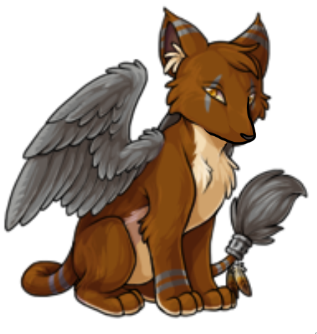

Something about the head and neck seems off to me. Like it's not really... attached right? I'm not sure how to phrase it. It doesn't look like part of the rest of the pet. The revamp also looks quite rigid pose-wise. The shading, however, is a vast improvement.
I think it's sorta fox like, which is almost like a mix between a cat and a dog (didn't know that foxes have retractable claws!). But I'm not sure about their anatomy as far as their tummy's go lol. But yes, cats do have that cuz of the fur and skin around by their back legs. But this is def more canine which usually have more taught skin around by the back legs (at least on the slimmer dogs lol). I spent years drawing dogs and wolves and that all wrong, so I finally learned how to draw them properly so seeing them drawn wrong bugs me lol.
Heh, thanks. It's not perfect, but you get the idea. xD
I like the body of the new design but the face of the older design is much better. The new face doesn't have a lot of personality, lacks the finer detail of the old design and the snout is bulky and less delicate.
Overall, voted for the old design, and if the new one goes through as-is I'd probably have to change my Montre up.
I've been keeping my fingers crossed for this for a while now.
I like what odduckOasis did to fix up the anatomy for sure. In the proposed revamp the Montre snout is really angling downward, and on top of that the nose itself is weirdly positioned lower still. (That's just a thing that's bothered me with the design in general, the Snoopy nose really low on a puffy looking snout.)
I think I'd like to see the ears looking a little less.. super round. Making them more angled and messing with it to make the ears look more connected to it's head would probably help.
Errrr.. okay one last thing because it's bugged me with the Montre in it's entire existence: making the eyeballs look like they're sitting in sockets in it's skull. They've always looked like they're these flat shapes sitting over the skin.
I'm really for reals excited about this revamp, really really :D The Montre is a nice pet design looking for some lovely artwork. Now I'm gonna stop rambling and go to bed.