Montre Revamp Feedback Gathering
Filter
Show Official Posts OnlyReplies
Reposting from the comments section: This is the first time I've liked a design the way it is better than the revamp. The old one has a little more movement to it, the new one looks strangely static and uncomfortably posed.
Like you can tell it was drawn while trying to fit the size constraint--notice that the wings were given a lot more space on the canvas but now the body looks really cramped and the head and neck are at a strange angle in order to make it all fit. The torso is barely there.
I'm not sure if I'm explaining it well but the body looks squished horizontally, the artist could use the canvas space a little better.
Echoing everyone on the snout. It almost looks broken to me, pointing down at such a sharp angle. Otherwise the revamp looks really nice!
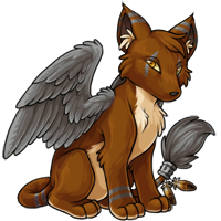
The wings are a marked improvement over the original, and the ears are nicer, more graceful. I also like the tail positioning of the new design and the more realistic ring and feathers, also the body position overall. But I'm not sure about the muzzle and face in general. I liked the sharper angle of the old design, and also the larger, more defined eyes.

the muzzle looks strange in the revamped version...
• • • •
love it! nothing that i can see that really needs changing.
I wish the eyes were different. Not as dull. It looks a little feminine, which isn't a bad thing if your pet is going for that look, but others..it doesn't work.
Please, please, no. The quality like colouring and lineart are better, yes. However I do not like it at all. Its head is so big and it's leaning forward a lot. But mostly I guess I hate the face and overall body type. The montre has always seemed like a slender, sleek, agile kind of species to me but the revamp is going more for fluffy puppy. The snout seems like it's sloped downwards in a forced attempt to hide the mouth like on the original - might be good to decide on the angle then. Feels like the features are getting "rounded" in the revamp.
At any rate, the montre is my favourite species so I apologize if it makes my tone kind of whiny (???), hahaha;;;

This is probably the first of the proposed revamps that I'm feeling kind of "meh" about the revamped version. The rest of the other revamped pets either retained the same kind of personality of the original artwork, but just with updated shading, positioning, etc. However, I feel like the revamped Montre doesn't retain any of the original aloof personality. Don't get me wrong, the coloring and the shading is absolutely gorgeous, but I wish it incorporated some of the elements of the original: the hunched back, the look of longing in the eyes. The new one just feels stiff and bland in terms of personality.
[tot=Fennekin] Egg @ Fennekin TP @ Fennekin

When I first saw the revamp I really liked it. Going through this thread and looking at all the redraws, the face really bothers me now. Some of these suggestions are fantastic
[flower=Xilicia]
The muzzle's angle is a little weird to me. It looks too short and low, but otherwise I dig it.

I chose the first option - I prefer the more detailed version of the Montre and I think the colors look better as well.
I prefer the original shape and position of the montre. Especially the angle of the face. I liked it looking more directly at me.

Love the revamp! It's much better than the old version, on pose, artwork, details and attitude!
 ❤
❤🎉 | | | 🎉
A thinner, more tapered muzzle would help it stand out more from the other canine species - otherwise, I really like this!
Looking good so far. I must say, the right side of its face--the side closest to its wing facing us--stands out oddly due to the lack of shading in contrast to the rest of its body which is highly shaded. In short, the revamp's face is a flat plane devoid of shading or character while the rest of its body shows depth and life.
Adding a bit more shading to the planes of the face will also help keep the head from looking too big for its body, which currently it does.
Really loving the new wings on this revamp guys, definitely a huge thumbs up there. However the body of the montre is kind of bothering me a little bit
 Even though the posing is way more natural, its not reading as actually sitting. The butt is kind of hovering off the floor a little bit. The same with the paws, they're not really seeming to take any weight at the moment.
The thing thats bothering me the most is the neck though. I read the Montre as sort of a bigcat/wolf/fox body, none of which have that neck. The neck is almost human, and its making the head seem like it's just stuck on, rather than attached.

Very rough edit ahoy! I also feel like the box space could be used a little better, the tail seems slightly unnatural curved the waay it is, and there is space to extend it under the wing. The head is also very large, and slightly wonky, I raised one eye on this, and shaved the side of his head a bit (I forgot to put the cheek poof back oops!) and also lifted the nose a smidge so he looks less like a Womble.
I think the left (our left) ear is in the wrong place to, and it could move forwards a bit to be in line with the other one!
I really really like this revamp, there's just a few things niggling at me in the anatomy. I hope I'm not offending anyone with making edits like this, I'm just not good at explaining myself without a visual ref.
i never give feedback but there's something about the muzzle, as other people stated, that also bother me a bit :( maybe try making it less straight?

i'm still getting used to drawing pets, but i think this would be slightly more natural looking?
as for the rest i really like it! :D i seriously love the new revamps!
edit: and the redline for the body that databunny also posted is also a good point! x)
I really love the quality of the new art, but I am not digging the new muzzle. Before, the Montre had a much more fox-like, tapering muzzle, and now it's just a wide wedge. Also as others have mentioned, the pose is very stiff and "stock" - just a plain 3/4 sitting pose. While the art in general is an improvement, the pose itself really needs some more life and personality to it.
So sorry!