The saga of Bug vs. the Wardrobe
Filter
Show Official Posts OnlyReplies
Really enjoying the latest wardrobe. Its both functional and esthetically pleasing. Thanks for all your hard work!
I especially love the fact that skins are now in their own scroll box and I don't have to keep scrolling up and down to see my HA.
Happy to see that the shifting items has been fixed. I often view the wardrobe with different zoom values and that problem was really bad whenever it was more than 100%.
Continuing problems:
-
Drawers still don't want to load very well. Sometimes they load immediately, but that's rare. Still having to jump around tabs to get them loaded. But they do eventually show up, so its bearable.
-
Would really, really like to see the "none" drawer category working again. I noticed that its also not working in the Wardrobe: Organize Items page, which is extremely annoying, it makes it much harder to keep track of items that I haven't sorted into drawers yet.
-
The load outfits page takes forever to load (I have well over 100 outfits saved). Pagination might help.
In loving memory of Need posting achievements?Then join Posting Frenzy Achievement Items - searchable list List of Borders and cutouts New at Fresh and Flavorful Ping Group
Aw. I liked having the items on top and the filters below. & I thought that it worked better that way on mobile and looked nicer on my computer too. I prefered being able to look back and forth, instead of diagonally. But, it doesn't matter, since this is closer to the way that it was before (and people really do not like change that much. haha.) The little Go! button on the end of the search, instead of being in it's own space, looks nice! (as well as it not trying to find the item as I am typing in the name). And, having the dropdowns automatically make the change is nice too.
Here's something that I noticed are not working like they used to.
My keyboard shortcuts! Oh no! I like being able to ctrl-A & delete/backspace in the 'Search By Name' box so I can clear it out faster. Can't do that anymore.
I can't select the words in the grey item area/box. I like being able to double tap, highlight, ctrl-C and P the words from the item name into the search box so I can more easily find related wearables, like for items that are named, well, I'm going to say poorly, (but I don't mean much by it) where the name is Color Fancy Pants or whatever, because they would not be beside one another when the items are sorted. I am lazy, if I want to see all my Fancy Pants, I do not want to type those words. :P Never mind, that's working again. maybe I did something.
[edit]As for scrollbars, I use Chrome on both my Android(v7.0) (Chrome v59) smartphone and Windows(10 v1607) (Chrome v60.0.3112.113) laptop. Laptop works fine for scrolling both owned items and the layers.
I did not play with the mobile version enough before.
On mobile Chrome, the scrollbar will fade out, but it comes right back when I swipe on the side of the items I own at the bottom. (probably just a Chrome thing) For me, it works nicely in both portrait and landscape in the area of items that I own.
The avatar layers, on the other hand, when I have it in landscape, I can't scroll the layers area. If I put it back in portrait, I can scroll layers. I can scroll the Skins page regardless if I have the page in vertical or horizontal orientation. Weird!
I have a couple of screenshots with a little more info here, if that may help. But, I do want to say that I don't really use mobile Chrome that much to mess with the wardrobe, but that it could be an issue? Sorry to throw one more thing on the pile, Bug. :(
I read back some and didn't see anything about the filters on/off. I know you've been crazily tweaking, but are we losing the filter off option permantly? I can't see what I'm doing with filters on. want to chose filter then turn it off to try items. Is this final?
[center] [egg=storm42] [tp=storm42] [center]
Hai, Bug! ♥ This is just a quick 'lil request that I'm not sure if anyone has mentioned, but could we get the feature back that took away the Shop Search bar when we owned an item, or at least maybe make a note pop up somewhere on the page that says "You do/do not own this item!"? I have a huuuuge Wardrobe, and it gets really hard for me to remember what I /actually/ own. XD;
I know there's the check box for only things you own, but when I'm trying to make a new outfit + pick up new goodies for it, then that box really has no use for me~
 Art by ~ Sig by ~
Waves. Hello. Really love the wardrobe on my iPhone+. If we can have the filters back that would be lovely. So on my phone both vertical and horizontal views it is: HA. List of items. Filters. Wardrobe items. If I can collapse the filter section to hide that I can see my HA and items and then bring back filters to pick the next category of items I need. Right now I have to scroll past filters and lose sight of my HA. Thanks for your consideration on this matter.

Forum Art by
Signature Art by
It's mentioned in the first post.
No, nothing's final. You can consider the entire wardrobe a huge WIP while this thread is up, basically. (Also pinging ) Going to add back the hide option. It was easier to rearrange things without it, but now that we've pretty much settled on this overall layout, it shouldn't be too much trouble to add that back :)
Thanks for shedding some light on the scrollbar issue. That is really annoying. Do you think it would help to simply leave some padding on the right side of both boxes so people have space to scroll with their fingers? Ideally I could detect whether you're using a touchscreen device, and change the CSS accordingly, but I'll have to see how possible that is detect.
[] Yes to the second point (see my reply a paragraph up) but no to the first. I'm looking at other ways to address the scrollbar issues. There has to be a way to detect the device being a touchscreen, and/or force the scrollbar to show and give it a bigger width. I know you can style scrollbars with webkit but that doesn't work on FF and I have no clue if it'll work on tablets at all. I'll do some research.
🐝 ☕ bug (he/him) | your friendly neighborhood code wrangler. stay in the loop! join and check out the latest admin post highlights
@ Bug Bless you for your hard work. Thanks.
Forum Art by
Signature Art by
I have no opinion on spacings. If I need more room, I use my browser's magnify feature. Your current design works well up to +200%. and then still works but is kinda odd which I would expect as a general thing not particular to Wardrobe.
Do you use the "not sorted" button on the organize drawers? It does the same thing, and I don't actually even see a "none" button (though it's possible Bug just took it away). But not sorted has always done fine for me.
That's terrific, I'm so good then. Color me patient.
[center] [egg=storm42] [tp=storm42] [center]
Sorry, yes, I should have specified the "not sorted" drawer on the organize page, which does the same thing as the "none" drawer within the wardrobe.
When I select that option all I get is an infinite loading symbol. I used to be able to reload and eventually get the unsorted items, but that hasn't worked for several weeks now.
In loving memory of Need posting achievements?Then join Posting Frenzy Achievement Items - searchable list List of Borders and cutouts New at Fresh and Flavorful Ping Group
-oh, sorry to hear that! Yeah, that would annoying, sorry it's not working for you.
My major issue with the new layout is how few items are listed. It makes it really hard to move items up and down. :C I like making HAs with lots of items so this is a real problem for me.
Apart from that, I like it! Especially that the search is finally fixed. <3
🔭🐢
I thought we could only put 1 of each item in our wardrobe, that if we tried to put a 2nd of the same in it would say there's already one in the wardrobe. But I just discovered that I had 2 Holy Warrior Earrings in my wardrobe. Strange. And I agree with Skolletta about the new layout.
CWs for Sale or Trade https://subeta.net/user_shops.php/shop/24266
<p>Remind me again, what device are you using (what brand of tablet is it), what operating system, and what browser are you on?
I'm on a Samsung Galaxy Tab Pro. Android version 4.4.2 (assuming that's the operating system) and my browser is Chrome.
Edit: I don't have any scrollbars on web pages but not sure about embedded scrollbars? If you have a site example that should have a scrollbar embedded I'll check!
[tot=Reduka] Flower me please?
hey i use google chrome Version 61.0.3163.79 (Official Build) (64-bit) and since you updated the wardrobe i can no longer search for an item. when i click the green button it says loading items, then goes away and there is nothing. i made sure to unclick the just items in my wardrobe option but it still doesnt work. i deleted my cookies and it made no difference. any idea what else i can do ?
Edit : duh i was a ditz and had it set to bottoms when i was looking for hair duuhh .. sorry

Ditto agreeing with Skolletta: all the fixes and improvements are great, but to bring it up to 10/10 for me I'd like to have more of the on-avatar items listed so that I can play around with the layering more easily.
Not sure how to make more space. Suggestions for moving things around (Saheric Slide style) and possible resizing / reshaping: -- Perhaps the "wear now" and "save to shared outfits" buttons could go up into the top navbar, or to beside the HA and preview instead of above them? That'd make a little more vertical room, maybe enough for two or three items in the on-avatar list. -- Narrowing the search filters zone, and the details for currently selected item, could possibly make space to move the HA and preview over to the centre of the page. This could make room for a (narrower) list of on-avatar items all the way up the left side. -- The list of pagenumbers could go to right-aligned under the search filters instead of left-aligned to make more vertical space in the centre of the page. -- The list of wearables currently displays 5 rows of 15 items. Maybe those numbers could be changed? -- On my screen (1920x1080) there's a bit of dead space at the bottom of the page. For me (though maybe not for others!) that could be used.
Annotated screenshot labelling the various parts; I've coloured the background grey so that we can more clearly see what the important parts are.
SPOILER (click to toggle)
Click for fullsize

useful threadsThe Giant List of Usability and Random Improvement 2.0 Comprehensive Guide to Battle Opponents (v2) [topic not found]
|
[topic not found] |
i'm actually really missing the minimise button for the filters - i just went to click it before remembering it isn't there anymore XD oops. when the filter options were down the bottom it didn't bother me at all, so i quite liked them at the bottom. either that, or being able to minimise it so i can see more of the items i'm choosing from
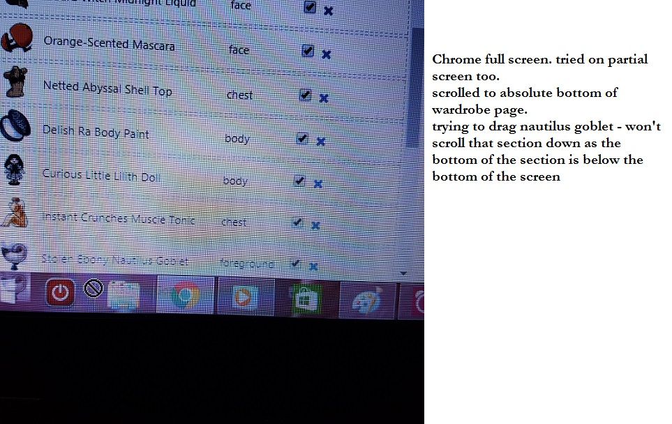
edit , ok i've got an update on the dragging and scrolling thing for you - it works correctly when i've got Chrome zoomed out to 80% because at 100% the bottom of that section is riiight at the bottom of the screen (i think the bottom of the box is below the bottom of my browser, even though i've got the full wardrobe page scrolled down as much as possible) and when i try to drag downwards it just thinks i'm trying to drag the item onto my taskbar...i took a dodgy pic at 100% to show it better than my lame-ass explanation. screenied it first forgetting that the cursor disappears oops what a sleep deprived numpty i am XD now time for bed... also, current screen resolution is 1366x768
 lovely art by
"grey would be the colour if i had a heart" ~nin ❤️
lovely art by
"grey would be the colour if i had a heart" ~nin ❤️
I do appreciate removing that kind of redundant filter where it was sort by "what you own in your wardrobe" (??) or "what you own on the entire site" (if I remember right). Checkboxes work just fine!
I don't like the placement of the drawers filter because I keep expecting it to be layer / I don't use drawers but that's minor.
