☀ CW Denial / Help Thread! ☀
Replies
how are you resizing your file? usually this is the setting i have when i don't want the file to look sharp :) you can also try out the other options and see which one best fits your cw!
here's the diff between the sharp and non sharp versions:

the sharp version almost has no lineart around it, and it's really thin and pixelated c:
Hi! You are aleays so helpful. <3
I'm saving my file in Manga Studio, so I don't have the options "Bicubic x or y". THESE are my options.
I have read that Bicubic Sharper was the best option on Photoshop to resize images to smaller sizes. Are you saving my file with Photshop? :3
[img align=right]https://i.imgur.com/Axtd3mF.gif[/img]
Doesn't manga studio have a resizing option? Cuz right now you seem to be resizing it directly as you save it? o:
Photoshop resizing really depends on what you need. I usually play around with the bicubics cuz each one of them can be useful for something different when resizing to a smaller dimension! Also yes, I opened your file in photoshop :)
Yes, it have one. But I'm not using it, and now it seems that's my problem. xD The steps I do, usually, are: With the PSD not merged --->"Export Single Layer" ---> "PNG" ---> Resize to 125x250 ---> Save with the "quality" option.
So... should I merge, resize and THEN save? :3
BTW, I stopped saving with Photoshop because it let's colour bleeds averywhere (at least to me).
[img align=right]https://i.imgur.com/Axtd3mF.gif[/img]
I usually don't merge when I save, I just resize and save. Sometimes on PS the color does bleed a little, and when that's the case, then I merge it. But I make sure to keep the layers file alive, otherwise recoloring is a pain xD
Yeah, I'm still at zero recolours but I can understand why. Hmmm, I've tried everything and the wings still don't look better than the original preview. :/ I don't know what else to try.
But thanks a lot for the advice, as always. <3
[img align=right]https://i.imgur.com/Axtd3mF.gif[/img]
thanks for the feedback. I looked up people sitting on horses and the HA form. I see why it got denied now. so is this better?

thanks!
I think so, but like I said, I am definitely not an expert at perspective =o
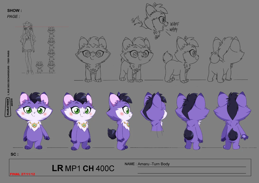
: Could I get some help for this tribute item? Username --- Link to the overlay(s) --- Current overlay update. The very 1st attempt. 2nd/3rd attempt after it was denied. Link to the CI --- Current CI
What do you need help with ---
I would like it to look like Lolirock's Amaru and not look like it's come out of a Pokemon TV series.
Current feedback to the artist after it's been updated for the 2nd/3rd attempt
I think for number 2 (the tuft of hair/fur on his head) though, might be best to be removed entirely? Maybe it wouldn't look so much like a Pokemon?
I don't think the pink blush is noticeable or even visible anymore.
I wonder about that myself (for the length of the tail).
TBH, I quite prefer the fur where the tear-shaped gem used to be, but I wonder if re-adding that would make it look like it's the same again.
<ol>
<li>changed the gem into a collar with a star</li>
<li>changed the tuft shape (now even longer than previously)</li>
<li>changed the tuft colour to purple-streaked</li>
<li>drastically lightened the purple fur</li>
<li>changed insides of the ears to purple (used to be pink)</li>
<li>removed face markings and paw (kept the belly)</li>
<li>removed blush (actually i turned it purple but i dont think its visible idk)</li>
<li>eye colour is now blue (was green, then changed to teal)</li>
</ol>
<p>these are on top of the old changes which are kept:
9. changed ear shape
10. made tail longer + changed colour of tail (i think you should link this as a reference) because idk why they arent seeing lengthening the tail as a change???
Was there a denial --- (paste denial here if any)
After the 2nd/3rd Denial
• ITEM and OVERLAY: Not enough changes from original tribute reference; there must be at least four changes
• ITEM and OVERLAY: Changes from the original tribute reference are too subtle
• NOTE: The more we look at this, the more we just really feel like the changes are not enough. ALL of the changes listed are so subtle (a whiter color than the light purple-white, a slightly different purple, slightly longer hair/tail, etc) that this still looks exactly like the source material. There need to be stronger changes.
Optional Can we take a look at the PSD files --- ? yes/no? Can we redline --- yes/no - Please do?
Usually in tributes like this, staff is looking for a completely different color at the very least. The "drastically lighter" purple is noticeable if you're looking for it/can compare the two versions, but otherwise the character still looks the same. Perhaps go with a light pink or light blue instead? The point here is to preserve the concept of the character you're making a tribute of, while also making it different enough that copyright holders probably won't be mad about the tribute existing, if for some reason they found out.
As for the pokemon look, the only thing I can think of is that the simplified style of the face and body looks a bit "anime,", especially shrunk down for the overlay. Perhaps make the irises of the eyes smaller, so some white can be seen around them (like the original cartoon character)? Adding toes to the paws and a more feline mouth might help add a more realistic look?
: Belated thank you for the feedback! I'll ask Ursa when she gets back to the computer world. ^^
Might also consider changing the colour for the first one to make it a Luminaire themed one first, if that's the case of having a different colour first.
teeeeeny question, how far can you go with animated ci's?
I'm working on one for my latest cw and the animations pretty simple but it kinda changes the image even if temporarily.
ci link (theres a bit of a delay before the animation starts but it does move x'D) ^^^^^^^^^
This is the cw for it if it helps I just wanted something a lil more than a static image for it.
Thank youuuu in advance as always! ^v^
Personally I think that is fine, I mean, it changes to the overlay after all. But it does take a long time to change, ahaha

The has a similar animation, so I think it should be fine. Add that in your notes to be on the safe side maye?
Thank you both! I'm gonna cut down the time by a second and hopefully that will help with the length I was just scared it would be too fast for a pause @;;
Username --- Link to the overlay(s) --- Click 1 Click 2 Click 3 Link to the CI --- No need to. <3
What do you need help with --- Well, I did the blush on my skintone (base 1), and it worked fine for me. I was asked to test the blush on a base 4 and it worked fine. I don't know what to do to fix this. Maybe lower the opacity?
Was there a denial --- Your custom clothing Dont Mess With My Pink Blush was denied for the following reason(s): • OVERLAY: Does not work on both light and dark avatar skintones
Optional Can we take a look at the PSD files --- Yes. Can we redline --- No.
Thanks!!!
[img align=right]https://i.imgur.com/Axtd3mF.gif[/img]
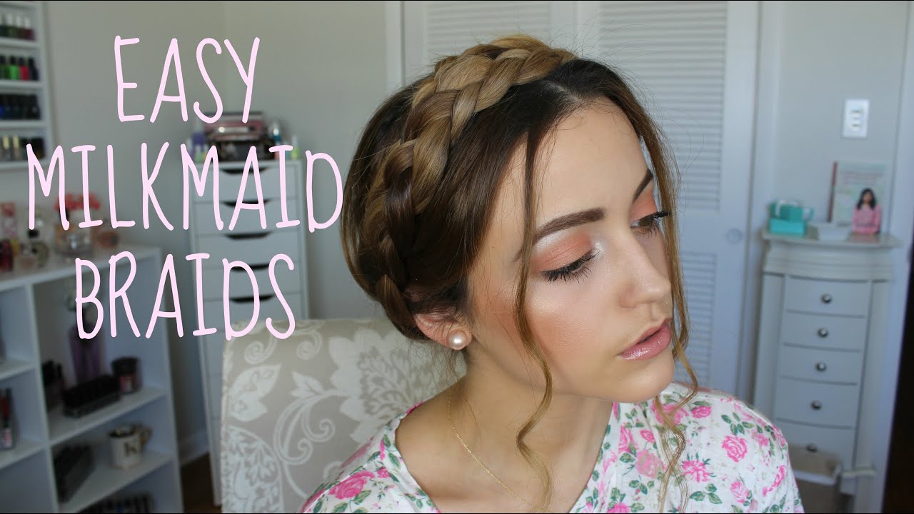
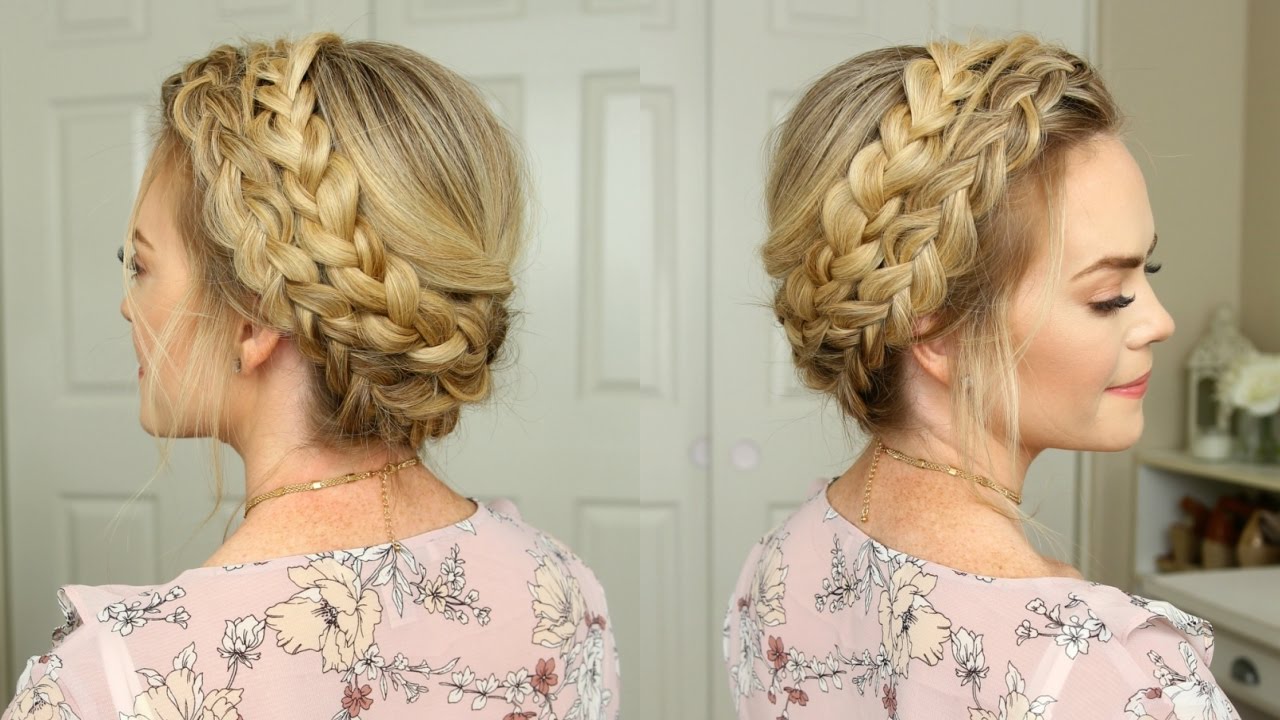
Heyyo guyssss
I'm having an issue with a denial here because tbh I understand it, but when I look at the reference, I just don't, since I pretty much copied the way the braid should be :I Also you can ignore the "sticker effect" part, as this is something I know how to fix xD
Username --- Link to the overlay(s) --- here and here
What do you need help with --- Fixing LOL
Was there a denial --- • OVERLAY: Sticker effect: flatness due to black lineart around the edges and colored or missing lineart inside • NOTE: This is a really interesting concept for a wig, but I don't think it's looking quite right yet - it sort of looks like a knitted hat more than hair! I think of it is some of the loose strands in front which don't quite match the braided part, and it needing a bit more depth (hence the sticker effect)
Optional Can we take a look at the PSD files --- It's a commission, so no, sorry! Can we redline --- Yes of course!!!
So basically staff said that it looks like a knitted hair because of the loose strands in front... but then, here are some references: x | x | x | x
I don't think the problem are the loose strands because, as you can see, all those refs have loose strands. Maybe it's the way I drew the braid, I really don't know xD Also usually when there's a braid, the hair is pulled back to form it, but in this case it just seems like the braid was pasted on top of the head, which is probably the style of this braid x:
Thanks a lot in advance!
im awful with blushes so i cant say for sure, but i too believe that lowering the opacity of the pinkish part would help a lot! (you dont have to lower opacity of the pink lines and white dots)
if you really wanted to keep the pop of colour, pick brighter pinks/reds to combat the toned-down colour from lowered opacity. it will show up brightly on lighter skin tones, but hopefully the lowered opacity can blend well into darker skin tones.
good luck! v
hi bab!!! i dont know much about drawing wigs, but i hope this helps idk ;w;
first redlines clickky im thinking the biggest reason it looks like a cap is because you added a lot of volume to the back! i went to take a look at some examples and theres actually close to no volume. i mostly traced the shape of the HA head for this. also you drew the hair pulled up like a bun/ponytail (which can look like a knitted cap), but after staring at examples, i realised the hair is pulled downwards! xD
next redlines clickuuu braids argh this was the hardest q.q ignore the volume i drew the braids at, its the shape that is important! the bottom of the braid has to be really close to the neck! it helps reduce making the front and back look like separate parts.
and of course putting them together + adding some stray hairs to the tied up part hopefully makes the whole thing look much less like a cap, and more like a hairstyle!
of course this is just my interpretation and i hope it helps! i hope others will give you their own opinions too! c:
p r e s a g e .[/font]
aaaa thank you so much!!! def gonna try those changes cuz they make sense ^o^ <3
Thanks so much or the input, hun! <3
Here's the new version, 20% more transparent:

Also, still kinda new to this CW thing, do you think I should re-ping everyone to notify about the changes to see if they still want the item or the changes are to subtle to bother everyone?
[img align=right]https://i.imgur.com/Axtd3mF.gif[/img]