☀ CW Denial / Help Thread! ☀
Replies
Heyyyy n_n So the biggest thing I'm seeing regarding the shading parts of the denial is actually got to do with the fact that you're shading each part individually, rather than as a whole. So the thing about something this large is, it really helps to lay down the general shape of the shading before you begin detailing, because if you start detailing first, there is a chance that you can over detail without keeping the shading you need. Here is an example from me helping someone else of what I mean; LINK In the second to last image you see that I've sketched out where the shading should go, and then n the last image I've begun the detailing. For something this big and this detailed, I really suggest this style of working, simply because after a while of looking at it, you can miss / forget parts of the shading and just go about the detailing and texturing.
If you need more specific help on this, I may need to see the PSD just to save myself some time if that's okay! sMail me if you're interested in a more personal breakdown C:
I had to organize my layering. Only thing I have to let you both know that sometimes when I line in sai, no matter what settings, the lineart will be semi transparent so sometimes I have to fill in with solid brush under everything so its not patchy...It has no impact on the art other than making it less transparent..You can see how it looks without it to know what I am talking about(hard to phrase myself) I dont know if its my filling tool or my lineart brush.
I primary use sai,then adjustments/etc on photoshop. In this overlay, I have a shading over the lineart, they were last minute shading.
But its all organized so hopefully its not too hectic. I appreciate both of you for helping me. <3
https://www.dropbox.com/s/bs17dm2uyju7a3e/DressAndCloak.psd?dl=0
yes you can have it too! thanks :D
No, I dont mind. I use sai primary, I use 1px to 1.5px typically. Should have the lineart thinner than 1px? Sometimes I find when its that line, its almost too thin. I guess Ill have to do slightly less than 1px and see maybe if its better than I thought in the past.I dont normally get thick lineart denials and when i do its my shading contributing to that. Not too sure since I have not been the most active artwise lately. So anything will help. More eyes the better, thank you for looking as well..
Thanks! Your right on the shading as a whole vs separately.. I dont mind giving you the psd as well. If anything you see working size, feel free to send a smail.
edit// sorry i forgot to add the psd!
Originally the cat was on the line that you mention and staff told me to move it back, then denied again after I moved it back. ;n;
but did you show them the image with the three cats together? :I cuz damn, i dont really see whats wrong considering the other two cats...
so what i see is that the issue is not the lineart that is thick; on your layer of shading of the yellow part (where the lineart looked the thickest to me at least) you added some shadows that ended up looking like thick lineart instead of actual shading if that makes sense?
as for the neck part, i'd try to give it more contrast on the texture;; when you use similar colors and the way you shade makes the layers too "close" together, when you zoom out it's more like a 'blob' of color, so you end up not being able to notice the "limit" of each shading layer, thus giving the pillow shading effect
as for the skirt they mentioned, i think they are talking about the lineart, because the way you shaded with a real dark black makes the shading look like lineart instead of a shading layer; so while contrast is good, too much contrast doesn't help much im not entirely sure about the pillow shading on the skirt though :I
i've painted over it (i hope you don't mind!) just to maybe give an idea of what im trying to explain (because as you probably noticed, i suck at it LOL)
No not with the image. Another artist mentioned adding the image after the first denial. When they denied it again and gave no further notes we were kinda left in the dark not knowing what staff wanted from us. I can understand and fix gradient shading despite gray being the one color that I just cannot get a grasp on for whatever reason, but the positioning portion is just leaving me perplexed and frustrated.
I can try it again with the positioning from before and redo the shading to maybe get rid of the gradient feel? maybe if I fix the gradient they will overlook the positioning?
[edit] We being me and the submitter
personally speaking, i'd reshade it on the size it is now (because resizing does make the shading look gradientish) and try to resubmit again in the previous position, add the screenshot of the three cats, and additionally ask, if it's denied, if staff can give a better explanation of what exactly looks off, considering the perspective of the other two cats were accepted and the small one is fitting exactly between the two!
Okay. Thank you! ;A;
I took everyone's feedback when i was updating...so gonna ping those who haven't seen it, I did a big preview. I thought id ask you all who been helpful to see if it's better or if im still missing stuff.. Thank you!
I have two versions..one with some casting shadows from the cloak, set on multiply 100%
then the second version, is one with it being 50%
I dont know if my ver 1 is too dark,worried about burn/dodge effect. Not sure, anyways..thanks! Ver 1. Preview clicky
i think it looks a lot better, especially the yellow part! tbh i dont rly see much difference between the two versions??? just a liiiil something; the skirt on the viewer's right side now looks sliightly too dark compared to the left side; so maybe just add a little bit more of highlights at least on the part closer to the yellow skirt inside??
np! good luck ; v ;
Sorry should have added a gif instead since its hard to notice...

full opacity is at its darkest..
good tips on the black skirt..i was thinking that was the case but wasnt sure as i was staring at it for a long time. thank you :D
Hey! So I spent like an hour going over some ideas for you without realizing you'd already posted LOL, but I honestly think you've addressed almost all of it on your own! I think Sonatine made the best point about how your shading merges into/mimic thick lineart, and I think you've worked hard on correctly that look. When I took a look at your lineart all on its own, I saw that you don't really have any "internal" lines (for folds, etc), and rely on shading to create that. You seem like more of a digital painter, and your style is beautiful, but sometimes just doesn't jive with Subeta standards. I think that's why Jessi was pointing out how the cream part of the bodice was "perfect," - it looked like thin lineart, with shading added to it. Make sense?
In your latest iteration, I think your lineart is maybe still a tad thick (around the yellow and red parts, specifically. I think you would benefit from coloring this lineart a dark brown/dark dark red to match those areas, instead of leaving it all black. The only real problem I have still is with the collar, which still loks a bit flat and too contrasty with the dark fold lines. I'm gonna go ahead and put my example things that I made below, maybe it will help show what I mean:

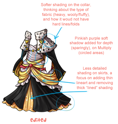
I feel weird leaving such detailed suggestions for changes, because I really love how much effort and detail you always put into your work! I think you just have a hard time reconciling your personal style to subeta's requirements, I guess. Anyhoo, hope this helps! The dress is gonna be gorgeous when it's finally accepted!
Thank you, I cant say i did it on my own. Mesmer sent a smail of some things. I will take in your tips and apply that as well..I loved how you did the fur, i was trying to achieve that in my head but didnt know how.
Yeah clothing has never been a strong suit. you got it spot on my style and how i go about things...
thank you for the tips! I really appreciate the effort you went in showing me. Thanks!
I'm super glad you had such great feedback from Sonatine and Mesmer! And I was glad I could help a little too. That frustration of trying to figure out what staff wants and making your style fit that is a problem I know all too well, LOL. I'm glad my tips made sense. As for the collar, try looking up maybe fur coats? Or maybe something like this. The heavier fabric just doesn't crease/wrinkle in the same way. Sometimes it's just too hard to picture exactly what you want in your head, hahahaa. (Been there!)
oh! now i see the diff xD i'd personally go with the darkest one! also tartelette's tips are pretty awesome, especially the part with the wool thingie! ^o^
Erm... Are any of you online right now? I need a tiny help with creating previews for the shorts that I've commissioned. I created the previews, but without my own computer (it's being checked out, so I'm borrowing my family's computer) I can't paste the shorts that's going to be sold onto my HA preview...
[edit]Cathii has already answered! :)
yupps i can n_n
Cathii's CW shop ❤️
:
Outfit Not Found - Above the outfit Outfit Not Found - Below the outfit
http://i.imgur.com/jWgfQWI.png - Link to the shorts
there you go!

Cathii's CW shop ❤️
: YES! Thank you~! T-T
I totally hate being computer-less in this day and age...
silently whispers that your guide there is just really helpful cause i suck at clothing shading and those pointers were really nice tips :0 tyty <3
and also to all other artists that showed pointers too omg. <3 i think my tiny brain has added new knowledge into it lmao //
ps i still totally suck at shading so i read this board frequently OTL XD
 [sub]by [/sub]