What pets do you think need to be revamped? v.2.5
Filter
Show Official Posts OnlyReplies
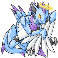
Here I am with another Telenine wish (thanks for the glacier revamp :D )

I would love to love this but it's ... ugly. The flowers etc. are okey, but the actual Telenine is so simply drawn, that I can't get warm with it. It looks like it doesn't have any soul, it's just a picture of a green Telenine with flowers on it. I would like to see more glade pets like this ones:


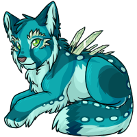
I mean, look at the storm Telenine, I can actually feel and see how he runs to me and jump onto me to play. I think it's just a common problem with the old pets, the drawings are just out of date. And here the storm Telenine, cause it's my favorite pet of all time :D

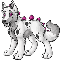
I'd love a Glacier Antlephore revamp. The pose is all so pretty but I miss details. The Glacier Hikei is also very simply drawn and looks kinda foal-ish. A bit more Hikei pride would make the look for me ❤
Since the Angelic Archan was revamped back on 12/5/17, and the Glacier Archan was just done on 3/6/18, you can take them off the lists when you get a chance.
I would still love to see the Galactic Archan revamped.
 The awkward pose and the pained expression makes it look like it has the mother of all migraines.
I think the hydrus feli, galactic harvester and nuclear kora are all in need of revamps. Hydrus feli looks flat and stiff, plus the expression could look way better Galactic harvester has a really boring pose Nuclear kora has some really funky shading that makes it look like its made of plastic, esp on the black parts
they/them
The Darkmatter Aeanoid could use some TLC alongside its relatives that were already put in the original post!
Definitely has the "older" look that the Reborn, Galactic etc all have. The shading's more up to date, but it seems a bit less polished than the newer Aeanoids (e.g. the Steamwork, Sweetheart, Storm ones).
Most colors of Celinox and some of Tigrean. I loooove these felines however some colors of them have the shadows much cartoonized, weak anatomy or the entire execution is badly done. I would say the same to Noktoa, an a m a z i n g pet with just few options of colors that change the pose.
 This is begging for a revamp ;_;
 This has to be more than a decade old.
 This has been revamped, but I think the older one with the smirk is better overall.
What's the newer one doing? It has really stiff limbs and shoulders, so it's neither laid back, in normal posture, or ready to pounce. Is it having a thousand yard stare?
This has been revamped, but I think the older one with the smirk is better overall.
What's the newer one doing? It has really stiff limbs and shoulders, so it's neither laid back, in normal posture, or ready to pounce. Is it having a thousand yard stare?
 This was on the welcome page long ago before we get to choose our own themes!
It looks great, but you can notice its age by the shading.
This was on the welcome page long ago before we get to choose our own themes!
It looks great, but you can notice its age by the shading.
 Uh... xD
 The front limbs looks off, and the face as well.
Unless you want a REALLY old charlie, you can only choose the color fills and that's ridiculous at this point
art by YURA
I’m not sure when the BR Popoko came out, but I feel like it could use a couple of minor tweaks to its eyes. Right now, the size, position, and highlights of its eyes make its eyes look huge (even for a Popoko) and like they’re staring in different directions. ;__; Its gold eye in particular looks very large and low-down on its face, as well as a bit too far towards its cheek. I otherwise think it looks pretty great! But the almost-googly-eyes it has have been putting me off from adding one to my Popoko family.
If the highlights and pupil/iris positions were adjusted, and its eyes shrank down a tiny bit and moved a little higher up on its face (right now, they’re kinda low-down on its cheeks), it would be perfect. :0
The Storm Popoko also seems kinda... off, somehow? Compared to the other Popoko colours, and even compared to other Storm pets. I think it’s the head... Its cheeks seem too big and round, making its head look a bit chubby, and its eyes seem just a touch too far apart. Its head in general looks disproportionately large next to its body, I think. ;; Compare with other Popokos, which have less-round cheeks and a more even head:body ratio:
 If the Storm Popoko’s head was slightly smaller, its eye position tweaked (mostly the far one/our left), and its cheeks less chubby, I think it’d look fantastic!
 The Angelic Chai is looking pretty dated and stiff next to more recent Chais. Almost all of the other Chai colours look current (and very cuddly!), so I hope Angelic can get some TLC to match them!
The Darkmatter Sheeta could certainly use a revamp. I’ve thought about changing mine for years now but I’m too worried the artists will revamp it and I’ll miss out on something amazing...
The species as a whole is pretty outdated compared to the current art direction of subway, but the darkmatter one in particular is painfully in need of an update. It looks blank, the lines have no dimension, and the darkmatter aura nearly looks solid—none of the wispiness that is so cool to see in other species of that color. It even looks a bit artifacted.
I’m pretty sure I’ve had my Darkmatter Sheeta for over a decade and their hasn’t been a revamp in that time.


 I'm... not sure what this expression is supposed to be. Pain? Anger? Just checked his bank account balance at the end of the month? Cybills are more or less penguins, so I think a swimming pose would be a lot more fitting for hydrus!
 I might be biased because I have one but I use this site for over 10 years and I don't think they ever changed Spectrum Kerubis
also Angelic Cadogres
I might be biased because I have one but I use this site for over 10 years and I don't think they ever changed Spectrum Kerubis
also Angelic Cadogres
 It's showing its age a little bit, but I think just some thinner lines/newer shading is enough to revitalize it
this little guy:
 and
and

 THESE TWO. these guys could be so fun for ocs but they're soo outdated ;;
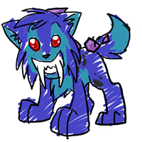
TELENINE
Thick lines, flat shading. The telenine was revamped a few years ago I believe, but its already starting to age just comparing it to other pets who have been revamped. You can't tell its age just looking at the common color alone, but the colorfills definitely prove that someone is just using it as a coloring book and moving onto the next. It needs more love than that. Also the Telenine needs more colors in general lest it becomes the next Serpenth.
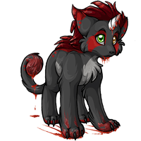
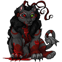
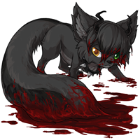
Bloodred Ruffie

Its the derpiest bloodred pet I've ever seen tbh. It doesn't look menacing or intimidating, not even in a cute way. I blame this on the bloodred color having two different colored eyes because one eye is looking you and sometimes the other eye is too busy reading the letter it got from Hogwarts. The pose also seems rather forced.
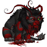
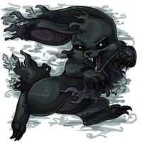
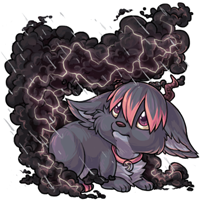
Darkmatter Kumos

It looks like the kumos suddenly grew two feet taller and just realized it, so now its looking down at the ground in confusion. Seriously, it looks like it became part german shepherd during the creation process and I don't know what happened.

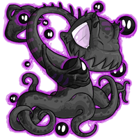
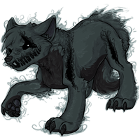
 I think the scribble montre could get a little update. It's hard to describe, but I feel, compared to the others, it's a little bent outta shape. The others are also a little bit cuter and funnier/derpier. It's still the same one from the april fools prank.

 These two are adorable but they could use an update to match the newer style of the ontra :)
i got one of these from the zapper today, and oof

the newer colorfills look nice and high quality but the older ones need some love for sure.
wait wait i take that back there's coloring outside the lines at the bottom of these hahaha

![]()
[size=9px]

do i need to point it out; flat colors, cel shading, the thickness of the lineart in general.. a lot of other chibi pets have this kind of thing going on as well
also a very, very honorable mention; the scribble telenine because YIKES. it disturbs me more than any nightmare or bloodred pet would