What do you think needs to be revamped? [non-pets]
Filter
Show Official Posts OnlyReplies

The bloodred magnus! That right hand bugs me SO SO much 0.o
Would love it if the Black Formal Gloves were, you know, actually black. Not gray. And I suppose the rest of the formal gloves might would need a touch up to follow suit.
he/him / 31 / EST |  | My best friend is |
My sections are now up to date!
I only added the Fresh Mistletoe to my section, since the rest are wearable items! I'm pretty sure sonata has at least most of the others in her section already.
Oops, my bad. ^^; Picked them out of a pet tc so kind of forgot they were wearable!
[/font]
Yaaaay! Removed the GY Kumos and GY Serpenth from the list.
No worries. :D
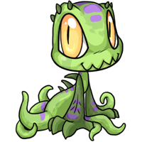
 I personally think the basic Aeanoid needs a bit of a facelift? The shading and highlights don't stand out very much, if at all in some places, and the lineart seems a tad bit thick.
 I'd also put these colors up for the species as well, since their style is about the same (mostly for the thick outlines).
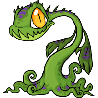
 I'm also surprised the basic Charlies haven't been mentioned yet, because they have the same issues as the Galactic (thick lineart and needing a shading update).

 I'm also adding these in, though I skipped the Galactic and Hydrus since they're already listed:
Angelic - Thick lineart and style update
Darkmatter - Anatomy, low visibility on highlights (it looks very flat)
Nightmare - Anatomy, specifically the proportions of the head and hind feet
Reborn - Style update
I'm also adding these in, though I skipped the Galactic and Hydrus since they're already listed:
Angelic - Thick lineart and style update
Darkmatter - Anatomy, low visibility on highlights (it looks very flat)
Nightmare - Anatomy, specifically the proportions of the head and hind feet
Reborn - Style update
The poor dog in the overlay looks really strange... is it just me?
then you set the mask upon your face
my silhouette in the air you trace
and the dagger performs with a start
I'll update my sections a little later today.
Here's one for the "should be made wearable" section.
I should be up-to-date now. ^^
If not in list add: -I can't tell if they were already supposed to be revamped or not. Plushies: beanbag: foods: minion: wearables: weapons:
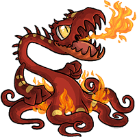
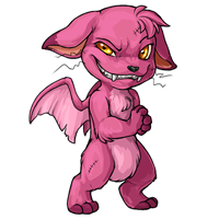
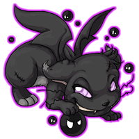
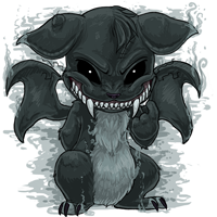
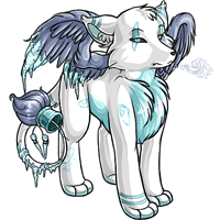
Some pets that'd be nice if they got an update:


 They're all using the old shading and lining style which makes them look flat, apart from other mistakes.
Another item I'd like to see revamped even though I don't think it will, is the and its versions. The anatomy of the item image makes me cringe. Are the collarbones really going AROUND the neck? e_e
All of the hair Dyes...BUT NOT THE COLORS. Please, please do not dull down the neon. We need some neon on this site so bad, but the basic shape of it could use a touch up.
Just don't take away the neons.
Same deal. Mmmm, neon.
Can we just... I mean.... compare it to the three others:

All of these need to see some love:
And this: This not only doesn't look skeletal when worn,but look at the abnormal way the fingers are spread on the right.And they look more like human hands than skeletal,probably because of the old lineart.
Like a good neighbor, stay over there!

Today I was thinking about the fester and remembered that there were still some items that had the old fester design, from when the common fester had a lime green mohawk. Not sure if this stuff was mentioned but:
This still shows the old fester design even though the chibi fester was updated
Though it's very small, you can still see the lime green mohawk of the old fester on the can image
still has lime green mohawk on the skull
old fester design.
old fester design.
old fester design.
he/him / 31 / EST | | My best friend is |