Kumos site layout feedback
Filter
Show Official Posts OnlyReplies
My sidebar is pretty full on legacy now and I need to scroll to reach certain parts of it. Wouldn&;t want the clock to get in the way, once everything is there.</p>
<p>I want to see my whole avatar, not just the headshot, because my sidebar is sort of the only place I see my avatar. If I can never see it, it&;s kind of meaningless to have one - I know, others see it on the forums, but again I don&;t post that much...
Because the clock widget is how we're able to make it work with the layout -- it's not something every user needs (most can use the clock on their computer) and so it's available as a widget for users who do want it. I'll work to make it more compact, but you're going to need to scroll a little bit if you'd like to use it.
Also, there is a ⚙️ icon to the right of some of the widgets, like the avatar widget. That'll allow you to change the options, like use the full avatar instead of the headshot. Instead of making it one way for everyone, we're giving folks the option to display it how they'd like (and a large percentage leave it as just the headshot!)
💖 ✨ 🤗
- the dark mode themes are going to fight me to the end 😭 I'll work on brightening those up, they were way too bright before. Will continue to tweak (and open to suggestions! i am not a theme maker by trade haha)
- CustomCSS will be back for everything! it'll just be much, much easier to edit colors and general vibes (rounded corners, colors for success, etc) than it has been in the past.
- That's a great question. I'll see if I can get it up in the cosmetics section or something this week, I have no idea how it'd pick up the changes otherwise 💀
💖 ✨ 🤗
The clock shows Subeta time, and I guess the majority of users doesn't live in Subeta time ;-) So I indeed use the clock a lot, to see, where we're at in Subeta. Due to also differing summer/winter time switching, it's not an easy always add/deduct so many hours.
Re avatar - very smart! I didn't even see the icon on the widgets (very slight difference in colour there). Thank you and sorry.
I appreciate your reply!
I'm trying to write this post on Kumos for the first time. Is there are ping button I don't see or do you have to manually write out people's names?
I see you made a change to the font color. Looks a lot better now. Though I did notice there was still an issue with header type text in posts.. Let's see if I can do this...
Testing testing
testing?
Well, there's no preview post so let's hope this works.
Err... Scratch that, I can't actually make a post on Kumos. I tried, but when I clicked Post Reply, I got this error "The body field is required."
I wrote this on legacy, but hopefully those pound signs will turn into something on Kumos...
he/him / 31 / EST |  | My best friend is |
Oh no, you should be able to reply! it sounds like you might not be loading the markdown reply box? it should look like this:

If you aren't loading that correctly, I can look into why that might be the case! but that also provides previews for markdown in posts, which might have been what you were looking for 😰
💖 ✨ 🤗
ah yes, my bad. All that totally wasn't there on my end, but it was my fault due to not allowing things I didn't recognize on NoScript. I got this markdown box now and am writing this on Kumos, let's give this a try.
Testing let's goo
Clicked the header twice and got this one
Think bold is still dark too
Aaand let's preview now. Alright the preview was a little weird so let's just try.
EDIT:
Image of the preview not really working
 https://i.imgur.com/gGqklYZ.png
he/him / 31 / EST | | My best friend is |
You shouldn't need to click the 👁️, it should look
like this
while you're
typing normally??
I'm wondering if you're blocking a .css file or something, you should also have a darker background for that element.
💖 ✨ 🤗

I do see that kind of stuff while typing! My thought in using the preview was seeing it without all the pound signs and asterisks though. But I promise I'm not smart enough to block a .css file, I don't know what that means or what that does. By default all things are untrusted in NoScript, and as I learn what things do I cautiously allow them. Yeah, that preview box does have a white background, and so do the markdown icons when you hover over them. I'm using Firefox 134.0 (64-bit) on Windows 10 if that info helps.
Below this box it says you can attach files by pasting from clipboard, but that didn't work for me, I got an error. I don't know how to put an image here, if the old img scode works?
 This is just all I see in NoScript.
EDIT: also, thanks for correcting the colors of the headers!
EDIT 2: I also just checked this on my phone, and I'm still seeing a white background for the preview box there. And I can say with 1000% certainty that I would not know how to block anything like that on there. I do not have any add-ons like that on my phone, and I'm using Chrome there.
he/him / 31 / EST | | My best friend is |
Which theme are you using? Can you select one in the footer (even if it's just selecting away from the one you're using and back) to shake up your CSS? I wonder if that's the issue
💖 ✨ 🤗
And just to double check - if you switch to one of the light-color themes, does the background of the box turn white or does it turn into their special colors (e.g. delphi should be a light blue)
💖 ✨ 🤗
unfortunately it appears to be the same white color on every theme.
he/him / 31 / EST | | My best friend is |
ok weird i'm seeing that other people aren't seeing the same issues that i am so i guess i will point them out.
screenshots


- it seems like there's all this space at the top reserved for the header image, but no header image.
- the sidebar has two arrow icons. clicking them to collapse the sidebar makes one of them change direction (to indicate it will un-collapse the sidebar) but the other stays facing left.
- clicking the gear icon to adjust the sidebar settings opens the panel in this way that makes it overflow the top and bottom of the page, with no ability to scroll up or down. if i want to be able to see the whole panel and access the buttons on the top and bottom, i need to zoom out the page to about 80%.
- can't change the theme. i can open the theme dropdown menu but clicking on any of the options does nothing, even if i refresh the page. (for the record, i've never actually been able to change the theme on kumos, even when the theme options were set up differently.)
- on some pages, there's about 200 pixels worth of empty space after the footer menu. on other pages, such as the forums and friends page, there's a lot more, enabling you to keep scrolling and scrolling through the void—which you can see from the position and size of my scrollbar in that last image.
and then just some things that aren't necessarily buggy but that still feel awkward imo:
- having the events directly in the sidebar (instead of its own tab within the sidebar) still feels clunky af, and there's no fast way to clear all or multiple events at once, so you just have to click the checkmarks one at a time. they also don't seem to be grouped by type.
- the news page automatically switches each week to show just that week's news posts—but if there haven't been any news posts yet that week (like there haven't been this week), the page is just empty. you can't even see the previous week's posts, so you have to go to the archive to do so... except even the archive doesn't have last week (week 2) as an option, so right now you can only view news posts up through january 5.
- the "you" and "frenchi" navigation tabs still feel like some sort of sick joke... "you, frenchi" yes? i am? that's me? thanks? now how am i supposed to predict the ontological nature of what i will find under one of these headers as opposed to the other?
- this is a small thing but it feels like the HA ought to be centered in the HA sidebar widget. having it off to the side like that looks a little funny.

Okay.... something is going on with the theme widget for you. Are you blocking any JavaScript or CSS scripts, and what browser are you using?
It looks like it's tossing you into the autumn theme, but only halfway? you'd have different headers colors in the widgets, and an image in the header at least. Can you go to a page, refresh, and try changing the theme right away?
The other things are great notes, i'll toss them down. i'm obviously working on porting over an entire site, on my own, which means things are coming over in bursts and fits. next time any of those things get touched (likely widgets, i've got lots to add 😰) i'll pop in some of that feedback 🫡
💖 ✨ 🤗
i know that "solve it yourself!" never feels good, but i did want to flag here that i pushed out a beta version of customCSS for kumos: https://kumos.subeta.net/forums/t/939109/customcss-comes-to-kumos
i've included one that removes the image at the top of the page, and i'm sure other useful ones will pop up!
💖 ✨ 🤗
i use firefox version 115.18.0esr. as of the end of last year i guess my OS is officially Too Old so i have been shunted to the ESR version of firefox, so maybe that's why certain scripts aren't working. the only extension i have that might affect that sort of thing is ublock origin, but i've temporarily disabled all my extensions and nothing changes. still can't get the theme to change no matter what i do.
i certainly don't expect everything to be immediately perfect and beautiful lol but i figure it's worth pointing out possible issues as they arise for when it comes time to deal with those things. then again now i'm worried the ESR version of firefox won't be able to handle whatever fancy new-fangled scripts kumos is using... but i haven't had any issues on other sites, so i wouldn't expect it to be an issue...
Hmmm... we are using some newer CSS technology - mostly to make the themes work, which would explain why you're having the issue that you're having. Let me research how we can do a nice, pleasant fallback for the @layer keyword, and at the least how we can fall back to something simple.
I'm actually curious - if you'll humor me - https://kumos.subeta.net/account/settings/css/popular If you go this page and subscribe to my "cyberpunk CSS" and then refresh the page, does it make the site dark themed, but more successfully, for you? You can turn it off right away if you'd like, I'm just curious if the way that it sets styles works for your browser. Thank you for helping me get to the bottom of this!
💖 ✨ 🤗
yep, that does successfully set the styling!

🎉 yay! that at least points us in the right direction. would you prefer a light layout? i can toss one up in there and give you the link to enable it, and that'll at least make the site look normal while you're browsing it.
and get me a starting point for fixing the issue overall, and I can delete the snippets once they're not needed anymore?
💖 ✨ 🤗
I haven't seen anyone mention this yet, so maybe it's just a me problem? But on Kumos, the drop down menus layer weirdly with other elements. Like, they should be rendering over the other content on the page, yes? But for whatever reason, the other content of the page seems to be taking precedence and leaving me unable to access half or more of the menu most of the time.
screenshots
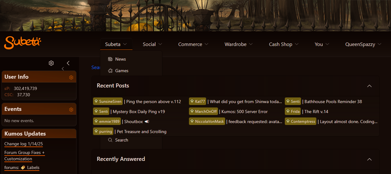
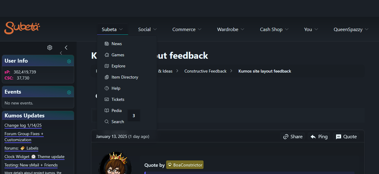
You can see in the top image I'm missing everything between games and search because the recent posts section is on top of them. It's not as bad within a thread as the second image shows, but I'm still missing at least the logout option past search, and the currently selected page number is floating over the side of the drop down, though no other part of the thread navigation does that. I tried browsing through various pages on Kumos that don't utilize the legacy frame, and most of the ones I navigated to have an element somewhere that will show over the menus, with the exception of the cash shop main page. sMail seems to be mostly fine, but user headshots and the little paw icons beside names will cover menus.
The insertion point in the reply box is also REALLY hard to see on all the "dark" themes in the theme switcher because it stays black regardless of the chosen theme for me. The Darkside and Morostide themes in particular are nearly impossible for me to see.
I also have the same double arrows in my sidebar that has, though only the smaller one will actually collapse my sidebar. The larger one doesn't seem to do anything at all when clicked.
xe/they/she