lock please
Replies
 [font=book antiqua]—
you are welcome! :)
your dropbox folder is here! copy and paste the text in the file labeled code into Alisae's description. I also saved the images and the .psd for the layout in that folder in case for some reason imgur loses the background images :')
you are welcome! :)
[edit] I AM SCREAMING THANK YOU SO MUCH FOR THE GIFT!! <3
*Sorry for the late reply. I've had some issues IRL that needed my attention.
Sure! Let me dig around. I knew I had forgotten something when I posted but I just couldn't even... UGH! If it'll be easier, I'll redo the information here so you can have it all in one place.
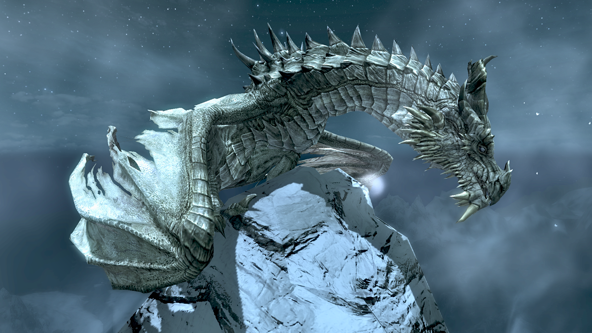
Pet: Paarthurnax Art/Image(s): XXX Sections: Story, TC, Spotlight Extra/special requests: Quote "What is better - to be born good, or to overcome your evil nature through great effort?", maybe have the profile kinda serene, almost dream-like. If not too much to ask, can the spotlight be a dropdown?
--
Pet: Ahzidal/url] Art/Image(s): [url=http://prntscr.com/f1v1j6]XXX or XXX Sections: Story, TC, Spotlight Extra/special requests: Quote "Bitter-Destroyer", He's the only dragon priest with green robes so maybe an ancient green like in the second picture
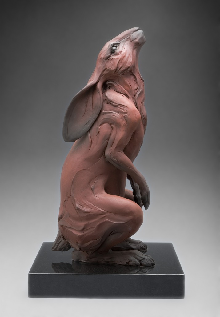
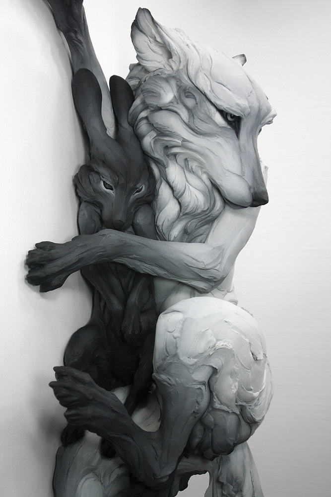
hallo Art/Images: I have choices for you if you're interested haha this, by Denise Nestor or either of these two by Beth Cavener Description of what you want: I love the layout of your profile but you can do whatever you want c: I'd just like my username somewhere please :)
thank you for considering!

hello~ I would be so appreciative if you ever want to give this a go <3 Art/Images: Here you go! Description of what you want: Anything really! Preferably somewhat clean/simple, but it's up to you (:
Couple questions/ some updates!! You can see my progress here. (Ignore that little 'oompa loompa doompety do' text LOL, sorry)
- The size of the page will expand vertically to fit more TC items, of course!
- How's the size looking to you?
- I have 24 items in each row, which is the same as are on Oompa Loompa's current page, so all the lines will fit the same way
- The items are slightly bigger to fit in the box nicely
- Would you like me to remove the border around each item?
- Would you like me to remove the rounded corners on each item?
- Would you like the species/color and owner link to be visible in the dropdown or displayed somewhere on the page?
- Would you like me make the items more/less opaque before hover OR would you like me to remove the hover effect completely so the items are 100% opaque even when not hovered over?
- would you like there to be more space between the rows or columns? (or both, if this applies)
- I plan to make the spotlight a separate dropdown tab. Is this fine with you?
Sorry for so many questions!! just want to make sure it's what you want :')
[edit] OK SO... i am not sure if a layout like this is too dark for your aesthetic (haha) but let me know if you are okay with where i'm going with this!! c: i still have to do some work with patterns and colors and stuff to make the textbox/name part much more visible (right now it is super dark I HOPE YOU CAN SEE IT AT ALL??), but i just wanted to make sure you were okay with the layout and placement of things first! the block above the animals wil be a text box & ill put a comment box underneath.
If you're not happy with this just let me know c:

Its looking great! :D
- I love the size of the items, they're nice and visible and it should be easy to read.
- In theory I love the rounded edges and borders around the TC items but I don't know how well that translate to Oompa's, since its about about reading it. I think it might break up the flow too much. Its kind of an awkward thing to deal with. I'm not sure if its possible to smush the items together and have a border around the whole treasure but if it is that might work, possibly?
- Putting them in the dropdown is fine! That'll help keep things nice and clean. Also, I like the hover text but would it be possible to make it blend in more? Maybe use one of the lighter oranges from the background for the main text color?
- The hover effect is awesome! Maybe slow the transition a little bit (I love the fading in/out thing) but otherwise its perfect.
- That sounds good to me!
And lastly, the background tiles a bit oddly at the edge. I'm not sure if you're done with it yet or not but I figured I'd give you the heads up.
previously shortaxel
ohhh shit that's rad! I love it! it is hard to see atm but if you can tweak that a little bit to make it more visible it will be perfect! my monitor is also super highly contrasted so it might just be me haha - but yeah I love it! thank you ♥♥♥
i cleaned up all the stray pixels around the animals as well so it looks a lot cleaner!
How's this look? Yes or no to a light border around the text section? c: also the text itself will be light so it'll be readable!
I'm gonna make the stroke (border) a bit thicker around the name & info section, it looks very thin haha. ALSO i'm going to include an accent color so it's not all greyscale, do you have a preference?

ooo yeah that's looking good, and I'm down for the border - super loving this c:
op my bad, didn't see the thing about the accent color I'm kinda partial to peachy corals, somethin' along the lines of this (# FF876F if that helps) if that's cool with you
im glad you like it!! if you get curious i'm coding it on my profile if you want to check up on it (it's kind of messy right now tho!!) c:
OKAY i just have a question, do you mind if the comment box is a dropdown? ALSO are you just going to link to your pets as you do now or do you want me to format the 'pets' section? (or gerehas some really editable/nice pet buttons here if you want to use those instead! those are the ones i had on my profile)
[edit] actually do you mind telling me which sections you are going to display on the profile so i know what to format? sorry to be so complicated LOL
oooo it's looking so cool! but nah I don't care if the comment box is a drop down, I might even prefer a drop down actually c: which ever is the easiest though, I don't care too much either way and I'll just link to pets like I have them now - all of my text is just in a blank section so that's all I'd need :) I love the look of the pet buttons but I think for my pets it'd be better for me to just link them so I can keep them categorized easily and such thank youuuu
okay!! how is this looking?? c:
would you like any changes?? if not I can send you the code! :')
it looks pretty perfect to me c: really like how you added the mail & friend links on the drop down tab too it's so cooool haha :3
YAY <3 I'm gonna gather the code + instructions for putting it on your profile and I'll smail it to you!