lock please
Replies
Sorry for the delay! I was asleep :3
I was planning to just have the TC sub as a story but looking at the Spotlight rules again I don't think that's acceptable because its a lyric TC. Idk. The Spotlight rules are weird and inconsistent so maybe its worth trying anyways?
Hm, I'd prefer if we could keep it the items same size or just a tiny bit smaller at most. I have a really big screen so I like it being big and easily readable for me even though I know its not the most useful for small screens/mobile.
I'm loving it so far! :D Especially the lighter colored one. The placement for everything looks/sounds good! Maybe just add a bit of texture to the orange part if possible, since it'll be so big? That might help break it up some.
previously shortaxel
@ ShortAxel no problem! Would you like me to just leave out the story section for now then? If it gets denied then I can add a story section c: And okay, that should be fine! And i'll definitely put a texture on there. :)
how's the size of the tc container? too massive? LOL lmk! I can make it a tad smaller if you'd like : p ignore the random text on the profile haha
[edit]
@ Meow I've got a live preview for you! please check here and lmk what you think c:
[edit]
You don’t seem greedy at all, I like having options! :> And you’re welcome c:
I just have a question for you, do you have any specific art or images you would like me to use for them? I’m a bit worried the profiles will be a little bland without either!
 [font=book antiqua]—
Um, wow. Just wow. Your profiles are fantastic! I'm looking for profiles for two pets so I hope it's okay if I post both here to give you a choice of either?
Form
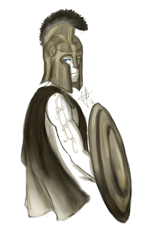
Pet: Stelios
Art/Image(s): Art by Thirrin
Sections: Story, TC, Minion, Spotlight
Extra/special requests: Nothing that I can think of c:
Pet: Photographie Art/Image(s): Art by Holeweet Sections: Story, TC, Minion, Spotlight Extra/special requests: Could her color scheme match her story?
Thank you so much if you choose either of my kids c:
everyday deeds of ordinary folk,
that keeps the darkness at bay.
Simple acts of kindness and love"
The Hobbit (film)

Eeee, that looks awesome! The only adjustment I can see is the padding/spacing of the treasure items, it looks like one more might be able to fit before the scroll bar. THANK YOU SO MUCH. omg I need to work on more of my profiles. so much to do. ;;u;
Yeah, I'd say probably leave it off since I don't really have time for stories. Unless you feel like doing maybe a pop up tab for the credit section, or something, that could expand to fit the story if it ends up needing to be added? That could potentially work so you don't have to edit it later.
It looks great! I did a quick fit test of the TC in Paint and its awesome! The orange "border" makes it pop really well.
previously shortaxel
It looks good! Maybe you could get away with dark green or brown instead of red? IDK whatever you think looks best.
@ Meow thank you, I'm so glad you like it!! and you're welcome. :) (and YEAH i know that feeling!! i have a bunch of pets to finish haha)
about the treasure - that's a bit strange, would you mind sending me a screenshot of what it looks like on your screen so I can troubleshoot? the tc padding & margin are both 0 and on my screen the scrollbar is right by the items! this is what the tc looks like on my screen.
[edit] I also had a couple other people check the layout and they said that the tc looks right on their screen but I'll do some troubleshooting once I see the screenshot! (: (Also what browser are you using?)
yay im glad you like it! And you're welcome, I'm coding it now :> Would you like the spotlight to show as well?
Here you go. - How strange! For reference, I'm using google chrome?
@ Meow thanks! I'm also using chrome, this makes no sense??? i think it may just be that the treasure width was too small so it was cutting off the items. It seems like the scrollbar on your computer takes up more space than it does on mine, which is strange.
Anyway! is it fixed now? c: i increased the width a little and also made the scrollbars smaller so it looks nicer. :') if it isn't fixed, i'll just increase the width a bit more.

Here's an image update with how the treasure and smaller scrollbars look on my end. :)
mother of god your profiles are so ❤️ I joined your group if that's ok!
also your HA is gorgeous ahh.

So as weird as this may sound would you be interested in going wild and doing whatever you want on a harry potter or a book/library related pet profile? I have 0 images or any ideas in my mind other than that for my pet Reducto and Edition.. bc I'm lame...
[Tree=romance]
your code is here! c:
[edit] I have also uploaded the background images, the art, and the psd into a dropbox folder here if you want to download them!
@ Meow you're most welcome, enjoy! :)
[edit] I have a live preview for you! c: what do you think?
please feel free to ask for any changes :')
Could the main text box stay a solid colour like you had in the preview by chance? Sadly all I see for the most part are the darker diagonal outlines of the feathers and it looks a bit off to me. The text is also somewhat hard to read as white on such a light colour, would it be ok if everything was the same colour the bold and italic font?
Thank you so much again, apart from those 2 things it's perfect! c:
of course! fixed :> is there anything else you would like me to change? I also changed the border around the tc items to match the text, but if you would prefer me to change it back I can!