Serpenth Feedback
Filter
Show Official Posts OnlyReplies
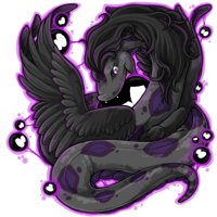
I think part of the optical illusion of that gray section, for me, is that I initially couldn't identify it as part of the background. There's a gray outline around this new version that, to me, increases the "sticker effect" and makes that in-coil background bit under the wing look really odd.
I'm not a huge fan of the nose shape change, but that could be personal preference, sure. I liked the old version's expression far better than this new happier one.
What gets me, though, are the wings. I'm not sure why the choice was made to literally blunt the primaries so they look truncated and rounded. real wings don't look like that. I think it's a very interesting idea to position the near wing so that we're looking at it side-on, but the optical effect is confusing, as if it doesn't have a wing or as if the wing's been cut off.
Not as much of a fan of the duller colors and I do miss the gold belly, but I'm less bothered by those changes than I am about the wing shape.
Glad now that I didn't change Nocturnius to Serpenth.
Edit: for what it's worth, I really wish this was a new thread and not a reused one. I was incredibly confused when I saw a whole discussion about chibi on the front page when the title and initial post was all about the galactic Serpenth.
Aaaand reading upthread I'm wondering if this should be in the debate section.
I came in here to comment on the wings, but I don't know anatomy very well so my comment wasn't going to be nearly as informed. :P
I totally agree about the near wing. I (kind of) understand what the artist was going for, but it doesn't really work. Either the wing isn't positioned properly or it's a strange optical illusion, but it just takes too long to figure out what exactly you're looking at.
The best explanation I can come up with is that I think maybe the motion is too complex for a static image like this. If this was a comic strip or an animation, there would be some context and it would be easier to see how the serpenth was moving and what its wings were doing, but it's not communicated very well in this single image. I think the artist needs to keep that in mind and simplify her ideas in the future.
The serpenths' poses are an ongoing issue for me, and the wings are one of the biggest issues. Again, I'm not well-versed in anatomy so I can't say exactly what's wrong, but I feel that something's off.
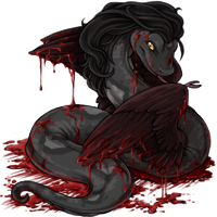
The biggest offenders for me are the darkmatter and bloodred serpenths. For the darkmatter, it's the fact that the serpenth seems to be hunting but has coiled itself around its own wings, which would seriously limit mobility. I get that it's trying to pin the darkmatter blob, but the wings could have been positioned on the outside of the coil.
The bloodred serpenth... I just don't understand at all. The position of the uppermost diamond seems to suggest that the near wing is coming out of the serpenth's back? And then the other wing would be coming out of its stomach or something? They also seem to be turned at a strange angle to the body, so I'm not really sure what's going on. To me they just look glued on or broken, but not in an intentional way.
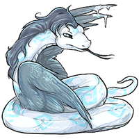
The glacier serpenth is also wrapped around its wings kind of like that, but I can give that a pass because they're meant to be frozen and unusable, and the image communicates that well.

Spectrum (and blacklight) seem to ok anatomically, but but it bothers me that the serpenths are throwing their wings out in front to brake. The serpenths seem to be flying at a high speed, and with the wings out in front like that it looks like they're going to land on them, sort of like tripping and falling on your palms. It's either that or a Superman arms-out-in-front-to-fly sort of thing, but that's not how wings work.
Don't get me wrong, I love serpenths. The art coloring and shading is always gorgeous, and I love almost everything else about them, too. It's just that the wings frequently seem to be either anatomically off or positioned in a way that looks like serpenths don't know what they're doing with them, and it distracts from an otherwise great species.

Definitely not a debate, as Jessyta pointed out the thread would be moved here anyways. And honestly, I chose to re-use the thread as I feel that one of my earlier feedback issues (which was on the spectrum/blacklight Serpenth) was used on the Galactic Serpenth, which was something that I had asked the artist to keep in mind. (So, again, Thank You to the artist of the Serpenth! You have made this snake keeper quite happy with that!!)
:) I'm really glad that you and Lirikai have given feedback regarding the wings. I don't keep birds, so I wouldn't be able to tell you how an actual bird's wing works. So, again, thank you for the great feedback on that! I will agree that the Serpenth's wings usually don't look right, but I couldn't always put my finger on the reason why.

[tot=Skree]
The right wing of the new serpenth confuses me. I don't understand what it's doing.
That being said, I do think it is a vast improvement - the background looks much better, and softer colors make it easier to look at. I like that the mouth looks like it has a galaxy inside it (I think).
No I definitely didn’t feel attacked, on the contrary, I appreciated that you acknowledged all my issues and took the time to voice your opinion on them. Thanks for the pics, I adore the one where she looks over the leaves!
As to your overlay suggestion. I have already taken that into consideration, since it’s only 500 CSC. But obviously I cannot use the old art as is but will need to have someone add minor changes.
Thanks to everybody, who have answered!
So I blew up both of those images and now the silver part makes even less sense.
On the old version you can see the ventral scales from the thoat into the first coil, then the body twists to one side, twists again into the next coil and the golden scales therefore reappear, more indistinct body coiling behind the right wing, which eventually ends in a nice wellformed tail. Btw. If you look at an all muscle definitely not overfed Northern Madagascan Boa bending its body backwards that strongly, you do indeed get similar wrinkles ;)
So, the new one: The head, the throat, 3 ventral scales into the first coil, body twists, right wing, body reappears, twists a little so we can see the ventrals again, coils carry on to form an 8 behind the left wing, reappearing as 2 silver scales underneath the neck ending in the tail – which doesn’t look as wormlike on magnified, because now I can see, that it is sideview and there are more ventrals.
This silver blotch cannot be part of the Serpenth – the colouring would make it spacelike background, anyway., but the lining shouldn’t be there, that’s very misleading.
The Serpenth wings have always bothered me a bit D: They always look broken or hella awkward, but I think that has to do with their body shape. Putting wings on noodles is never gonna be easy. I'm probably one of the few that wishes the Serpenths didn't have wings at all.
I do love that they lost the peapod belly though.
I prefer the old eyes, but the coloring on the new version is just beautiful.
I really love the galactic revamp. This serpenth looks so sleek, and has such a great attitude (for some reason it looks like a rock singer to me.) The right wing bothers me a little though. It just looks a bit... awkward. :(
[tot=Gryphon]
Oh good! Believe it or not, another person thought that I was attacking them for giving a contrasting opinion, so I now tread on the side of caution. And thank you! Maddie is a unique little snake, for sure. I need to find a mate for her so that there will FINALLY be a captive bred option for those who wish to have them in their lives! :)
Of course, and minor changes really probably should be made either way. :) Sorry that you don't like this revamp as much. (As was discussed earlier in the thread, I have much the same thoughts regarding the Chibi Serpenth, as I feel that it no longer resembles a snake at all).
I will admit, the tail on the previous looked very NICE, as compared to the current tail. Being as I do not own a Northern Madagascan Boa, if you could give me some pictures that illustrate that, I would greatly appreciate it. I'm certainly not an expert with all snakes, but rather, I have worked with many that are found commonly in the pet trade, studied some of the venomous thanks to the Wildlife Discovery Center in IL, and worked with a few less common imported species, and none of those have had wrinkles like that when they were in optimal shape.
As for the silver blotch you're speaking of, are you meaning the one in the mouth? That one does throw me off, but as someone else stated, it gives the illusion of the Serpenth having a galaxy in its mouth. If not, could you maybe show us what you are speaking of?
I have to agree with you... wings on any snake are going to pose challenges, even for those who are very well informed on the snakes anatomy. I typically remove the wings from my Serpenths, as I like to turn them into more serpentine characters, so if they lacked wings, I would be just as happy.
[tot=Skree]
Sadly I have no pictures to share esp. not with a tight coil, that will display those “wrinklesâ€. Already if you compare the 3 indigenous constrictors (www.regiusco.ca/collection/otherboas.html), you will notice, how much feistier with a much bigger diameter the Ground Boa is, not just because it is the largest of the species. Also compared to a same size Boa constrictor or Burmese, the touch is so strikingly different, really stone hard, all muscles. So naturally, if you have such compact strong flesh bend tightly, there is not enough room and some bumps are bound to happen on the inside – actually also with the feisty ball pythons.
As for the silverish part that bothers me is that irregular rectangle underneath the head. As written before on enlargement I could finally follow the coils and see, that the lower 2 scales belong to the end of the snake and have nothing to do with the top 3 ventrals starting at the throat. It’s definitely background, but giving it a prominent silver lining is an unfortunate choice, that basically makes it look, as if it was at some point part of the snake's belly and then the whole posture naturally makes no sense whatsoever. But of course I once again have to admit, that I seem to have strange difficulties with all kinds of possible Vexierbild, where my eyes stress parts other people don’t, so I see them in a different way. Maybe that part doesn’t stick out as much to others as it does for me. Since she is my main battle pet now, I keep seeing her all the time, and what I see first of all is that rectangle there and it drives me nuts.
What bothers me the most on day 3 of looking at it is the small version we get on the sidebar. Everybody, if you don’t own one yourselves, try shrinking the picture to that size. I wonder, if you can agree with me, that then you can hardly (in the pure sense of the words) make heads or tails. Due to the dull colours – esp. the “black†– basically most I see is an undefined unbalanced dark blotch with emphasis on the huge left wing in the lower left corner. While the right wing prohibits view of the body, so everything looks weirdly mutilated.
I think we definitely at least need the now greyish parts to be turned to black again, to make it all more distinct at least.
P.S. I found a pic online: reptilescanada.com/gallery/data/500/Ground_pair_1.jpg See it on the right one’s top coil?
I like the new serpenth, it looks much more lively - yet I can understand people don´t want to loose a design they are attached to... ^-^

Thank you to whoever presented me with the Serpenth Beanbag! :9
I love Serpenths but I've been a little disappointed with the revamped Galactic one. The shading is nice, but the face seems way too happy... with the old one they looked well foreboding, you didn't want to mess with that guy. And well the wings just look painfully placed...
Looking at the picture you provided, I do see some wrinkling, which is expected of movement, but in the old version, we saw wrinkling on the neck and throughout the body, which, as I said, a healthy snake wouldn't show. (Even in your pictures, it was in the bend of the animal, but the head:neck area wouldn't give that unless it was a drastic bend, which, I have seen on my own snakes when they come closer to shedding, usually in the last day or two of the milky eye phase)
:( I'm sorry you're having that problem with the revamp-- I personally can't seem to find the silver blot/box that you're finding.
I would love to see a return of that deep black that was used in the original's wings, as it truly was a great choice, but I know from what has been said in the past that it isn't terribly likely. :( I'm sorry.
As I said earlier, I never thought of the old one as foreboding/fierce/aggressive, but rather he had a rather dopey look to me. Is it the fangs that makes everyone think that he was mean? (I personally love that they gave us another beautiful coloration with a non-threatening face.)
[tot=Skree]
o.k., so I never saw those wrinkles, all along I thought you were talking about the ones on the right coil.
Its ok! :) I know when the Galactic was first introduced, I had no idea about what a healthy snake should look like, as at the time, I was only just starting to get my feet wet with herpetology/herpetoculture. When I saw the revamp, the first thing I noticed was the tongue, as I will admit, I had expected another tongue-in-glottis scenario and was instantly applauding it due to the fact that the tongue was positioned in the right spot, not in a glottis. (I'll admit that I had overlooked a few anatomical differences between the two versions just because of the excitement of that alone, which I shouldn't have done, so I'm really glad that you kept me looking at it, as by talking with you about it, I can see elements that I wish had carried over to the revamp. I still say that, overall, I'm quite happy with the new look.)
[tot=Skree]
I'm glad that the serpenth is getting a lot of attention/revamps lately from last year. I wasn't too sure on the revamped galactic serpenth at first until I eventually appreciated it a bit more. Anatomically, it's great and totally needed it. But I wasn't too sure on its expression as its previous one looked mystical and enigmatic while the newer one looks carefree although the revamped's expression suits the whole galactic pet theme as most of them look like that. The colour on the belly is more subtle which I prefer and I can understand that the silver blotches are mimicking the patterns on the serpenth species. Love the contrasted shadows too!
I think what threw me off is the wings. I've noticed a lot that the wings on most of the serpenths had a few flaws and issues with position, more with this colour than the others. Its left wing looks very incorrect as the primary feathers look almost 'sausage-like' for it to work. That's when I realised that the wing is curving round and me seeing how its position would work (which made sense in the end) - Overall, the revamp is pretty good from first thoughts! I know it's really difficult to draw a pair of wings on a snake so I can completely understand and so far most of them are working. I don't admire the idea of removing serpenth's wings as it would differentiate from real-life animals to made-up pet species.
I love the revamp. It's so much better then before :)
I think it looks incredible. Galactic is one of the best pet colours 5eva :) A little nitpick I have is preferring the tongue and belly scales to have the same colour, either gold or silver. But overall it's just gorgeous, especially the shading.
[tot=Avery]