Serpenth Feedback
Filter
Show Official Posts OnlyReplies
<p>There is nothing wrong with these in their current state in my opinion. You are being nitpicky
this is all I came here to say. that, and there's nothing wrong with the chibi serpenth. sorry that it doesn't fit your idea of what a 'real' snake looks like? but last I checked they're not real snakes. so. yeah. there's concrit, and then there's nitpicking.
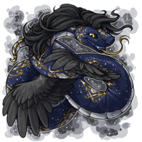
[ forum art by [userid=519517] ]
Someone makes legitimate, polite, constructive criticism on art and continues to be polite, and people STILL bitch at them for questioning the artists.
Good god
I'm in agreement with OP. It would be nice for the artist to at least in the future remember that the tongue doesn't come out of there.
Thank you. I've started to realize that if you aren't 110% overjoyed with the art, you're nitpicking, no matter how obvious the anatomy errors. For a snake, having a tongue in the glottis is the same as having a dog with a "broken" leg-- to the people who own them, its a glaring error.

[tot=Skree]
The Telenine is a make believe animal, but clearly based on a wolf. If it had a leg bent at an unnatural angle, you can bet comments would be made.
LOL No, they're nitpicking!! Jokes aside, I know they would be. I think its, as I said, because not many people know about the glottis/snake anatomy in general.
I feel like... If I wanted to nitpick, I could, easily, just by saying that snakes don't stick their tongues out with their mouth open, and that it looks odd to see teeth on the bottom jaw, but muscle on the top jaw... the muscle on the top looks like elapid fangs, etc...
Clearly, I'm not trying to nitpick. I'm giving concrit, and I don't expect it fixed, but if it is, great! I would be overjoyed! If not, hopefully if the artist goes for open mouth again, they'll remember that the glottis is an airway and not where the tongue goes.
[tot=Skree]
I've had my own nitpick with the revamped serpenths, in that so many of their bellies are rounded, making them look more like worms and less like snakes. Especially the bottom scales being so prominently segmented. But I've just been so fucking happy that they finally got revamped that I've only made mention of it once or twice.
Yeah. >> Thats exactly what I said about the chibi... it looks more like a worm/caterpillar than a serpent, while the others are clearly serpent... feels SO WRONG. I'm more forgiving about belly scales, as there are hundreds of different types of belly scales.
[tot=Skree]
I understand an artist who makes fantasy is not happy with comments from someone who just don't want to see a snake with wings and manes like a horse. Yes, I can call this nitpicking too. But in this topic there is no veto against fantasy.
In this case there is intelligence feetback and it's constructive with still respect for the fantasy of the artist.
What about the chibi serpent. It does me think of a rups carterpillar. An overlay when it gets much tiny legs like a rups carterpillar, will be funny.
Edit:
When subeta was down, I was bored and make this for fun. For me Chibi is a style. You like it or not. Chibi could be an aduld pet and could be also a baby too, like the chibi mallarchy. This colour by the mallarchy is chibi and also a baby.

,
Do you mean a revamp like this?

Thank you for that lovely Caterpillar image. Thats exactly the point I've tried to make with the chibi serpenth. Why does this clearly serpent creature need to resemble a caterpillar soooo much in JUST that pose?
As for the Spectrum/Blacklight, I mostly wanted the artist to know that the tongue, again, does not come out of the glottis, which you did accurately in yours. Fangs or no fangs.
[tot=Skree]
,
Ah thank you. I didn't know the english word of carterpillar. I have always believed it was the same word in dutch like the words "rat" and "hand". In Dutch carterpiller is "rups". Dude, nice to help you understand. :)
Chibi's are mostly focused on being cute and deformed (which sometimes translates into bobbleheads, but not always). So if you are looking at it as a baby serpenth, then I can see why you're having some difficulties with it. But yeah, chibi pets aren't actually intended to be baby versions, just ridiculously cute and squished around a bit!
And that is very interesting about snake mouths. Not something I've had cause to look up myself but that's a neat little evolutionary trick they've got there.
I think we pinpointed the issue I've been having with it... the chibi looks like a caterpillar... (I swear, I'm not trying to be mean. ;- ; )
As has drawn on the legs, the appearance became far more obvious.
I guess part of the problem is also that while most of the other chibi pets are in their common coloration, the chibi serpenth is field/green, which makes it stand out even more (I've noticed there are 3-4 that are in varying colors, which doesn't seem to make sense to me?)
As for the mouth, as I said throughout the thread, it isn't something I expect changed, but I did want to make sure the artist was aware of it, as it seems like a glaring anatomy error to a snake keeper, but it might be the Herpetology major in me speaking there. (They really are fascinating! Most animals DO have a glottis, but the snake uses theirs uniquely as an air passage. Most animals use it to make vocalizations, which the snake also uses it for, but breathing is the primary function of the glottis.)
[tot=Skree]
Ha ha, no, I don't think you're being mean. The inchworm/caterpillar-ness of that particular one was intentional to push the cute/deformed idea. So that you're seeing that isn't bad (although if it's actively bothersome to you then that's unfortunate).
Ah. Well, at least I know that it was intentional and not an accidental thing. I guess that would also explain why it appears to be a Field Serpenth as a chibi and not a common coloration? :) As for actively bothersome, well... There is always a nice script to replace the image with something I think is better, or adblock like I had to do with poor Cinthia. (Girl gives me the heebies.)
Thank you for taking the time to come talk with me here. :)
[tot=Skree]
Yep, that was part of the reason for the color choice! ;) And no problem! Hope it helped a little. ^^
@ Dannica It did. Thank you. ;- ; Always nice to be able to get insight on these guys. I do think there are a hundred ways to do cute for chibi snakes, but ehh. I guess not everyone fancies snakes, just as others may not like dogs.
Edit: 10/06/14 REVAMP! I personally have to say that I really do love this new Galactic Serpenth.
Oh my God! What did you do to the Serpenth&;s nose?! Looks like a pig snout or at least upward bent. Why did you have to ridicule the poor being like this? And she&;s my active pet now, meaning I have to look at this all the time! The beautiful fierce look is gone, the right wing and the aggressive posture was a ton better. Looks as if it got beaten up and landed on its back, since the top of the wings look down. I don&;t mind the silver bottom instead of the gold, but what are those silvery blotches in the middle of the curl and underneath the head? The colours are dull now as opposed to the saturated shiny black and blue. Where are the teeth? This is a huge step back and simply horrible! I hope we get to vote on the Galactic Serpenth! Hm, got interrupted. The old one filled the square better. The hair is weird, too - wearing a wig? The eye was more prominent, definitely better drawn with more reptile resemblance (slit pupil) and dangerous. The old one looks a lot more "modern", whereas the new one resembles the old drawings, that get cleaned out now.
Wait... what? Old one filled the square better? The new one's hair looks like a wig? Are you sure you're looking at the correct thing?
 ->
-> 
The hair on the new on is a HUGE improvement. Actually, most of it is a massive improvement, overall. I wouldn't say that the old version was fierce looking, either. I think the old one actually looks a little dopey compared to the new one. The tongue was too thick, throughout. The belly scales were shaded strangely, and in many places, you couldn't tell what the body was doing.
As for the eyes, you say they look more reptilian in the old? I say there is no one single eye-type for reptiles. Some have slits (most pit vipers), others have crosses (boa constrictor and their relatives), and a great many have rounded pupils (most colubrids, the Ball Python, both the Eastern and Western Hognoses).
I personally don't see the problem you're having with the nose, myself. However, as mentioned before, there are hog nosed snakes. I don't really think you could have been any more rude about that, honestly. :/ IF they went with a hognose, it would have been more like that of the Madagascar Spotted Hognose (Old world species of snake), with a slightly upturned nose.
I LOVE that this guy has his tongue positioned in the approx spot that the tongue slit would be in and not in the glottis this time ( ;o ; I'm so happy about this, you don't even understand!)
The dorsal (belly) scales look great, too, and I do think they work better in the silver color, though, if they and the tongue were swapped in color, you could literally call him a "silver tongued serpent"-- This can easily be done with a simple recolored overlay.
I will admit that the right wing does look a touch strange, and I think it has more to do with the Serpenth turning his body the further down we go, which does give a slightly broken wing appearance there.
Overall? THIS GUY IS SO AWESOME!!
[tot=Skree]
Hi Tawar!
Since you took the time to look at all my issues, I’ll answer chronologically.
“Old one filled the square better?†Yes, indeed, with the tail up in the left corner, head in the middle and the left wing reaching into the right corner it looks much more balanced in the square. As I said, she is my active (and, since widget problem still not resolved also battle-) pet, so I see the condensed version in those smaller pictures and it becomes more obvious – and the colours even duller.
“The hair†Too much on the new one, esp in combination with the snout probably.
“I think the old one actually looks a little dopey†I guess interpretation of the expression lies in the eye of the beholder – like we read things into our real pets’ faces. For me it is just vice versa, on old the whole posture and looks say “don’t mess with meâ€
The tongue isn’t really a problem for me, nor are the belly scales. The body coils seem to have remained the same, just the tail made smaller (see picture balance)
I prefer the bigger, shinier, more detailed eye with the slit pupil to the nice round, if you so want regius cute eye, because it was part of the aggressive, wild look.
The Hognose doesn’t come to my mind, when I look at the snout, still looks piggy to me with the nose holes being where they are and no horn, I’m afraid. And the Hognose also falls into the “oh my how cute!†category if anything.
As for positioning of the tongue, I’d never looked that closely at the old , but you are right, this part looks anatomically more correct now. As mentioned above, I have no issue with the tongue and will agree, that this is overall better.
The wings were definitely a lot more detailed, with shiny feathers. Why give up that beautiful deep black? Size was better and the forward movement.
And even this morning I cannot understand that silverish part underneath the head (between head and wing).
Overall: the original one looks complete, the overhaul like a trial version on the way to completion. Even worse on the sidebar. I’ve come to peace with the Hydrus Serpenth, while I still miss the rounder face there and despise the huge hole. Sorry. Hate this one with a passion and am deeply unhappy about my 2nd favourite pet.
I still hope we get an option to vote on the Serpenth seeing a lot of users don't like the new one. I don't quite understand, why some overhauls qualify for community decision, while others don't.
And even this morning I cannot understand that silverish part underneath the head (between head and wing).
I believe that's just the underside of the tail. If you follow the body along that silver bit would be the belly scales nearing the tip, which is right on the other side of the hair.
Overall I actually really like this revamp. I like the change to silver as the gold on the old always seemed really overwhelming. While it may not have worked out 100%, I do like that the artist tried something new with the wings and I don't have any problems with it.
Headshot by
I still hope we get an option to vote on the Serpenth seeing a lot of users don&;t like the new one. I don&;t quite understand, why some overhauls qualify for community decision, while others don&;t.
Polls are typically only for some species revamps, not individual colors.
First of all, I hope you don't think I was attacking you.
In order: Box: To be honest, I think its a matter of perspective. The other looked larger, but was riddled with anatomy flaws (Look at all the wrinkles on the original. No snake, unless severely malnourished, would have that many wrinkles.)
Hair: I personally feel that the amount of hair is on par with the other versions of Serpenth, which gives an unified look to the species. Though, I fail to see what about the snout would make it look bad to you? To each his own.
I tend to read the posture more than the face with a snake, and neither the posture of the original, nor the face, give off that vibe to me. The only thing I can think of that would even come close would be the fangs and the slit pupil (which, again, not all snakes have slit pupils, even when angry). If thats all it takes to change the mood, then I could easily give you an overlay of just that if the artist chooses to release a larger version of the revamp.
I personally feel that the bigger, shinier, "more detailed" eye is one of the things that the site is moving away from-- too cartooney. And, be real... that old art NEEDED a massive revamp. It was done circa 2008, at best, 2009, making it 5 or 6 years old. I'm glad that it was revamped to match up with current site quality.
Not all hognoses have the horn, such as the Madagascar Spotted Hognose (Another view of Maddie, which looks more like a hognose thanks to the angle) Looking even closer at it, I do think that the nostrils could be better placed, as they do seem to be a little off on the snout, but I believe others would call that "nitpicking"-- which I had already been accused of in this thread.
Wings: I will give that to you, I loved how DNA had done the original wings, but that far back one looked too small compared to the closer wing. I do still like the saturation/dark black of the original. I believe the sizing of the wings in the new version looks more accurate/even with each other, though, yes, they could stand to be larger to keep up with the snake.
As for the silverish part between head and wing, as said, if you follow the movement of the body, that would be the body leading up to the tail.
My comments on the tongue weren't necessarily directed towards you, as I did use the post (and some of your points) to give my overall feedback on the revamp, but I am glad that we can agree that this is a major improvement.
I'm sorry that you hate this one, but as I said, I will stand with the artist on the revamped Serpenth. As others have told me in the past, there are overlays. You could always get a custom using the old art.
As I have also been told, the artists don't really make changes to released pets based on feedback, or else MANY pets would never change.
Sorry for the ping, but should the thread be put in revamp feedback or is it fine in general feedback? (I do hope that the thread can be re-used for all feedback on the Serpenth, myself. :) )
[tot=Skree]