Kumos site layout feedback
Filter
Show Official Posts OnlyReplies
I'm still stuck on this nightmare tablet but I wanted to share what the compost page looks like
https://www.tumblr.com/weerwolb/766064970480926720/just-wanted-to-capture-the-compost-page-on-my
Six images per page! Mostly white space and no item hovers. Its just a nightmare to navigate.
[edit] Finally back on PC. Here is the compost page on my tablet:

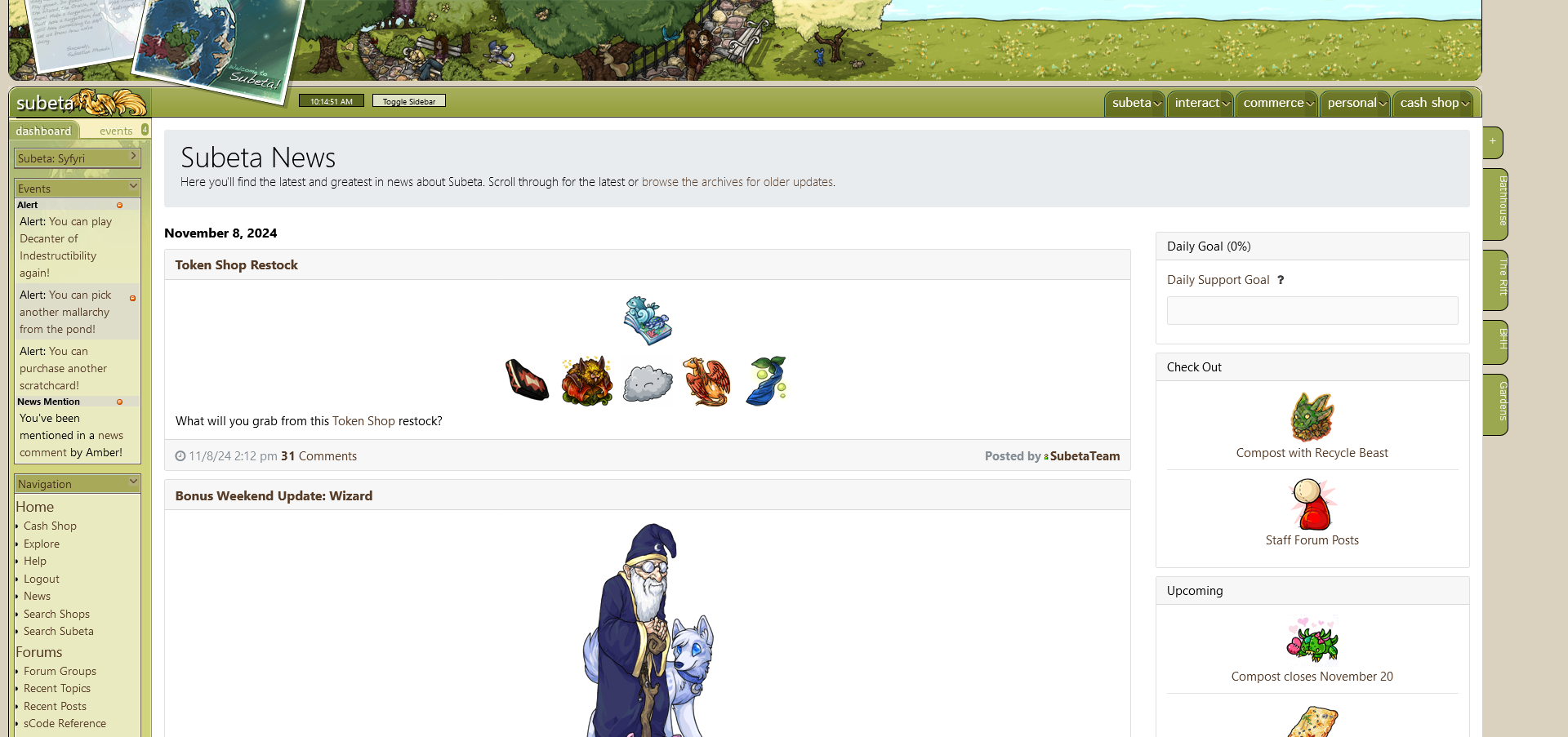
Also, I just posted all items from past November collections on the news post. Since there is a link to load that page on kumos, I gave it a shot on the desktop version of the site, and there are errors that appear on kumos that don't appear on subeta proper.
, it seems you can't nest spoiler tags on kumos. Or do they just function differently? It also looks like the center bbc code doesn't work in the news comments, dunno if that's a bug or working as intended and the code expectations are just different.


These items don't show up on kumos: [item=Eye to Eye: A New Beginning] [item=Tally Ho: Journey To The West]
Could it be the colon?

The site feels very "busy" and overstimulating, while at the same time having strange "gaps".
For example, the inventory has a "overwhelming" amount of info. I&;d much rather be able to see just the item and name and then use my hover for the additional things like user price and rarity.
The use of soft colors to "box" the site page-to-page is so helpful to my brain. I hope Kumos uses this!
I want to highlight how much I love item hovers too! Item hover functionality is something I noticed as a recurring theme on the Subeta Positivity Thread and strongly agree with. I think it does a lot to keep pages neat while allowing us to access vital information in pretty much every situation. That's one of the biggest changes between the legacy and kumos inventories, I think for the worse. All the extra info as part of the page stretches it way out, making it less efficient and busier.
I don't hate the intent behind adding common links directly to the inventory page without the need to click through to an item's own menu, but I'd rather see that as maybe one line of text below the item name, where we now have "Artifact", "Game Prize", "Holiday Item", etc. Maybe that could even be something we can adjust in settings? Like, which buttons we'd like to show vs hide? Someone who uses their vault a lot, or buys a lot of wearables for their wardrobe, might like access to those buttons, but others who don't use those things as much may prefer to save the button space and click through to the full menu. That way we could also potentially customize even more direct quick links, like adding to a certain shop or reading/feeding to a certain pet? Which really would add to efficiency. But yeah, the huge boxes around each item are not my favourite, and I think the ability to hover on an item all over the site is 10/10 useful.
Just emphasizing I fully agree with hipster, Frenchi & Co. !
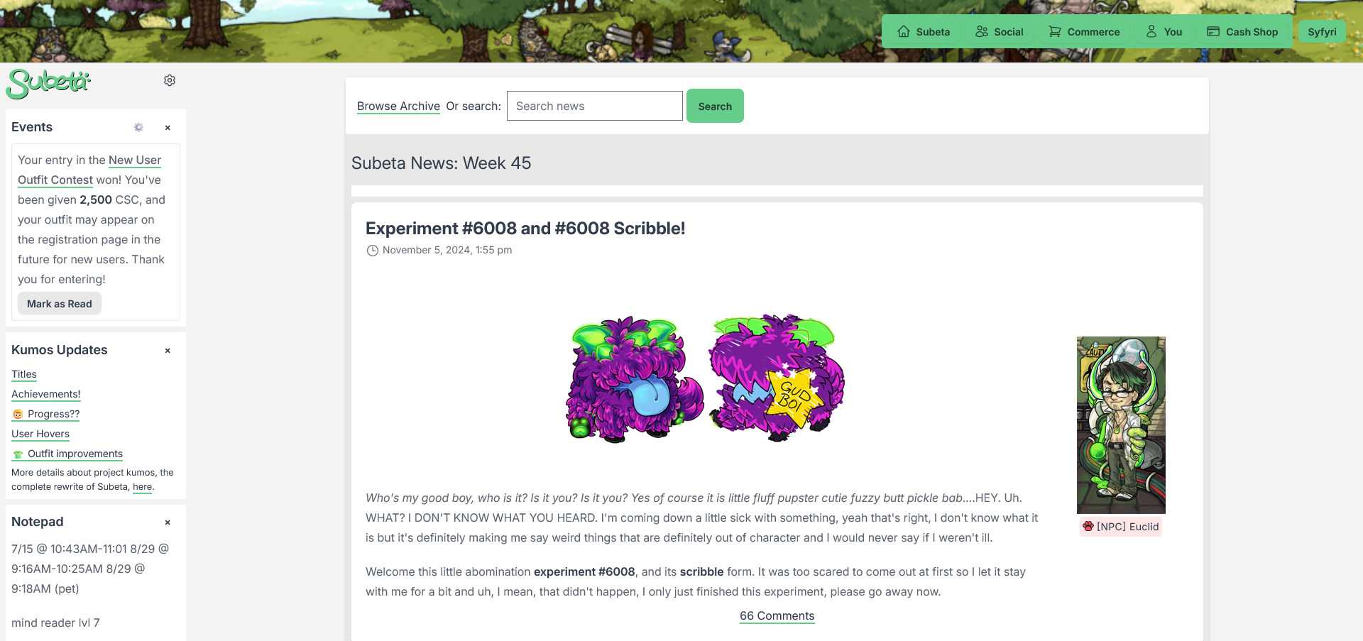
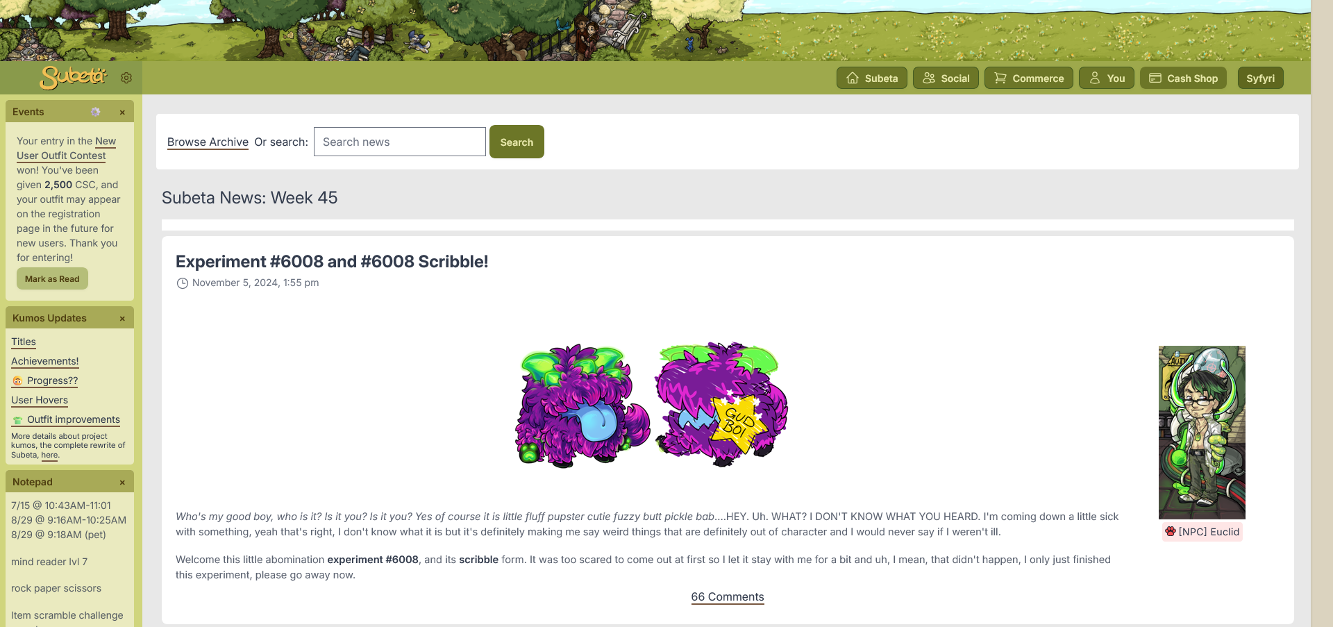
In regards to the layout itself, I think what is putting most people off & making the site not really feel like Subeta is the absolute lack of color combined with the large amount of white space which is partially caused by large fonts & line heights. I feel like the bones of the two layouts are similar enough that the Kumos layout could easily be made to look like a more "modern"/cleaner version of the legacy layout without a lot of major changes. Here's an example of what I mean by that:
And some full size screenshots: legacy site vs Kumos vs modified Kumos.
- Colors: Kumos is currently mostly grey & white. The colors that it does include may still be based on those generic layouts it initially had? In any case, those colors mostly do not match the header images at all. I think the legacy layouts all have pretty solid color choices, so why not just select from those instead? Adding more color, such as to the sidebar, goes a long way towards giving the site its old personality back.
- Header Image: I was really glad to see the header images get added to Kumos - they all still look great, even 15 years later! It is a bit of a bummer, though, that they're being stretched to fill the page, resulting in the art being blurry & cut off. They need to be at full size with the repeating edge instead, like the legacy site. [ul]
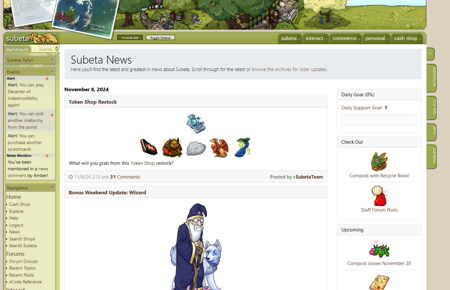
- As a side note, the art of the Recycle Beast on the composting page is also really zoomed in; Subeta's art is so lovely, I feel like it does it a great disservice to show it in a poor light by purposely making it blurry.
- I'll also echo others that the width of the sidebar itself feels too large.
- The font on Kumos is larger & has a larger line height than the font on the legacy site, which also contributes to how empty and white the pages feel. The line height in particular feels excessive. The font size for content isn't the worst, but on the sidebar, which shouldn't be a major focus, it definitely feels too large.
- To illustrate how customization is nice: a few different users on this thread have said how they like having events in a different tab on the sidebar. I don't like having events in a different tab. I'm actually using custom CSS to hide the sidebar tabs entirely and I only use the event widget to view my events. That's because if I don't have the events front & center, I forget about them. But I totally understand the desire to have them out of the way, especially since you can sometimes have a crazy amount of them such as during holidays. Which is why it's nice to have both options and would be nice to continue to have both options!
- On the legacy site, there are 23 sidebar widgets to choose from. (Some of which are broken but nonetheless.) At the moment on Kumos, there are 4. That's just... It's an extreme difference.
- How has the bookmarks under the navigation bar in their Modernised Theme is a really clean looking option for bookmarks.
- I know there's been a long-standing discussion about also separating pet profiles from the main site layout and I feel like there will be no better time to do so, since everyone's existing profile codes will inevitably break once we move over to Kumos. If they get separated, then no one has to ever have to worry about profiles breaking with layout changes again. I also think having widgets on pet profiles will both make it easier on coders and allow a degree of customization for users who aren't good at coding.
I think sometimes a valid concern over major changes to a site like this is less the fear of change and more the fear of loss. Part of that is the loss of familiarity (the site has been around for 20 years and has looked like this for 15 of those years!) but I do also hope that as features are being rewritten, we don't lose any aspects of them and instead only add to them.
omg your mockup is exactly everything i want from the new layout... pls can we just have this 😭

Your mockup is amazing and I hope Keith sees it! It's really is the best of both worlds.
I love this mockup! I hope the new site also prioritizes putting links to staff posts and the holiday calendar, as well as links to the events currently happening, front and center on the front page as they are now. Having that info get burried will make it harder for people to engage in what's currently happening on the site.
I also really like 's mockup example! Still a bit updated, but looks familiar enough to the old/nostalgic version of the site to not be so jarring for people to get used to. If it's possible to make it looks something more like this, I would totally support. I already support the need for the better coding base, but right now it seems to be mainly the visuals that are putting some users off.
Syfyri's mock-up feels like coming home to a freshly painted house. Unlike the current version of Kumos which makes me feel like I accidentally clicked a hidden link that hijacked my browser to an imposter site that will try to steal my login and/or credit card information lol. I kid but being redirected to Kumos and trying to play there just feels all wrong and like I've somehow been downgraded. Syfyri's version better captures the upgrade Kumos actually is.
Paramnesia
The unmatched power of the distortion of memory, arcane magic, and artisanal cheeses!
That mockup addresses the visual issues with the new site so well! So much of it is just in size, padding, and colour. Completely agree with your thoughts on change vs loss too.
I think this has been mentioned by others already, but just coming back to mention it myself since I've been poking around the Kumos version a bit more:
I'm cool with moving the Friends and Comments pages under the "Social" section of the dropdown navigation, that makes sense to me. However, the "You" and "Username" navigation sections should probably be combined into one instead of having them split in a weird/arbitrary seeming way that they currently are.
This is also more of a sidebar widget feedback, but I miss having the sP amount on-hand linking to your currency vault, so I hope that can come back. I also noticed it doesn't seem like the vault is working at all on the Kumos site? At least when I go to the Vault page from the navigation, it just loads a blank section with the Legacy Frame banner at the top.
YES. That mockup is exactly what I want (except missing clock)! I cannot stand how sterile the Kumos site looks currently.
Wanna know more about battling? ❤️ The Official Battle Guide v3.3 ❤️ Need to find books? 🌈 The Book Grind Guide v1.0 🌈
🎶 all we want for luminare is that mock up🎶
A player returning after 1½ month ( after my old laptop had decided to crash haard and a rough month of sickness ) getting back to subeta beign forced to use the new layout ( used to be able to pick and choose between old layout and new when logging in ) it has been very very hard for me to figure out where anything on the page is at now. Missed 3 days of luminaire because I could suddenly not go to the sidebar and get any info from any of the forum topics I follow with the daily reminder to pick up the gifts ( or the daily hot spa pick up thing notif for that matter ) , nor figure out how to/where to find the luminaire update announcement ( when I click in the news archive i only get links for a specific few dates and none of them matches with the luminaire announcement, which is how I in all these years have been able to keep track of it and know where to find her. Also I must admit that as a light sensitive person all the white background stuff really hurts my eyes in the most literal sense.
once you're logged in, you can still come back to the original site for the vast majority of pages! There are a few features that only work on the new site - the wardrobe, some seasonal stuff like the new Mysterious Melody, and the process of actually logging in - but the original site is still here and working. My first move upon logging in is always heading directly back to subeta.net
Sorry to hear you've missed some stuff though - it's not the most intuitive, and took me a bit of messing around to figure out when I first came back too.
: is it a easier way than the subeta.net/legacy which is what I use now as soon as I have logged in. took me too long to get to remember the daily login and the legacy part I missed out on both of the usual melody luminarie achievements but thank you for letting me know. also learnd the tree dont work in the new design but only in the old.
I usually play on a PC on the legacy site, but I popped into MM on Kumos last night to check out the prizes, and... it's not really very functional. I'm on a Galaxy S22 using Chrome, and everything just overlaps and is impossible to read unfortunately.
Melody's dialog messes up the page layout and squishes it all into the left of the screen, which also crushes the list of items distributed by the MM. Plus, a lot of elements seem to randomly overlap the header (my avatar border, for example).
SPOILER (click to toggle)
 -
-  -
-  -
- 
Hunting for: (It's the only beanbag I need for a full collection!)
thank you for this! i thought i’d replied earlier, but apparently not 🙇♂️ totally agree—there’s a lot of middle ground we can hit that builds on what we’ve got now.
over the past few weeks, i’ve been working with a designer friend who was recently laid off from her tech job and has been freelancing. we’ve landed on some ideas that feel really aligned with this, but getting it all coded (while juggling new features like MM) is no small task.
now that MM is live (and all the underlying functionality too—like melody’s npc agent and shop-buying mechanics, which required fully implementing user shops! there’s a bare-bones version here that isn’t linked anywhere yet, but had to be built to make the system work), i’m refocusing on mobile-friendliness, new themes, and getting everything to feel like subeta.
on a side note: i’ve been following this complete css course, and it’s been super insightful for these kinds of updates. if you’re into front-end or css, i highly recommend it—it’s been shaping a lot of the discussions around design and functionality!
💖 ✨ 🤗
oh, i meant to respond about profiles!
my plan is to do a similar conversion to what we did last time—though i’m guessing most people here won’t remember that 😅. the current user profiles are actually the “v2” profiles, and one of the very first examples of drag-and-drop templating on the internet (predating even zynga’s similar system!).
i started working on pet profiles but didn’t get too far. what you see here on my pet eradication is a “port” of the v1 profile to kumos. it retains the legacy styles and adds a “THIS IS A LEGACY PROFILE” note in the corner. there’s still a ton to do, but the idea is to handle user profiles the same way: you could switch to the “new” profiles (which i have so many plans for!) or stick with your legacy profile, and it’ll render correctly.
i’m so excited to dive deeper into this stuff—it’s exactly what i want to focus on rn 😭 but there’s so much foundational work to get through first 😭
💖 ✨ 🤗
No fair, Eradication gets to be T100.
Wanna know more about battling? ❤️ The Official Battle Guide v3.3 ❤️ Need to find books? 🌈 The Book Grind Guide v1.0 🌈