☀ CW Denial / Help Thread! ☀
Replies
I think I see what you mean about my feathers looking more cone-like than flat. Do you think this looks any better? I am wondering if I made the side on our left too dark now, though?

LINK On this side, the feathers near the top are going to be much closer to the light source themselves! I've marked the areas where the light would hit the most, and at the top I also showed a super exaggeration of the 'cone' shading I was kind of talking about vs my personal feather style. Hopefully it'll give you an idea of what to do C:
Thank you for the lighting illustration, I think that will help. =) Just to clarify, is the cone shaded one on the left or the right? I just want to make sure that I am not looking at the wrong one. xD
Cone is on the right side, where it's a very harsh highlight up against the very dark shading. C:
❤️ design shop ❤️ release thread ❤️ ping group ❤️ foodgram ❤️
I know you didn't ping me, but I thought I'd poke my head in. The problem is that you're only added a 'boob' on the side. The folds that flow down in the middle of the garmet would also be effected, if only just a little. Adding a little bit of curve there would really help.
No worries!
Not sure if you mean like this?

❤️ design shop ❤️ release thread ❤️ ping group ❤️ foodgram ❤️
Yes, but both sides C: The whole thing should have a very very subtle curve n_n
I'm assuming when you say both sides you mean the left side as well xD

❤️ design shop ❤️ release thread ❤️ ping group ❤️ foodgram ❤️
Yup! C: That'll give it just the right amount I think without it looking tight / not flowing I think n_n (PS it's super cute, you did a great job!)
very much better! v and are amazing hngg and so are you! ❤
p r e s a g e .[/font]
Username --- Link to the overlay(s) --- it's fine Link to the CI --- click click
What do you need help with --- I've been denied twice for the CI. The first one was not shaded darkly enough, so I went ahead and shaded it some more. Then, it got denied for not having a clear light source. I tried to shade it from the top left hand corner, so I'm not sure what I need to do to fix it. I was just hoping I could get some tips, because every time I go back to try to fix it, I just feel like I'm shading the same areas, haha.
Was there a denial --- Your custom clothing Snakey Crop Top was denied for the following reason(s): • ITEM: Ambiguous shading/light source unclear • NOTE: The shading on the item is definitely more pronounced now, but it doesn't seem to have a specific light source
Please feel free to redline. this was the first CI, the first time it got denied, before I edited it, in case you want to see it. (The shading was super light!)
hello! So right now the ambiguous shading stems from the fact that there are highlights everywhere n_n
The back of the snake should be darker. I also suggest highlights to be in a paler (but saturated) color rather than white. It could even be yellow or cream, but it usually helps to balance things out.
I did a quick example!

Cathii's CW shop ❤️
That makes a lot of sense! Thank you so much for your help. The example is super helpful. And that was such a quick response! I really appreciate the help. :) The subeta style is not really my style, so I am still trying to get used to working with it, so this is really useful.
Want sent here to seek advice on this wig I drew so here goes ~ I already had some advice and edited the wig since but I'll put it here too.
Thanks in advance /o/ Username --- Link to the overlay(s) --- click click
Link to the CI - click click
[b]What do you need help with -lighting/ general crit? -
Was there a denial -nope, not submitted
Optional Can we take a look at the PSD files --- nooooooo you don't wanna see the mess that is my psd files Can we redline --- shure~
Username --- Link to the overlay(s) --- click click Link to the CI --- click click It's a tribute to a Crash Bandicoot character - x - x
What do you need help with --- anything really. opinions, tips, help, all will be appreciated. it's the first time i'm attempting a cw, and i'm trying to learn
Was there a denial --- not submitted
Optional Can we take a look at the PSD files --- if necessary Can we redline --- yep
Username --- Link to the Overlay- click click What do you need help with - Okay so before I go into the denial. I wanted to say this is 2nd time it has gotten denied. The denial then and Now are basically the same. So I updated and re-shaded it. I wanted to show my original rug to see the difference I made and how even with that difference, it's still denied. I need some help to see where I went wrong when I tried to shade the overall piece in light direction as well as trying to follow the shadowing of each braid. So any help will be great. Original
Was there a denial - Yes OTL
• OVERLAY: Ambiguous shading/light source unclear • OVERLAY: Gradient or soft shaded instead of cel-shaded • NOTE: While I'm willing to let go the HA not casting a shadow on the rug, the shading does still need to fit the shape and the lightsource. Right now the rug isn't shaded to look like it's laying flat on the ground. It's very soft shaded and not adding any texture or depth.
Optional Can we take a look at the PSD files --- yes if need be. Can we redline --- yes, please.
Thank you
come back lazy butt
Cathii's CW shop ❤️
For the overlay what I'm seeing is that the line art looks really sharp and pixelated in some locations. Especially where it's darker, and then in locations where it's lighter it's so faint I almost can't see it. I do really like the style you've shaded this in though! Lots of subtle different hues and the like! For the item image, the only things I can really warn you about are things I've gotten denials for. One of which was the colors not matching (the overlay wig color is different than the item's wig color) and the second being that this looks 'like a headshot' rather than a mannequin bust with the abrupt way it's cut off at the end with no regard to shape or form. Let me know if you need extra pointers, or any specific advice or anything! Your shading style is a lot different than mine but I could still offer assistance with the line art I believe n_n
--
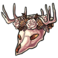
I can definitely spot all the tribute changes you've done, so that's a great thing to have locked down right away. I think your line art is looking pretty good quality. You may be able to thin some of the inner lines on the item image, but otherwise it's very smooth and clean. The main thing I'm seeing that may need a bit more work is the shading. Right now on the overlay it's very soft, and in some spots it's too faint to see the multiple layers of color (like the feathers for example). Some of the shading is a bit harsh (like the eyebrows) and could be lessened a bit as well. It's important to take the overall shape into account when shading, rather than the individual pieces that make up the whole. So for example, instead of shading 'a feather' you're shading 'a mask'. I typically do a mock shading to give myself a general idea of where I'd put down the general shape of the shading, and then refine from there. Let me know if you'd like some personalized help with shading and I can make you a redline/tutorial type thing to help you out here n_n (The last thing I want to add... I'm not 100% sure but you may want to consider adding a single feather or something to the item image just in case as I'm torn between whether or not I think this may be denied for the item image not relating to the overlay.... hurm. Maybe someone else can throw you an opinion here.)
--
Heyyyy. I'm not sure if this is possible but by chance do you have a version of this without all the different colors? (I know sometimes you merge / shade on the same layer if I remember correctly so I'm not sure if you have this in a solid color or not) Backgrounds are something I am still learning, and so seeing the less busy version is probably the only way I can attempt to provide you assistance so I can get a feeling of it. (It's what I do when my own stuff looks weird; I make it all one color + the shading to figure out where I went wrong lol)