Rate and Critique the Above HA
Replies

9/10 Everything is calm and beautifully colour matched. The grasping arms and facial expression tell a story of unrequited admiration from the masses to me. The only thing I dislike is the purple toned crown. I understand it from a thematic perspective but it is slightly off in colour and the art style is slightly older than the rest of the headgear.
[Center]
[/center]
9/10 I love the overall pirate theme and the rats are a cute addition. There's just a lack of a good sword or other weapon that any pirate needs to look their best.
[img align=center]https://archives.bulbagarden.net/media/upload/c/cb/Menu_HOME_0860.png[/img]
10 to 10 - Love this summer theme robin hood camping. Perfect background. Good theme after movie and book of robin hood.
8/10 love the creativity and everything meshes so well. the layering is god tier. The only thing holding me back are the shoe layering and no nose
[font=monospace]
10/10, love the way your avatar looks like it's backlit, and, well, the backstory, one knife in hand and one in the mouth, clothes from possibly a shipwreck, look of steely determination, and your forum title even matches.
10/10 love the movement of the swoosh, the smug smile, the colour matching, and it just represents you so well!!!!
p r e s a g e .[/font]
10/10 for sure!! I love the red and turquoise combo! It’s a unique combination that isn’t seen too often, and you totally nailed it. I am super impressed that the red and turquoise tones all match each other perfectly throughout the entire avatar. ^^
<p>― Peter S. Beagle, The Last Unicorn
9.7/10, something about the layering on your legs especially around your feet seems like it isn't laying right? Absolutely beautiful though
9/10 I'm a sucker for anything with a rat involved. I adore your layering of the chest and arm items. The eyes aren't my kinda thing, but I can see what you're going for with them. I would've looked for legs with a grey/black/turquoise tone rather than the bright blue you've got on.
[Center]
[/center]
9/10 that shirt collar fits so well around the neck of that snake head! I like the hiking rugged aesthetic against the framed kitchen wallpaper backdrop, it's very cosy.
Zombie Rrraw
Air Head : Angler : Ant Agony : Barnankles : Blistered Hearts : Brainrot : Bright Bite : Butterfly Bruise : Buzzkill : Clusterflux : Creeping : Cryomorph : Crystalitis : Death Slug : Doom Bloom : Eau De Ceased : Fevermore : Grosseries : Grossfungus : Ikupox : Lobster Face : Lotus : Love Bug : Metalmorphosis : Pinkie Patch : Sickura : The Vapours : Yggdrakill
Seeking
9/10 I really love the outfit and hair, the colours go very well together! The dress especially is very beautiful. I think what throws me slightly off is the which casts a white sheen on the face. I'd maybe use a face item (e.g. some kind of blush) that is more glowy/glittery instead to emphasize that fairy-like look you're going for. 😍
10/10 The only thing I can think to critique is the ear piercings look a little strange over the hair, but other than that very well balanced c:
8.5/10, i really like the fading into the bg effect, as well as the b+w/mauve combo :3 it looks a little strange around the jawline though- a choker might add some definition between chin and neck, and a light belt (or a dark hat) would help to balance the much darker lower body with the lighter head.
☥☥☥
[/font]
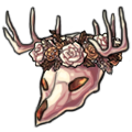
10/10 love your HA, colors are well matched and love the detail of the skull + yellow eyes! x
[flower=lucci] Stickers WL!
oooh it's giving me Roxy Hart. the face and hair is lovely, and the sparkles are a nice addition. i'm not a fan of the dress, or maybe just not the shading on it. 7/10
we are still human
5/10. i like the background (although you seem to have 2 separate full-cover bg items on?), but i can't really get a feel for what you're going for with the avatar itself, so my advice might not be close to what you had in mind. i'll be going with the assumption that the scarf is your 'focal' piece. this is going to be kind of long, but i didn't want to not explain my thoughts! i also tried to use easier-to-obtain items as examples, since i don't know what you do or don't have.
SPOILER (click to toggle)
the skirt's length and color is kind of awkward- it's not really the same as any of the other yellows, and it's taking up a lot of visual space. i tested layering on top of (both beneath the , so you can see it better) and i think the colors go together a lot more, but really just having it Not contrast so directly with the rest would help.
you're also wearing two different shoe items (?). of them, the ones that aren't visible are a better color match, and you could use some socks (i think would look nice, but any blue or purple similar to what's present could work) to bring the color to the legs, instead of the leggings you're using which are an off shade.
i don't really understand the open head, but i left it alone since i assume you didn't want to add hair. instead: there are glasses that could match a bit better that have the same round shape. i tested and - the former for the scarf match, the latter for the skirt match. finally, i think a small item on the lower right (like a lifelike doll or lower back piece/tail), or some kind of uneven ground texture would help balance things out, since atm the eye is drawn strongly towards the top left. i tested using .
the end result of my test examples is this, but again: this is just based on me using the scarf as a focal point! i hope it gives you some ideas, even if it's not what you wanted to achieve with your avatar. cybertron exampleby Ossuary also i hope this doesn't seem condescending or rude. i do genuinely just want to give feedback, i'm just a long-winded person. 😅
☥☥☥
[/font]
oh, gosh, i forgot to leave an unchanging show of my outfit while using the morostide zapper. my HA mostly relied on the blistered hearts skin! but I really appreciate the feedback on the colors, you did really good stuff with the outfit! i love the skirt and the ground really does help balance it out, you're right. (and i never noticed I had two shoes...! lmao). i'm really grateful for the feedback, and especially such thoughtful feedback!
okay, for your HA: I've always had some frustration for how most hairs treat skins that change the facial shape. the lock on the left side going over the beak is sad. but otherwise what you've done with the head is lovely, it all works together very well. the flooring is very rich and an excellent color for the rest of it. the sweater feels like it stands out, which can be either good or bad; i like its boldness but I think it could use a few other spots that share that dark, rich red. (the tail is Close...) i like the outfit in general, it's very casual and cozy. the bare, pale knees of fevermore is something i wouldn't expect but looks very nice. the tail adds nice flair, too :) the leaves, lights, and frame are all independently lovely and warm and fit the tone, but all together with the background and the skeleton dog it does feel a bit busy. glancing over the image, the HA is the simplest part of it. which could be used to good effect, but it's got enough going on by itself that it doesn't give that contrast. overall, I'd say 6.5/10? i think i'd like to see your HA be a bit more in focus
here's my current HA. not making the same mistake twice ❤ by Cybertron
we are still human
3/10 Kinda think it does not pop out. The color don't really complement each other and both HA and background are too dark.
edit: Oh wait do I rate the one you posted on the thread? Not what you're wearing now?
commission
art shop: Maximoff&;s (Kush’s) Art Shop
pet story booth: Pet Story Booth by Maximoff ✨ [EMPTY SLOT]
8/10 i really like it, but it is busy mostly in the background where i cannot see much. i would suggest if you can maybe make it a bit less busy in the background or try to find a cloud backdrop (there is an old one that has the same colour scheme). The hair could use some help too, but i like the rest it works well.