robin's nest // busy
Replies
Looks fantastic so far! I love the text you used, and the way you designed the background looks great. As for the colors, is there any way you could make the colors outside of the text and main content box a little less saturated? You can send me another picture if you want to be sure. ^^
As for the comment box, I'm assuming that if there's no way to have it drop down that there's no way to anchor it? Sorry if that's a dumb question; I don't know anything about how the user profiles work coding wise. If not, having it be part of the scroll down is perfectly fine. ^^ I appreciate you letting me know.

Oh my gosh...I love it! I don't mind at all that you flipped the sides, especially if it made the picture look better. As far as the buttons go, no I didn't mean to send the same picture twice lol. I don't think I need any patterns at this point...I think once everything is added it will look perfect :).
Buttons- http://images.genius.com/119254ae92037ef74e66fb573c1cfb9a.600x600x1.jpg
mid coding, what do you think so far? c: do the buttons look alright??
also! sorry i didn't ask this before, I haven't made many user profiles so I didn't have a very in depth form, but I would like to know which sections specifically you will have on your profile (this will help me code it and make sure everything you are going to display is formatted nicely!) and which columns these sections will go in (small or large column) c: thank you!!
I'm on my way out the door for work but I will let you know this afternoon after I get home on what sections I'll have and where I'll be putting them. I have just a quick question about the buttons. Is there a way to make them round instead of square and instead of going horizontal, can you make them vertical? If not I totally understand, I don't want to create extra work for you. I really like the way everything is looking so far <3....I'll be in touch later about the rest :).
no rush! Take your time about the sections :') And yes definitely can do for the buttons (: I'll work on it tomorrow! (2 am here)
okay here is what I have on my current profile...basic userinfo, extra userinfo, human avatar, pets, options, shops, medals, comments, wishlist, friends, widgets, stickers, multimedia, and blankspace. I'm thinking that's going to be too much for only having two columns, unless it's possible to make the second column even wider. If that's not possible, just let me know and I'll pick some sections to get rid of. As of right now, here is how I'd like to organize the columns:
1st column- Human Avatar Basic Userinfo Extra Userinfo Options Blank Space Pets Widgets
2nd column- Buttons you're making (is it possible to do the text in white?) Comment box Multimedia Friends Shops Medals Stickers Wishlist
Like I said, I can definitely eliminate some stuff if you need me to...I don't want to make it any harder than it already is.
@ ProlificDesigner I'm working on this now! I think that if I made the bigger column any wider it would look a bit awkward because I matched them to the gate! :c are there any sections you are willing to sacrifice? If not, it should be okay! It will just be very long, haha.
Another option is for me to make the entire layout larger, but in that case I think that the thinner column being any bigger would also look a bit strange. But it's up to you!
One more question! By first column, do you mean the wider column?
[edit] I have a preview for you! Instead of having a button to switch between story sections, how do you feel about this? The two stories are side by side, like the profile! If you'd like me to change it, though, I absolutely can :) Once you give approval, I will go ahead and finish the profile! Also, do you want both the spotlight and the minion displayed?
That looks really neat! I like what you did The spotlight and minion can be displayed or hover or whatever looks best for them
, I can definitely take some stuff out. I love how it looks right now and the picture is positioned so perfectly so let's just leave the columns how they are now...and yes by 1st column I meant the wider one. Sometimes I don't explain things the best lol :).
@ MAR no worries! RL comes first always :') (also sorry i double pinged you, i just wanted to make sure you got my ping in case it didnt go through since ive been missing a ton of pings!)
I have a trade lot up here for you whenever you're ready to pay, once paid i will send over the code! c: thank you so much for ordering!
[edit]
- Code is here!
- I have also got a saved folder here with the profile images as well as the psd in case anything ever gets lost :)
you are welcome! <3
okay! do you mind letting me know which sections you will be keeping in, then, just so I know what to format in the code?? <3 thank you! also sorry for my slowness on this profile, i've been a bit wrapped up in Vesnali! but i can get back to it full speed now that it's over. :)
[edit] I think I'm all done! check here please and let me know if you need anything changed! If not, Lot is up for payment, and once paid I will send you the code! <3
okay, so picking stuff to get rid of was harder than I thought lol...so here's what I'm thinking...do you have to code it? Is it possible to not do that and I can play around with the sections that I'd like to keep, to see what looks best? If that isn't an option than here's what I'd like to keep...human, avatar, basic userinfo, extra userinfo, blankspace, options, comment box, multimedia, shops, and wishlist.
@ ProlificDesigner I don't want you to have to sacrifice any sections so I managed to include everything you wanted in your other post! Also, all you have to do if you'd like to move one section to the other column is make sure that if you move shops, stickers, medals, wishlist, friends, and pets,
their amount of items per row must be adjusted to: 2 items per row if placed in column (the thinner column) and 3 items per row if placed in column . This makes it look tidy and not cluttered :)
So this means that if I were to move stickers from the wider column to the thinner column, I would need to click on the edit button then where it says "Amount Per Row", and type 2 so it shows 2 items per row. I hope this makes sense!
And I'm going to finish up the profile now!
[edit]
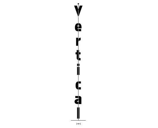
also, for the buttons, when you say vertical do you mean stacked on top of each other or with vertical text? :o (sorry if this is a dumb question, haha!
Here's a possible button:

[edit] payment received, thank you so much for ordering!
I also have saved a dropbox folder with the profile images and psd in case anything ever gets lost here (:
And yes, sure, go ahead and post your form whenever! It may take me a little bit to get to it because I have a few people ahead of you and also vesnali profiles to make, but I'd be happy to do another for you <3
you're seriously the best, thank you for being so accommodating :)...I would like the buttons stacked on top of each other, sorry for not explaining that better in my initial post lol.
you are welcome, it's no trouble at all! :`)
click! i've included the buttons both vertical and horizontal, because in my opinion they look better side by side - it also makes the column shorter! let me know which you prefer, and if you would like anything else changed! (i havent added the urls yet so the buttons arent fully functional but i will once payment is complete :) )
If there are no more changes wanted, I have Lot up for payment and once paid I will give you your code! :) however, if there are things you'd like changed, please let me know!
I actually like them side by side too, they look a lot better. I like the way everything looks, I'll go and pay right now :).
Profile Instructions: (sorry for the bit of a delay LOL i was having a bit of fiasco with the buttons LOL ;___; )
- create a blank section, and paste this code in it, and click update. this will set up your profile background!
- create another blank section. remove its title. paste this code in it and click update. this sets up your buttons!
- now that your profile is set up, you can drag sections anywhere you'd like :) just make sure that if you drag shops, stickers, medals, wishlist, friends, or pets into the SMALLER column, they MUST be changed to 2 items per row, and if you drag them into the LARGER column they must be changed to 3 items per row!
please let me know if you need anything! I'll set up a dropbox folder later with backups of the code and images when I have time!
Thank you so much for commissioning me AND THANK YOU FOR THE TIP OMG <3 <3 <3