finished, lock please.
Replies
Like feather it out? I can definitely do that, i thought it was kind of odd when i looked at it too
^_~ let me fix that and i'll show you once its done!
 [BR]
[BR]
Not so much feathered out, but following the black line and tapering in so it's not just a blunt line.

Ugh, im not sure you can even see a difference. If this is not any better. Please explain what you meant better for me :c I did this new one on a darker skin color than the example they use to see the shading better.
Welp. But this is how it shows on sub,
SPOILER (click to toggle)

CRIES IT LITERALLY LOOKS NO DIFFERENT -_-; welp please explain yourself further pleaseee~
OK, well this is what i based the editing on. here is what i have.
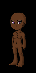
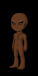
The site may have been cached, and showing the older one. XD BUT YES, that's more how I meant. How it follows the black inwards.
Ohhh, i didn't think of it being stuck on the old image lol. Okay, so you like it better now ^____^?
I think it flows a lot better, but that's simply my opinion !
I think it does too - I appreciate your advice :* i updated the front page with these images as well to give comparison in skin tones.
I can definitely see the improvement! Your CI is also looking very nice as well. It looks great on the dark base btw, i can see the eye shadow better now. c:
I'd hope it would be an improvement lol. Thank you <3 I'm trying !
Keep up the good work! Still rooting for you!
In search of and . Pm me if you're selling either or!! Miss by beautiful GSD.
Always happy to help, even if slightly ! =3
Can you judge my newest CI attempt? I wasn't a big fan of my last item, so i made it into a pencil. ^_^
Looks great to me. :D
I think the pencil is a very cute idea ! But I do think the shading needs some work. I suggest looking at how other pencil items are shaded, as it's much easier than trying to explain. You want to lay down the base, then shade the bottom part (erase a bit where the backlighting will hit). Draw a line in the middle long ways in the second shade, to give it a rounded shape. Then the highlight at the top. I may need to thin out the lines, too, they seem very thick on this (what size are you using for lining ?). And while I get where the line at the back of the pencil is and how it's supposed to make it look like the bottom of the pencil, it doesn't really look right. I'd just leave the outer line.
I appreciate you taking the time out to explain that in such detail. Initally it was only 1px but i shaded and darkened the lines which probably ended up thickening it. And I see what you mean about the shading. What if I try something like this? , i know thats a colored pencil, but alot of my super old eyeliners look like an actual colored pencil. I will probably fatten it up a bit like the second item you showed me :)
this is my attempt:
 let me know ~
I think I Need to blend the bottom shading out better.
Oh dude, you can use any pencil type as a reference (like the Delish one I posted is a "lip crayon" and is, well, lips !); I was trying to show the broad range. Noooooooo blending. Cel shading only for CIs ! It is looking much better though ! But the lines seem a bit blurry now ? If your canvas is twice the size as the final bit (128x128), I'd try 2px lines. It's the size I used to do all the time, now I tend to do three times the size (192x192), so I often do 3px lines.
, so is my shading good then lol? I noticed the out lines seemed too light? I can fix that. I shaded by selecting a part at a time and it came out pretty good to me haha. Thank youuuu, Well i drew the image in a different program (the outline) and colored it in photoshop, so that could be why it looks a tad off, or i might have accidentally colored the outline while shading idk.
how is this? :)

Looks much better, and yes the coloring is looking good ! The internal line can be thinned though, like it was before !
