Font all over the place
Filter
Show Official Posts OnlyReplies
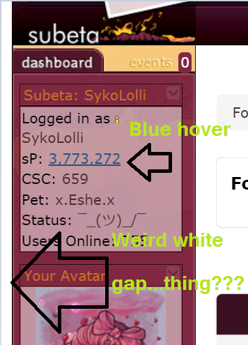
The font size is all over the place currently. The sidebar and layout have a white gap now, the text size is a size or two bigger than it was a few hours ago in different areas.

[kiss=blackwolf_2009] [dance=blackwolf_2009] [egg=blackwolf_2009] [TP=blackwolf_2009]
And links are all blue on hover...
i even removed my customcss to make sure that wasn't the problem and it's not. :
I'm noticing some similar problems with the link color being blue. Also training buttons (not sure what else) are now a different color which makes it harder to see for me.
he/him / 31 / EST |  | My best friend is |
Noticed this as well; seemed to happen rather suddenly as everything was normal and in the time it took for me to click to another page, everything was changed. It seems to be already-visited links are blue, also seeing the white gap and font-size changes galore.

Maybe they're trying to fix some of the side effects from when they changed the site to use people's system fonts? But I'm experiencing some weird things too, particularly the training buttons and blue links.
[edit]Actually, it looks like I'm not even seeing the same font as I was after the switch. I don't know what font it is, but it looks pretty different than I remember in certain areas of the site. It's not my computer's system font anymore...
@blackwolf_2009 What browser are you using?

Firefox 50.1.0 I haven't changed my browser in weeks or done anything to it or the PC. This all just happened over night.
[kiss=blackwolf_2009] [dance=blackwolf_2009] [egg=blackwolf_2009] [TP=blackwolf_2009]
Something is overriding my customCSS font choices - but not everywhere. I've noticed it on the training main page most especially (size is weird and off).
:(
I'm getting the white gap and blue hover as well, and the font is ridiculously large in some areas of the site (like pet income).

she / they
[tot=feminist]
Any idea if this has been shown to programmers?
[kiss=blackwolf_2009] [dance=blackwolf_2009] [egg=blackwolf_2009] [TP=blackwolf_2009]
Also getting the white gap thing, and I noticed another giant white gap at the bottom of page for Main Shops.
[img align=center]https://media3.giphy.com/media/v1.Y2lkPTc5MGI3NjExM2l0cGx3NGJ1ZjY0dndycmsxYnd4YmxoeWVyN3djZWk3djJocjZ5diZlcD12MV9pbnRlcm5hbF9naWZfYnlfaWQmY3Q9Zw/K1tgb1IUeBOgw/giphy.gif[/img]
Hide
i've been having this problem too. the white gap and the blue hover and all the fonts are arial now? instead of whatever my system font was. as far as i can tell it's like this on every page except the wardrobe, and it's been like this since yesterday. it's the same in chrome (on my laptop, windows 7) and in safari (on my ipod touch).
the user dashboard also has a big gap on the right side where the bookmarks should be http://i.imgur.com/iz5jpUg.png

Now it seems like the font has changed back to my system's font, but some of the sizes and button things are still weird.
It's really hideous! Everything is 'in-your-face' huge, the icons on the games page are all scattered about. The Training page looks awful with those gray buttons. Hope this gets fixed soon!

I spoke with Keith and he said that the system fonts are still in place. He is aware of the white gap though and is looking into it.
Dexter by ❤
I'm having a problem and it may be related to the font because it wasn't like this before. On the page where you organize your pet's TC items, there's a gap between the item image and the "remove item" button that pushes the remove link nearly underneath the item image on the next line. The item images are also spilling out of the black border. It's a bit difficult to organize TC items.
he/him / 31 / EST | | My best friend is |
On the Challenge opponent > Choose weapons page, things are overlapping pretty badly, because the images aren't scaling down like they used to (before today) and some of the text is too big. I can't see the challenger's stats at all, because I have 3 pets that can battle at the moment and their images are overlapping both each other and the challenger info. Can't even imagine what a mess this is for someone with several pets that are eligible to battle.
I'm using Safari on ios, so yes, my screen is small, but that never was a problem before.
🌸 [flower=Morse] 🌸