Font is changing sizes/Various format issues
Filter
Show Official Posts OnlyReplies

Links are normally that color because of the theme, but things like the item name, move item, and discard item are normally pure black? As far as I know I don't have any CSS that affects font color
For clarity: My screenie is from this because it's where I personally can most easily tell that the color has changed. I can provide a screenie of the forums if you like though
[ Cleared by staff. Combined height may not exceed 325 pixels. ]
Kind of an unrelated issue, but I didn't want to make a topic just for it.
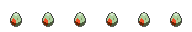
Any items that are wish-listed, the item image seem to become blurry.
 Two of the same next to each other. While it's not a major issue, I
figured I would bring it to your attention anyways. xD
Two of the same next to each other. While it's not a major issue, I
figured I would bring it to your attention anyways. xD
 ~ CW Group ✰ CW Releasing Thread ✰ My CS ✰ CW Wishes ~
Forum graphic by
I am glad it is not me my fonts are small even though I have Chrome set to 110%. I do agree with Warrior. Things seem blurry for me as well and a little brighter (as in part of the blurriness).
I just noticed the WLing problem myself. It appears as though when you WL an item it goes from 64x64 to 62x62 and becomes blurry during the forced resize.
(I'm having a grayed out text issue as well, making it hard to read a lot of things atm with my current site layout :S )
Is this what is going on with pet pages as well? The fonts are bigger than usual making custom pages look weird.
🤍🩷❤️🧡💛💚💙💜🩶
The fonts are definitely hard to read now. They're too small for me. Not sure whether the text is lighter in color, or the font is just thinner.
On a side note - playing Blackout is sort of spooky, because the lines between the boxes don't show so you have to use the cursor highlight to find them. (Maybe something to do on purpose during Morostide???)
Oh good, this topic exists. As I am typing this I see that the font has changed from serif to sans-serif. Or at least, it's a very different font.
Took off my custom CSS because my event bar was underneath the dashboard bar on the left. Also can't use drop-down menu for sub-links. And earlier I couldn't use my QS at all, though that seems to be fixed now.
Ugh, now those flowers are everywhere on the page instead of just in the top corner :(
 DEER GOD Y

Is this supposed to nearly match for the Riverside theme? And yeah, the links you can click look almost indistinguishable from the normal font color.

You deserve it[/font]
[font=georgia] [ToT=Pseudonym] CW Shop Join my HA contest! [/font]
I'm using Safari and experiencing these issues. I thought it was a forum revamp for a second!
❄️ Seeking Elsa or Olaf inspired CWs ❄️
I'm using Firefox on Windows 7,and I'm experiencing these wonky things with the fonts.
Like a good neighbor, stay over there!

Fonts and images are both going strange for me (like, right now I'm seeing my Firefox default font instead of the Subeta font even though I let the page I'm on override my font choice because I prefer to see the site like its meant to be seen). Spacing is super strange, random pages will load where the font is so small I'd need a giant magnifying glass to read it. And the buttons are all changing (like for training and whatnot) - they look like the old buttons, not the new ones.
For a second, I thought this wasn't a bug change! But since I hadn't seen a proper announcement, I assumed that it was a bug. It's more noticeable with the navigation bar in the widgets where the title is disproportionally large compared to the small texts underneath them. I'm using Safari if that helps.
[edit] Just noticed that it's also making some item images blurry as well, especially with wishlisted items
<p>Also why are fonts so much bigger in places? We only asked, that you make them SMALLER in the headers and buttons of the new shops!</p>
<p>The new buttons on the training Center are irritating and on my sidebar widget I dispise the greenish item search button on my bluish Arctic Frost Theme.</p>
<p>PLEASE stop messing with other things, if you are still heavily busy with fixing all the kinks and shortcomings on the new shops (and soooo many old tasks), because you didn&;t ask /involve your userbase before starting that project!!!! Time and again you do this!
from the "navigational dropdown" thread. Just in case staff only reads one or the other (hopefully any)
Also: Why hare the quotes in such a huge font? My eyesight is dwindling, but this is too much :)
Blackheart Hollow shouts at me with huge letters, while the Hustler's items are squished together.
On the Pets page the Text fields got moved more to the left and on smaller windows now are covering my pets' images.
Honestly, please stop messing around. Ever heard that: If it ain't broke, don't fix it. (You must have heard it, we keep saying that for years)
some of these fonts are disgustingly huge, even tho I "zoom" out. which used to make all of it the proper size for me. Now I have at least 3 or 4 different sizes :(
[flower=CastlesInTheSky] [tot=CastlesInTheSky] Dear users who keep blocking me....Remind me again, who TF are yous? ¯(ツ)/¯
I know you said just for the grey text but I'm seeing more issues than just that so here are all my screenies:
Screenie 1 Screenie 2 Screenie 3
Oh, and it is still not allowing me to click the hovers either.
[kiss=blackwolf_2009] [dance=blackwolf_2009] [egg=blackwolf_2009] [TP=blackwolf_2009]
I also noticed this. I've noticed it here:
-NPC shops -Our own shops -Ping notice board at the left side of page.
Please fix this, the font and images are so small. Also, I can't click on the hovers either.
Also, I am using the Torch browser.
- screenshots as requested
❤️ Wishlisting an item makes the image slightly smaller (62px square rather than 64px), which is what's causing the blurry image item problem
❤️ Preview and edit post buttons are odd sizes (that could be down to my customCSS):

❤️ Grey text (added in customCSS to force that to be black)

❤️ Buttons are a weird size overall (massive on the pet training page!)

Windows 10, Google Chrome 50.0.2661.94 m (updated yesterday - site was "normal" straight after that update)

My CW shop ~ forumset by [/font]
Quite strange for sure. I noticed it when the text was gray in the events menu, then my drop downs are messed up. I use CSS with my navigating around the site- and everything is off center, which makes me think that the pet pages are probably doing the same thing- considering it has to do with CSS. What are y'all doing to make this sort of things get screwed up so badly? 8I
I'm using Chrome, latest version. Windows 7.
CustomCSS to get the drop downs to work (at the moment at least):
.menu-btn ul li {padding-left: 0px!important; padding-right: -5px!important; margin-left:-5px!important; margin-right:-5px!important;}
-sub-friends, -sub-pets, -sub-shops, -sub-forums, -sub-vault {width:150px!important;}
(that'll make the pets, friends, shops, forums and vault drop downs a bit wider, as well as hopefully making them possible to hover like they used to) :)
My CW shop ~ forumset by [/font]