Cutout wearable hover preview
Filter
Show Official Posts OnlyReplies
Items such as and are such a pain in the butt as far as being able to tell what they actually look like. Maybe adding a slight tint on just the preview (not when in use) would make more sense. Right now the hover preview is completely useless
This is why you should use the wardrobe preview instead.
But no, people are going to buy them based on the slight tint they don't have when used, and they're going to be disappointed.
It was told when they were released to not rely on the hover previews.
Yeah, but not everyone was on Subeta when they were released, so saying "when they first dropped these items, you know, two years ago, they said..." isn't really the best support to your argument. It's not like anyone's going to see one of those items and immediately think "better troll through eight thousand news posts to find the announcement." I personally would like if the hovers of those items had some kind of attached note to say "put me over a second backdrop!" so people who aren't aware of their actual function wouldn't be like "wtf this wearable is just blank".

i think maybe just adding a "*layerable" tag to items of that nature would solve the problem best- it encourages people to go play with it in the wardrobe over different backgrounds so they can see what it looks like combined with what they already have.
not convenient for just a quick check but it's better than the later confusion of "where's muh tint i want that instead"
Maybe just adding a note to the item description would help clear things up. It's pretty unhelpful/confusing as it is now, particularly for new users or people who missed when they were released.

I can support a note in the description, but not a tint to the hover because even though they can be confusing if you don't chcek them in the wardrobe, people will buy them expecting them to look differently if there's suddenly a tint only on one type of item. Yeah, maybe not a lot of people will do that but not a lot of people seem to have been confused by them either.

I thought those were useless items that randomly chop up parts of the HA lineart so I definitely support doing something to make their use clear. An explanation in the description would be great.
previously shortaxel
I don't think a tint in the preview would be the best solution because of the reasoning others provided. I like a note in the description better. "*This item is meant to be used over a background" or something.
he/him / 31 / EST |  | My best friend is |
I can def go and add a note into the description of these items. :) If you guys have any other items you think need the note, let me know!
[item2=Artist Pencil] it is not obvious what this item does without seeing it layered. I was around when it was Suggested and created, so I grabbed one and I know what it does, but if you weren't there you may not be able to guess what this item is.
Maybe make a note for this one too please?
Yeah that pencil-- that reminds of and I swear there's one more but I can't remember what it is. It was released ^ along with the pencil, I think it puts a black border around the "background" area.
I'ma remember what it is 4 seconds after I turn my PC off for the night, I know it.
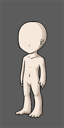
Why not have hovered wearable previews come with a dark grey BG with an HA cutout for the body so that wearables that are invisible, as of current, due to white on white, can be seen in their entirety?
Not a note, but a viable suggestion? :)

Hmm, you mean as a preference? Like the one that allows you to preview items on your current skin? I think it would be nice if we could choose to preview items on a white or a gray background. (like the ones that show when you submit a CW)
The only problem would be that we can use the wardrobe to preview items, so it might not be very useful. Plus some items (filters and semi-transparent ones) certainly won't look the same.
exactly what I mean. Wardrobe is really inconvenient, especially when new items are involved. This way it'd be instant. You could have the option to turn the grey BG on or off in Dashboard
- But then you'd have the same problem with things like these:
Or even the filter you're currently wearing:

did you miss the part about being able to turn it on and off in Dashboard?
- I did, but I feel the same way. If the preview doesn't display correctly, you'd have to go to the dashboard, change your settings, and then go check the preview again. At that point it would be less work to just check in the wardrobe.
(And how would you even know it wasn't displaying properly in the first place?)