Clumsy Penguin Companion [Item Image Needed]
Replies
Either way, I am very interested ^^ Thank you for the slot!
Potential future recolor if it's popular enough. :U I chose to keep it more to the original colors of the penguin it was designed after for the first release, since it's easier for me. But I'm open to any and all color suggestions for other versions.
You're welcome!
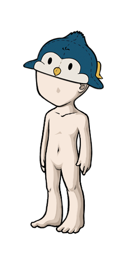
Earlier experiment as a makeshift hat, since you both mentioned it being on the head. XD
//it looks so stupid omg
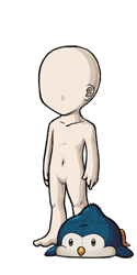
Yeah. I know. xD But that would require redoing the lineart and I'm too lazy for that right now. Plus I gotta run in like, half an hour since I work tomorrow. Blegh. I had in mind for a grounded companion anyway, given that it was modeled after an art of that same penguin face-planting after tripping over a rock.
Stupidly CUTE YOU MEAN. It's like it's glomping your head and flopping over it, I love it. If you went ahead with this position, I wonder if you could make the arms droop a bit more to show some gravity. If not, the tinier one on the head makes more sense with the original straight arms position since the arms are resting on the head. I love all of them though :D
If I did go ahead with this, I would definitely redo the arms to be more floppy. xD It just looks silly with them straight out like that. Looks like the penguin is trying to, I dunno, fly like a plane. xD
Looking good so far. I think you should an other soft layer of shading (just a slight one, not too dark) to proounce the body and beak a bit more.
I added another layer to the body and beak, light like you mentioned. Did it make any difference or should I make it darker? The beak still looks pretty flat in the small version, I think. D: Also, would you want a slot for it when it's done? I wasn't sure so I reserved one for you just in case, but it's cool if you're not interested.
Did you update the first posting with the new shading? I honestly don't see a difference. :c So, yeah, it still looks pretty flat. Mhh, I don't really see myself using to be honest. I'd probably more interested when it would look like a knitted plushie, though. If you need more slots to fill, I'd take one, though!
I did update, but yeah even on my screen it looks pretty flat still. I'm going to try reworking it and maybe changing the colors of the shading layers to make them stand out a little more and look a little less greyish. Going to experiment with different colors and see what works best. :D Maybe even redo the shading layers completely.
The reason this looks flat isn't the color choice, it's the fact that there is a large area that has no shading at all on it. Try to make the shading cover all of the area, instead of leaving a gap that has nothing but flat color on it.
Thank you for your suggestion!
I've been working on it a bit. :D It's still being tweaked right now, but for the most part, the body has a bit more shading. Current progress so far looks like this:
Um, I'm not really sure how I can add some shading to the rest of the area, unfortunately. If you have any pointers, they'd be really helpful.
Holy mother of gods, this is the cutest friggin' thing. I want one. grabby hands
As a non-artist, I have basically no ideas as to how to make the little fella get accepted... Maybe make him lumpier, or give the fabric a texture? This is me grasping at straws D:
(, I feel like this little guy is like the KS mascot waiting to happen :'D)
Thanks, I'll take your suggestions to mind. :D I was thinking that I may give him a pattern of some sort to break up the blankness on his back. I am taking preclaims if you wanted a slot. It's going to be a while before he's ready though, since I still also need to do the item image.
Daww look at him. I agree with the fabric texture idea. I'm not much into animal wearables though. He's a cute start :)

Thanks for the suggestion. :) I'll look into making fabric textures in Photoshop and see what I can come up with. :D
@BLACKWOLF_2009 I updated the first post guys, with my progress shots. What do you guys think of it now? Does it look better?