Clumsy Penguin Companion [Item Image Needed]
Replies
Wow, that is a great jump, the newer one has a lot more depth to it than the first. And the face is much more pronounced, I also love the new highlights that you've added. It's really looking quite complete to me!
I like the one that doesn't have the red on it's face best but they look a lot better now. :)
[kiss=blackwolf_2009] [dance=blackwolf_2009] [egg=blackwolf_2009] [TP=blackwolf_2009]
Thanks! <3 I sought out help in a critique thread, best decision I ever made I think. xD I received a lot of helpful tips and pointers and I really like how it looks now. It's way better than it was before.
@blackwolf_2009 The red for shading is to escape a possible denial of "grey shading." I can tweak the color a bit to be less red tomorrow though, see what I can come up with.
Denial? /really confused
[kiss=blackwolf_2009] [dance=blackwolf_2009] [egg=blackwolf_2009] [TP=blackwolf_2009]
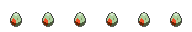
@blackwolf_2009 Custom items can be rejected/denied for various causes. One reason, that a lot of people got hit with in the past, was "grey shading," where the staff thought they used simple blacks and whites to shade with. It can really make the art dull, so a lot of people choose to shade with colors. Like on the penguin's back, I used shades of blue and purple, and reddish pink tones on the face for a warmer look.
That way, you can tell it wasn't shaded with black and white, and that's hopefully one less denial I'll have to face when I submit it.
Lol, put you on the slot list. xD Glad you think he looks good now!