Wardrobe!
Filter
Show Official Posts OnlyReplies
Sorry for a bit of a list here xD Ive just been noting down questions the more I play with this.
-
Well first question, why does the layer purchase page show 0/whatever number for all my layers?
-
Is there any way to get it to stop bringing up the huge 'buy a layer you have too much on' box? I tend to try 10-20 items from a layer sometimes to compare, and when I do that, I am fully aware I have too much on xD If I close it, it just comes back on with the next item. While if I leave it there, it stretches the page annoyingly/makes it jump.
-
Im curious why my skin I choose doesnt stay on the preview as well? Being as I prett much always use my zap skin midna, its sort of useless to have the second ava beside to show items as I hover when its just a plain human.
-
Also, Im totally cool with out having item names show. The little ? Works really well for me on mobile and I actually prefer this. As otherwise on my ipad screen everything would be even more squished. (Ps people, if you want to see the buy button that takes you to shops just click the ? It seems to work for most items)
I will say on safari it does stack still, which sucks and is a pain. But in puffin it loads just fine and Im sort of enjoying it now. While before I was unable to get anything to work on my ipad when it first came out.
Otherwise its going pretty well this week with the updates. Maybe its because Im on a browser with a mouse now, or just that things seem to be working better in general. But thanks for all the hard work. Its really cool to be able to change, especially with the new skins.

~ Cowboys & Russians ~
~Thank you for all the hard work. It's getting steadily easier to use. And thank you for putting the palette matching back in, I love that feature. It's one of the most useful things you guys have done with wardrobe changes. I am also loving how you're trying to keep it compact and visible in one screen area without having to scroll much. I have a wide screen monitor which means narrower top to bottom than most, and much wider than average side to side, so having everything visible, or close to it is amazing. :)
We are the ones who remember, the ones who see what was, and is, and will be.
Me~
I'm still having the same click and drag problem. I liked having the item name there because that's where I would click and drag, on the item name itself. With this, I try to use the item image but I end up just dragging the image and not the layer. Where exactly should I click and drag from if I want to layer? Using firefox.
edit: and I still can't take off items ??? I click the x and it stays in the list...
he/him / 31 / EST |  | My best friend is |
Ooo my god, I didn't even see the purchases tab. That's amazing. Thank you for pointing that out! Also, my clicking and dragging is working! Thanks very much for the quick fix! :D
Going to ask again because this was a useful feature that a lot of people I've talked to miss:
Will the layer of an item ever be making an appearance back in the sidebar? Its very useful for people who've maxed out to see exactly what items are being used instead of playing a guessing game (since some items are not as obvious as others).
That hasn't been fully implemented yet, but it's so that you can remove those items from your wardrobe. Clicking doesn't do anything right now. :)
💖 ✨ 🤗
it's planned to be back, but not immediately.
💖 ✨ 🤗
Weird Im having no issue with click and drag in puffin on my ipad, and usually if something is a big problem I cant get it to work here xD Maybe try chrome/check if you have any add ons that are causing issues? I am able to literally click any part of the item box to move it. Not even specifically the item image. Just as long as Im in the boundaries of the box border.
~ Cowboys & Russians ~
Yeah, sorry. Hate having to hover to see item names. It's really laggy and makes it harder for me to use. Also yep moving things around is a pain in the butt and clicking the X doesn't remove them from the list. Can we please please just put it back how it was. You know the whole saying "if it ain't broke don't fix it" welp.
Proud Gamer | My best friend is
Awesome :) I don't mind waiting, other aspects are definitely more of a priority, but its good to know that that is a feature that will eventually come back :)
This is the last time I'm going to respond to "if it aint broken" - it was broken. It's being fixed. There are pages of it working for other people, instead of saying things that aren't useful to the discussion at all, tell me what browser and operating system you're using so that I can help you debug your issue.
Make sure you've hard refreshed on the page so that you've got an uncached version of the javascript, as well.
💖 ✨ 🤗
Well I didn't find it broke, my bad I guess. I'm using Firefox version 39 on Windows 8. I've already hard refreshed a few times.
Proud Gamer | My best friend is
Will the 'added to wardrobe' ever be reversed. 500 items per page. Page 47 has my most recently added items. Where page 1 has items I added from the beginning. Thanks for all your hard work. It is appreciated. Using iPhone / Safari browser.

Forum Art by
Signature Art by
Ok so...ignore my previous thing with it working great/being with out stretching the page xD
The newest push you did seems to have killed it for me? The items forever have the buffering wheel, and now if I have any items on it moves my avatar to the very bottom of the page. Inside of being side by side with the item list as it should.
~ Cowboys & Russians ~
I'll go and update firefox, though again, it was working fine before now.
Proud Gamer | My best friend is
<p>The newest push you did seems to have killed it for me? The items forever have the buffering wheel, and now if I have any items on it moves my avatar to the very bottom of the page. Inside of being side by side with the item list as it should.
I'm dealing with the same thing at the moment. Here's a pic showing what I'm dealing with.
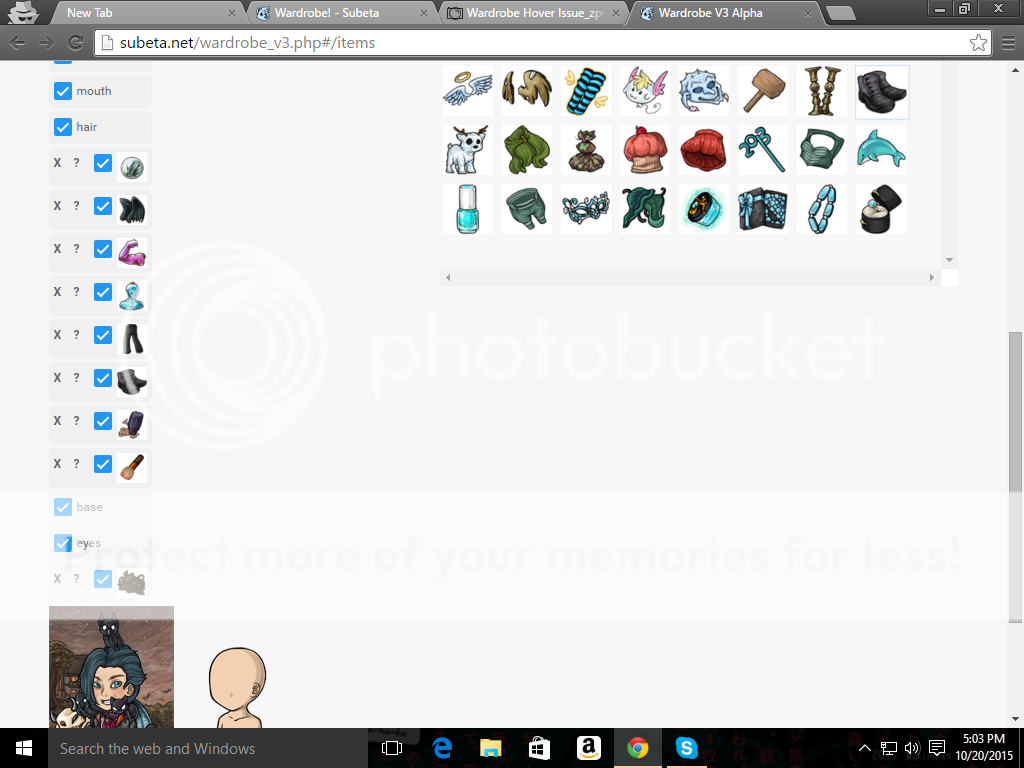
My OS and Web Browser Info if needed
OS - Windows 10
Web browser - Google Chrome Version 46.0.2490.71 m
Thanks for all the hard work! Clicking and dragging is working well for me, and while I thought having to use item images over names might be more difficult I'm actually finding that I know my wardrobe items a lot better than I thought despite having thousands of things in there. :P I'd like to have the names available as well if given the choice but understand that from a functionality and space standpoint it's not the best option. Having to scroll over the item for the name isn't much of an added step anyway, so this seems like a reasonable concession (plus we get to see more of the artwork for the CIs, which is nice as well). Besides, I myself would much rather see the item layers come back for worn items, so I'm happy to hear this is in the works.
Will the "remove all" button also be making a reappearance in the wardrobe (sorry if that's been answered already)? I can remove items just fine individually. It's handy to have the option to take everything off at once though. :) Still crossing my fingers that drawers will return as well.
I think you may be forgetting that this is the Alpha version so it will be updating and changing a lot and what they're doing is getting feedback on the changes they're making. It's more raw than a Beta version, so you'll have to be flexible with changes as they come. As Keith explained, certain aspects will be changing because it's easier for the programmers and designers and this is not the final design/coding for the wardrobe v3.
I was having issues earlier but I figured y'all were messing with the coding again, so I just let it be until I saw some updates. Thanks for all your hard work. I think the current way you have it set up with the icons in the list and then as you hover the name comes up under the ava is way cleaner than the name being in a hover popup (which can get annoying sometimes when the popup won't go away. Where did the 'saved' avatar button go? I assume it's just from the new coding and another push will bring it back or something? Anyways, it's looking better all the time. =D