Legacy Layout Messed Up
Labels
Filter
Show Official Posts OnlyReplies
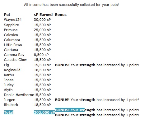
Job Agency collect income table makes it hard to understand which pet got the bonus, I thought highlighting might help but presumably doesn't.
Windows 11, Firefox 147.0.3
Why is the right sidebar on the news page so wide? I believe its size was equal to the real left sidebar? Every link has way enough free space on the right, to shrink the bar. It takes up so much space on the news page.
Yeah I'm not a fan of how cramped and crammed-in the News page is now - looked much better before the change.
New Random and Scratchcard pages are driving me crazy being so overloaded and crammed with new, unnecessary things that jump right at you. I prefer sleek and to the point, just as it used to be. If you think this to be necessary, please move them to the bottom of the page, so we still have our old game experience and can concentrate on that instead of helplessly staring at a cluttered tab in search of the actual game part.
I am so unhappy, not to have before/after screenshots to show the difference and what's actually MISSING, because we were just catapulted into the new havoc.
They used to have an NPC in the left top corner, didn't they?
The item prizes Random gives still only show a broken image. Return to games should be in the (everywhere else games') top menue and Set alert should be a visible button not a long brabble with "for Next Play" melding with the "Back to Games". Each time I aimlessly move my cursor to the former alert butten and then stare at the screen to finally spot the invisible button.
We have automized our moves here and all the unnecessary changes slow down gameplay immensely.
With all those unpleasant, needless changes, we could just as well have moved to the mostly unfavoured Kumos. I don't think indistinct pages help attract new folks, yet it more and more feels as if you were still trying to chase your old userbase away, sorry.
Item names in inventory are incredibly tiny all of a sudden. As are for example prices on edit shop. All over the place it more and more becomes a fight between this is far too tiny or far too huge now. In spite of redundant coding on the old script, everything was perfectly aligned all over Subeta, but now it becomes more and more painfull. I don't think anybody wants having to adjust their page% on every move :-(
Challengers & their info have also become way too small https://subeta.net/games/battle/challenge.php
Yeah I'm not really sure what the point of Kumos being sunset is, if the legacy site is just going to be turned "into" Kumos... I understood that a lot of the initial changes were unavoidable due to the coding being changed, but more and more pages are being changed into the Kumos-esque layout at random. (the whole thing with random pages being picked to be altered reminds me unpleasantly of Neopets, which is doing the same thing... don't care for the practice on there, either)
Honestly I just - do not understand the new trend towards making everything super teeny and cramming as much as possible into one tiny space! I like to think my eyesight's pretty good but I find myself squinting more and more at the site as everything continues to get smaller. Hell even the text in this comment box I'm currently writing in is way too small for my liking.
The lack of communication is upsetting too... just pages getting changed out of the blue with no discussion about why or whatever, feedback about the new layout mostly getting ignored unless it's to fix a legitimate bug (I.e. shop layout had its exploding white space fixed, but all feedback about the change itself has gone unanswered). I love this site and want to keep using it, but all the upheaval lately is difficult to work with...
Also I KNOW I keep saying it, but it's been weeks now and I still haven't had a response on why the background is now white for me when it used to be brown, or if there's any way to change it :/ I'm sorry to keep bringing it up but it really is really annoying...
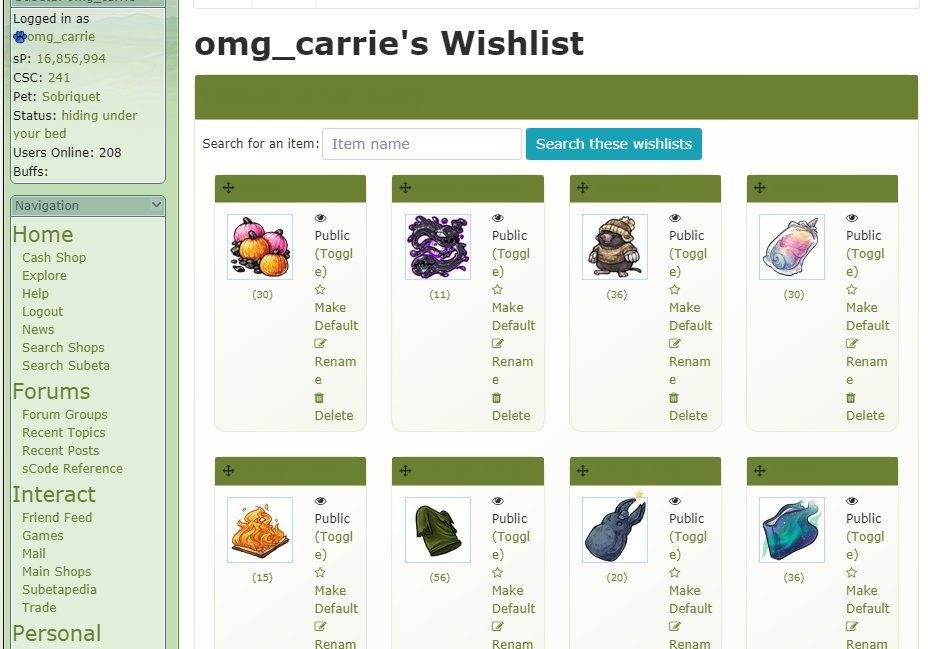
edit: Wishlist page also has the same "invisible" text issue that the shops page has: https://i.postimg.cc/3r1d843g/wishlistmessedup1.png (I don't recall the text spilling onto multiple lines like that before the edits, either)
I am begging, b e g g i n g, to be able to get rid of the pure white background and all of a sudden now the sidebar is bright white and even smaller text somehow and there's still a pure white border around the background on every single page making the page even smaller than it already was!!! the delete notification button is now literally the size of a period in regular size text and I cannot read anything on the site without zooming in so incredibly closely that it makes the site legitimately unusable and I am going insane!
I hate to say it but I brought it up in the other topic and it bears repeating here too, this is extremely anti-accessible for both older and new users alike and I cannot see anyone that's new coming here seeing the layout and staying because it is so difficult to deal with. we should not need to rely on user-created code injected into the site itself solely so that we can see what the notification pop up is trying to tell us 😭
[egg=roadkill] | | [tp=roadkill]
Soooooo ~ just signed back onto the Legacy site and looks like I'll need a magnifying glass since the Sidebar and News page have both become itty bitty teeny tiny print. And of course, tomorrow will probably bring other issues to deal with.
At this point, I am on my last gold medal because the constant litany of glitches, hot-wired band aid fixes and endless unpleasant surprises when signing on has become nothing more than unmitigated frustration.
Sorry ~ not sorry! My wallet is firmly closed. I will plunk on once in a while, but this site has simply become an "Ode To Techno Tomfoolery".
Hey folks 💖 Pushing out a fix for the stark-white sidebar right now — widgets will tint themselves from your theme so they actually feel like part of the layout instead of floating on top of it. And I'm bumping the sidebar font up a notch based on your feedback — much easier to make that kind of tweak now that it's all one system instead of every widget setting its own size.
I know this stretch has been rough. Pulling out the old styling libraries was the only way to actually work on legacy again — and genuinely a big win for everyone: the sidebar alone was pulling in Bootstrap 3, which is a whole UI framework we weren't using for anything meaningful there. Cutting it out means less bandwidth and processing on every single page load. I knew some things would shift in the process, and I'm tightening them up as fast as I can spot what's off.
Honestly, threads like this one (and the other feedback threads) are the only way I get pointed to things that need fixing — I don't see every corner of the site the way you do, so when you post, I fix. Usually same day. Please keep going.
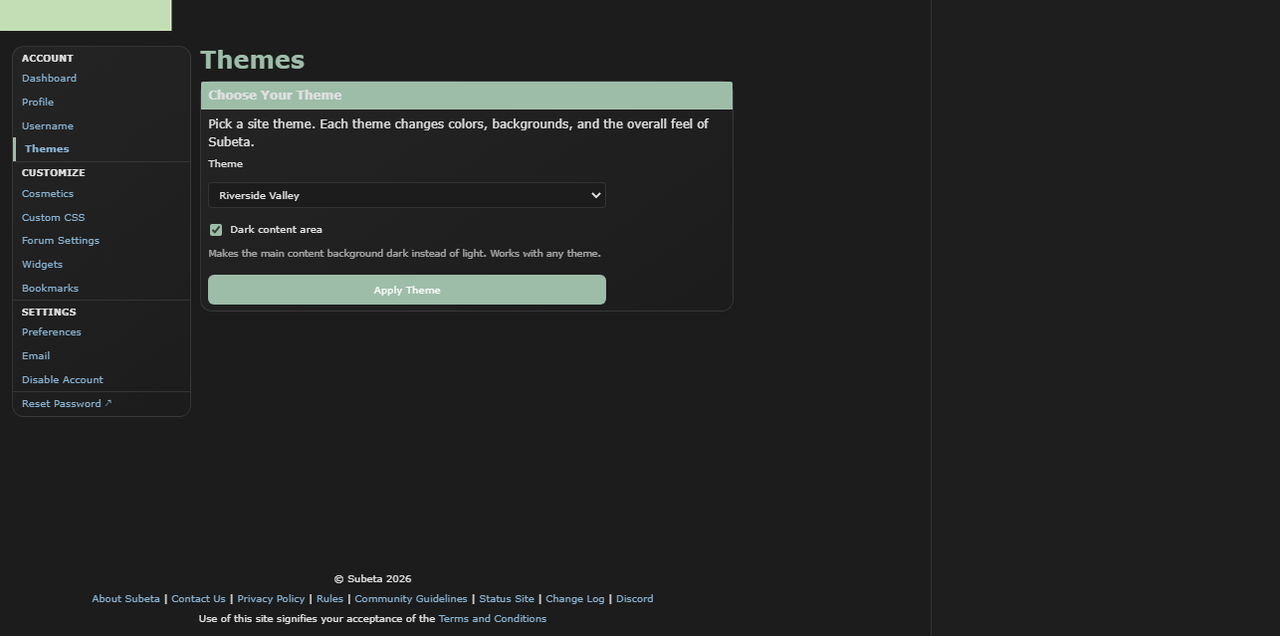
One thing that might help in the meantime: dark content mode leans the dark themes much darker if the light backgrounds are bothering your eyes.
Let me know how the sidebar feels after this push!
💖 ✨ 🤗
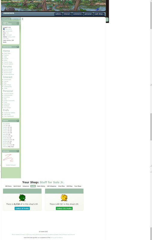
Uhhhhh so does the site look like this for anyone else, or
https://i.postimg.cc/CKqdR8zm/shoplayoutlatest1.png
At first I thought it was a Chrome glitch but I'm seeing it exactly the same way on Opera too (this screenshot was taken in Opera). Using the shop page for consistency since I usually use that for screenshots, but I've got the same issue across the board - huge gap at the top, main content shifting too far over and covering the sidebar. YET AGAIN the teeny-tiny text on the sidebar, and now everything's blue like on Kumos (but those text header things are STILL "invisible"!!!). Oh and the event number is flying off the sidebar and onto the main part of the page, just noticed that.
And of course, the white background is still a thing.
Honestly the ^ above post puzzles me since it makes it sound like a lot of this is a glitch, obviously stuff like the layout exploding on top of the sidebar is a glitch but much of this seems to be intentional changes? the colours, font sizes etc - it's getting really annoying. Just leave the layout alone already, NO ONE has an issue with the layout, I don't understand why it's still being messed with?? It's getting to the point where I'm dreading logging on each day and finding out what's been messed up and rendered nigh-unusable next. I love this site but this latest downward spiral is just wearing me out, not sure how much more of this I can take tbh.
first — the layout exploding on top of the sidebar, the event number flying off, the content covering the sidebar — that's 100% a bug and I'm sorry. I'll get it fixed. Thank you for the screenshot, that's genuinely the fastest way for me to see what's going on. if you could let me know what size your monitor or view port is (what kind of device you're browsing subeta with) that will go a long way.
I want to address the bigger thing you're raising though, because I think it's fair.
You're right that my last post made it sound like everything weird you were seeing was a glitch, when some of it isn't. The blue, the font sizes, the header styling — those are intentional changes in progress. I should've been clearer about what's a bug vs. what's a change I'm actively making, and I'm sorry for the confusion. That's on me. Here's the honest version of what's happening: I'm one person trying to keep a 20+ year old codebase alive. The site was running on PHP and libraries so old that I literally couldn't build new features anymore — the tooling wouldn't even run. So I've been doing the unglamorous work of updating everything underneath, and part of that means the 20-year-old CSS that was bolted onto every page for two decades has to get untangled. Some of that untangling is going to look weird while it's in progress. I'm not going to pretend otherwise.
I hear you that it feels like the layout keeps getting messed with. I'm not trying to redesign the site out from under everyone. I'm trying to get it into a state where it can run for another 20 years. But I can do a much better job of communicating that, and I will do my best. I'm a single person trying to keep this site alive, and what I said when "I can move back to Legacy" is that means that all of this code, that is 20 years old, needs to be uplifted.
I've also given the link now multiple times to remove the white background.
💖 ✨ 🤗
I think it would be great if we could control the width of the sidebar (up to a point, but my username for example is quite long and it overflows). Also there's a bug in Random, at least on Arctic Frost theme, where the text color of the button is the same as the background color. I can't add a picture cause I've played recently hehe
[flower=GirlWhoPlaysGuitar]
I'm using a laptop at 1366 x 768, not sure what other info you need/how to get it? Hope that helps.
Ok so... it's still unclear to me how much of this is just a side-effect of having to update the code (which I understand has to be done) and how much of it is just redesigning it out of personal preference? that's what's bugging me - stuff being altered because of the code being updated I get, the more drastic changes I don't understand, I'm trying to but it's confusing. Thanks for listening to us on this - I admit I'm frustrated but I'm just trying to understand it all really. Maybe a newspost or even just one thread to discuss all of these layout updates would be best? for me it's not just the spotty communication, but it being spread across multiple forum threads, that's been really confusing and hard to track - if there was just one place where all of these updates etc were being discussed, that would be fab and a lot easier to keep up with/understand/etc.
Where is the link to remove the white bg please as I must have missed that? (edit: okay I see - we got our wires crossed I think - did you mean the Dark Content thing? because that makes ALL of the page dark: https://i.postimg.cc/cH1znZXM/darkbg1.png What I mean by the background is just the right-hand sidebar, how it used to be, like in this old screenshot: https://i.postimg.cc/wTPxz616/sublayout2.png Is dark mode meant to work this way or is that glitching, or like... is there a way to just get it closer to the second screenshot lol. dark mode is TOO dark, light mode is too light, I need a happy medium! ^^; )
It's honestly a combination, but the need to remove the old code is what pushes the rest. I'll be entirely honest with you: I'm in my 30s, and the idea of going page by page just to rip out old bad code and rewrite everything to be exactly what it was when I first built it at 13 is not exciting to me. There are things I've wanted to do for 10+ years that I haven't had the time or ability to do, and when I'm already elbow-deep in thousands of lines of legacy code, I'm going to make those improvements while I'm in there.
What I'm hoping happens (and what has been happening!) is a feedback cycle. There are a ton of threads in the suggestions and bugs forums where folks are giving feedback on specific features, and this thread is the one for the layout as a whole. I'm really happy to keep responding to stuff inline here.
On the "one place for everything" idea, I hear you, and I wish I had a cleaner answer. The honest truth is that Subeta doesn't have the resources to hire someone for programming or for user communication, so it's just me trying to keep the interest up, respond to feedback, and do the actual work all at once. That's why things end up scattered across threads. I'll try to be better about cross-linking and pointing to a central place when I can.
Appreciate you sticking with it and trying to understand. The frustration is fair, and this kind of back-and-forth is genuinely useful to me. I know it feels miserable to have a broken layout while you're doing it, though, and I'm really sorry :(
And let me see what we can do about the dark/light mode stuff! And some questions:
- Is that layout issue (where the layout is beneat the sidebar???) happening to you on every page, or just that shop one, or all of shops? That'll help too
💖 ✨ 🤗
This is sort of related, to this topic, in the sense that it's something that was affected by the new stuff being implemented. With the changes to the CustomCSS page I can no longer get URLs to stick around in my CSS code. I used to have URLs for a custom banner, as well as for custom colored Dashboard and Events header images. But now, when I click the save button the URLs disappear. Is that intentional? Or do I have to do something different with them now for them to work? What happens is that I write the "url(my url)" bit and then all of that bit goes away when I hit "Save" :/
Can you let me know hwat URL you're trying? I was just able to get a URL to persist in my customCSS, but it could be a particular issue!
💖 ✨ 🤗
All three are on Imgur, not sure if that makes a difference at all though. These are the urls: https://i.imgur.com/BgevFvF.png https://i.imgur.com/pmvWZvn.png https://i.imgur.com/8u2XFiz.png
I'm having the same problem as - my banner (https://imgur.com/UkSFd6h) disappeared while I was trying to update my customCSS to be more functional/legible after the changes.
I understand that this is a work in progress and that you're doing your best! /tries again, badly
Edit: After much trying, I think I managed the colour changes so I can read! Hurray. Discovered I lost even more images than I'd thought, though. Keen to hear how that goes.
🔭🐢 [flower=Skolletta]
appreciate the communication! honestly as much as I do get frustrated with all of this, or disagree with stuff, I DO really appreciate how much you've been willing to hear us out over stuff like this. like, idk if I'm explaining this right, but I feel comfortable giving feedback/expressing frustration/etc here. idk if that makes sense but I wanted to say it, heh. I appreciate that!!
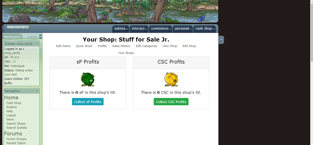
The layout issue - it is happening on all pages! Sorry, I just keep using that specific shop page as a reference since I basically use it as my homepage for the site, so that's where I first notice changes XD and since I used it for the previous screenshots, so I figured it'd be helpful to have a "before and after". But yeah I'm seeing that huge gap on all pages.
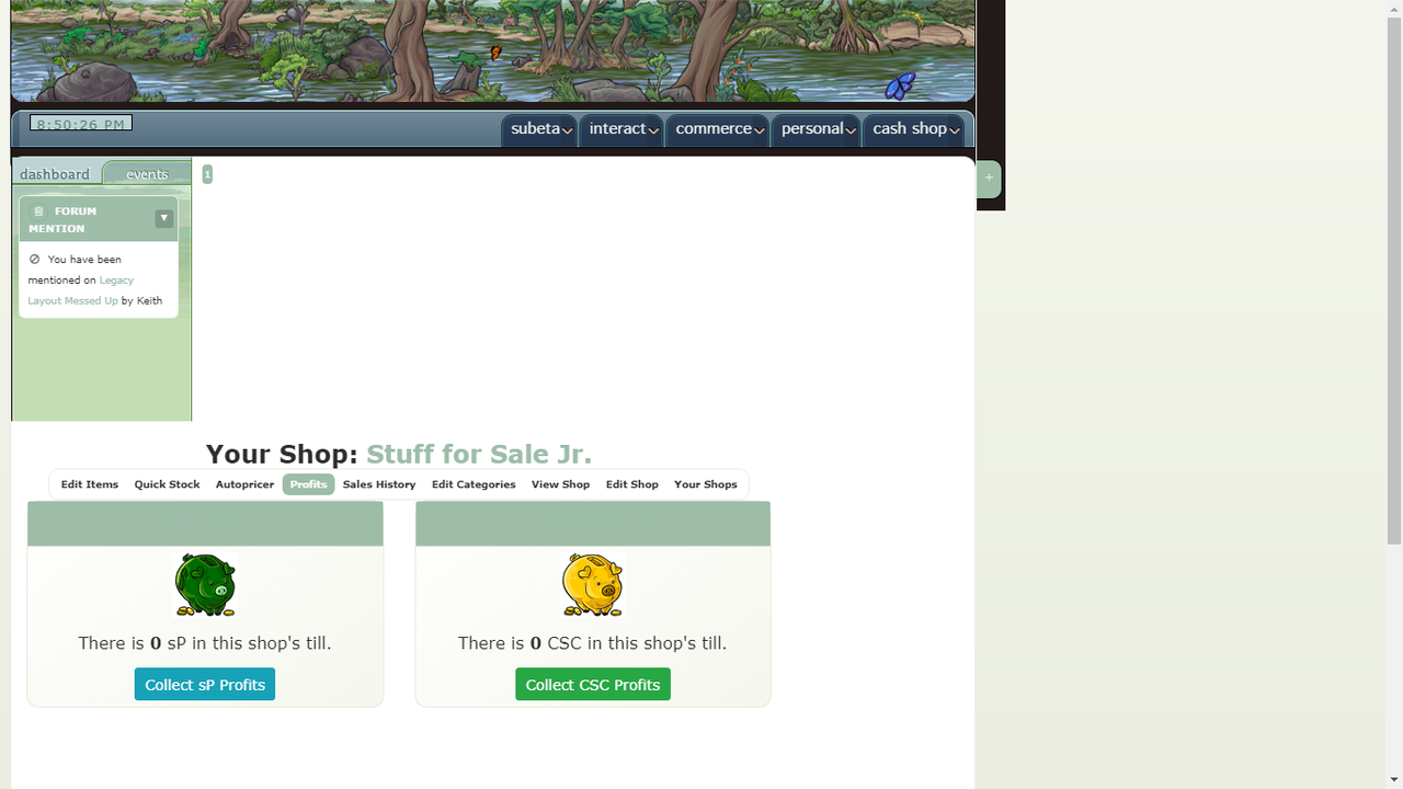
I'm not sure if this helps any, but I did just notice that the gap isn't AS big when I'm on the event tab of the sidebar: https://i.postimg.cc/fLhG3wLk/sublayoutmessup1.png
It goes back to the huge gap as soon as I swap back off the events tab though.