Layout Feedback
Filter
Show Official Posts OnlyReplies
Totally understand that it's a change in patterns, and as mentioned it's not working how it's meant to right now. Hoping to get that fix out today (and fix the mobile sidebar!)
The idea is that the notifications go into your "unread" and once you action on them (hit the X) they go into a "read" page (which will also be /events), where they'll be grouped by type and stacked. They'll stay there for 3 months until they're permanently deleted (but you can permanetly delete from the page). This way we resolve a lot of the issues we have with events:
- People accidently deleting them, and then not seeing an important update or something they need to action on
- Our storing 20 years of events in our
eventstable, is (outside of the forums and sMail) the largest disk storage issue for our database. Having a clearing schedule will resolve that (we won't be deleting any non-kumos events in this clear, since we've never done that and I don't want people to lose events from loved ones who've passed or left the site) - A frequent request is the ability to say that you've seen an event (so it doesn't show up in the sidebar) but you haven't completed (e.g. an sMail from a friend - you might not want it to show up in the sidebar as you're navigating the site, but leave it in your 'read' until you're ready to deal with it). This is a really, really common event request!
With the push later today it should resolve the issues with them popping over immediately (that doesn't happen in the event widget right now, fyi!) and the mobile sidebar not popping out anymore 😡
💖 ✨ 🤗
the sidebar should no longer automatically mark your events as 'read'! You'll have to click them manually.
Once you do, 'read' events get cleared out after three months, but you can mark an event as 'unread' from the read panel.
💖 ✨ 🤗
Not sure if it's just me or I'm doing something wrong, but I still am unable to view the sidebar on mobile.
I'm using the centropolis thme, but when i open a legacy frame the site in the legacy is nearly unreadable because its dark text on black background. I doubt it would be effected by what theme I'm using on the legacy side, but just in case, i use Riverside Valley there and its legable on the legacy site.

hoping the "pasting image from clipboard" feature works since there's till no edit forum post button on kumos.
-
I second the issue made by Spatial^ I'm using the Masq theme for both.
-
I'm not sure if this belongs here but when checking the rewards on contests you can't see the information in the 'hover' window as the page covers it up.
I'll upload a direct link:

-
I noticed on someone's profile on Kumos that while using the Masq theme there is some written information is unreadable as it's white. It happen in other themes too. The link also doesn't work.


-
This is the same as number 2 but it happens in the shoutbox too.

| [egg=emmie1989] | [tp=emmie1989] | |
Luminaire Tree
[Tree=emmie1989]idk where to post this since this site is basically unavigatible on mobile. it is not mobile friendly at all. every page is a variation of this. 
* * * my wislist
and my screenshot didnt load so rip i guess
* * * my wislist
Last night around midnight Subeta time, there seems to have been a change to the layout that stopped certain pages from working on my phone—the page content overflows to the right of the window, sometimes even in landscape orientation, and can't be scrolled horizontally. (I couldn't press 'Complete Quest' and had to move to a desktop.)
I checked again today and it hasn't resolved; any chance of getting that fixed?
(Seems like the problem is due to the overflow-x-hidden class interacting badly with over-wide elements, like the bar of quest links in quests—which looks like it's supposed to scroll independently but whose wrapper doesn't actually have a limited width—or pagination with too many (>~10) pages in shops. I'm not sure whether all the problematic pages were first affected last night, but quests definitely were.)
I'm sorry, I really don't like the layout, and I would like it to stay classic. I'm not sure why it was decided to change, I always use my phone, and I was able to see everything fine. On the new layout, I can't see my whole profile, such as longer description and youtube video. On forum posts, I can't see my signature. I think this is important, as it is how some people show more of who they are. I can't even see all my pets (no way to scroll or click more). Maybe this is all because it is still being worked on, and I understand that can take a while, but personally I would want the classic version to stay, and just make changes if it seems like some things aren't working right, or could be improved.
This is just my opinion, of course. I'm sorry if it is not helpful. Seems the Kumos site is staying, and could get to be at least as good.
"Time spent with good people is never time wasted." - Detective Llewellyn Watts (Murdoch Mysteries, season 15, episode 18 - Patriot Games)
^ This.
I saw that things can't be added to the old site, and I didn't realise basically only one working on this. So, I understand why another version had to be started, and thank you for your time, but I still would like it to be more mobile friendly, be able to see on the profiles what we could before, and have the look be closer to classic site, if possible.
"Time spent with good people is never time wasted." - Detective Llewellyn Watts (Murdoch Mysteries, season 15, episode 18 - Patriot Games)
My new, already beloved, hover popups are popping under in some situations. This is making them quite difficult to use and to read:

There's also still no edit button on Kumos forum posts; the Kumos "share" icon has no hover text and I didn't know what it did, until I clicked it, and then couldn't close the little share window (nothing happened when I clicked the X on that window)
I liked the hover pop-ups but they ended up getting in the way when questing if I overshot my mouse onto the item even for a hot second, so i couldn't use the buttons to get to the shops, so i had to turn it back into click mode. But its nice to know that clicking now gives the information at least.
Only now I discovered the new widgets and am especially happy about shop search being available. Question: Why is there an extra rectangle in the search field?
edit: lol, I knew, I should have tried it out before writing - I selected "item" of course. It's not the expected usual shop search field, only displays a huge page filled with "Search Results"
Initial question still remains, though, even if field is pointless.
Since yesterday on some items (in some shops?) the plus sign remains unresponsive.
Drop down works again, though (all lines visible) - providing + sign reacts, lol.
edit 09/09/25 Why do I have to rearrange my widgets setting every day?
I'm back to give some more feedback about the layout! :)
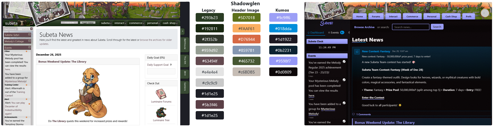
Colors: Although I appreciate that the layouts on kumos have become much more colorful, I still think that those colors largely do not match their corresponding header image. I feel that the kind of people who would play a game like Subeta are the kind of people who absolutely would notice this sort of thing, or at the very least be put off by it even if they don't know exactly why.
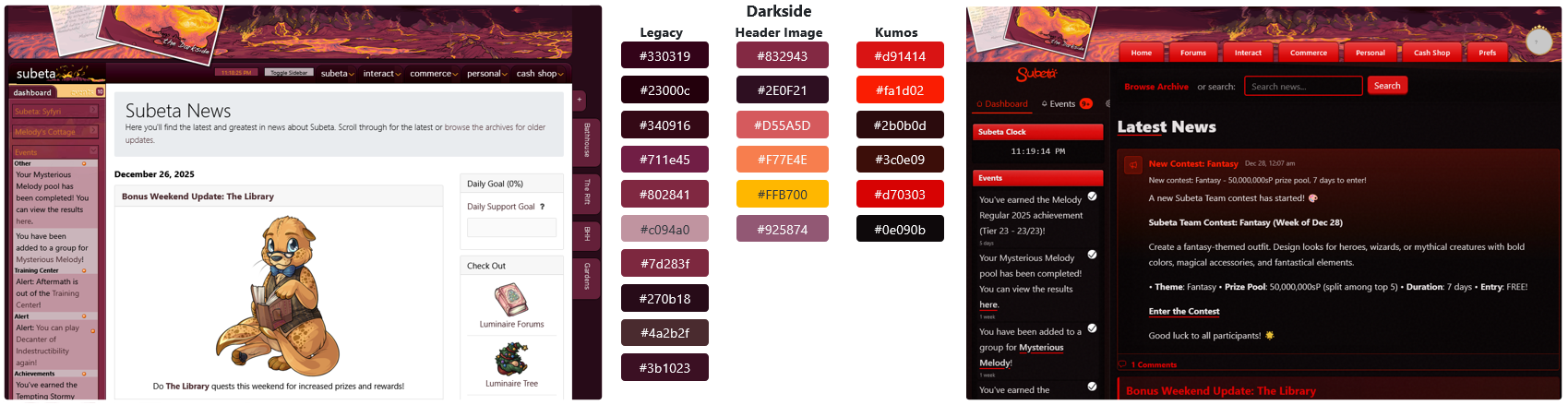
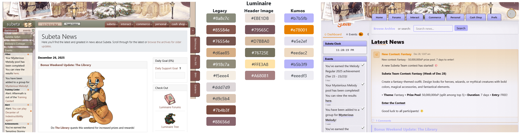
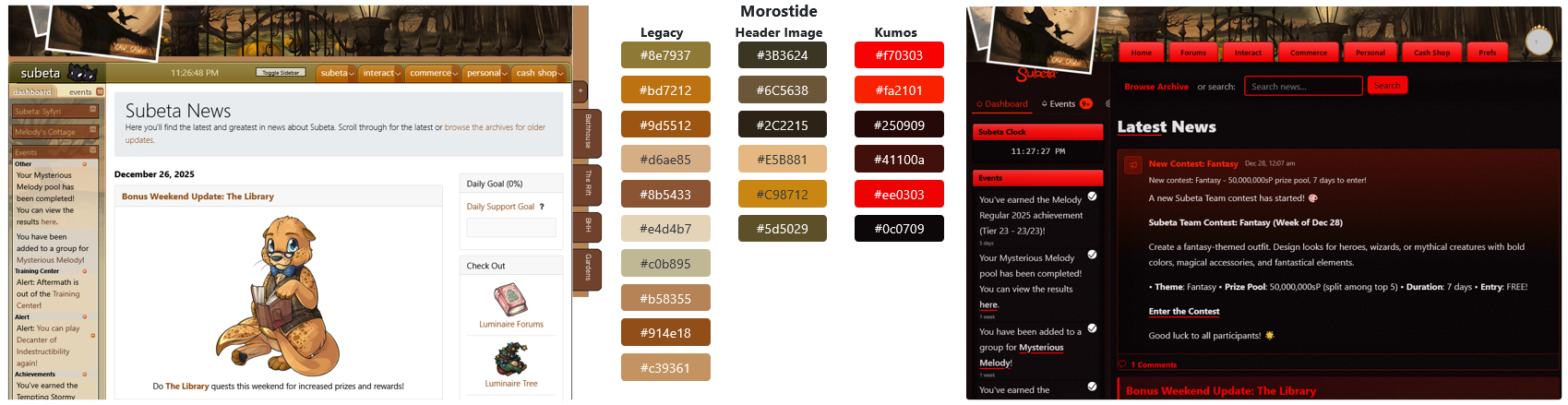
Detailed Color Comparison
Here's a breakdown of the major colors used in both layouts & the header images, to directly compare how cohesive they look. The palettes listed are very simplified, because the original layouts & header images use a pretty large amount of colors, plus both the legacy & kumos layouts use a lot of gradients.
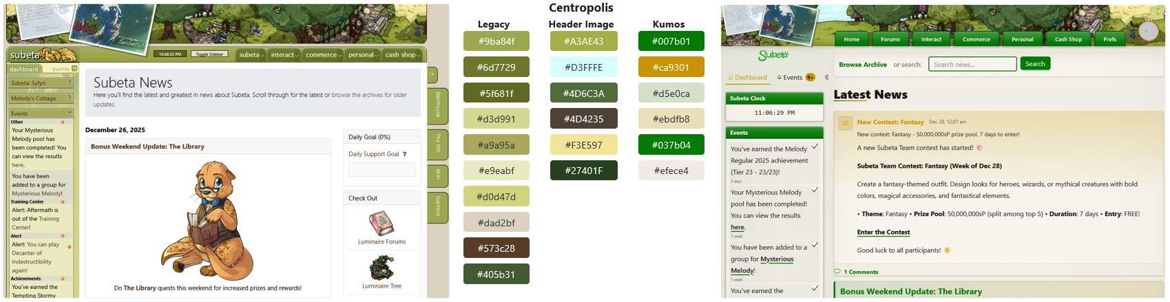
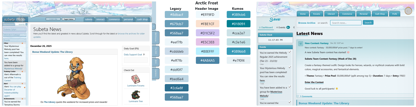
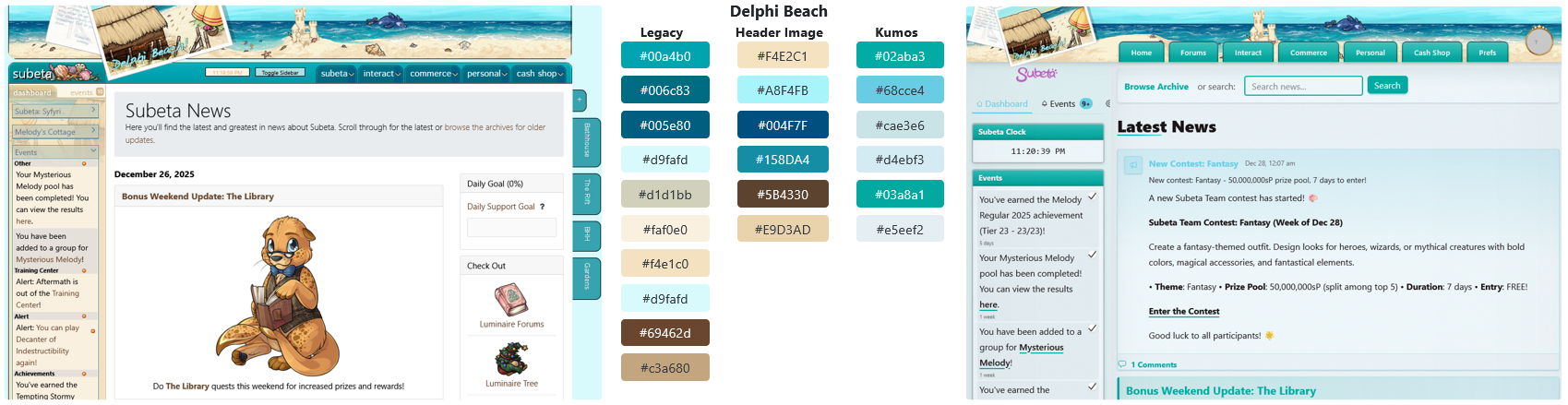
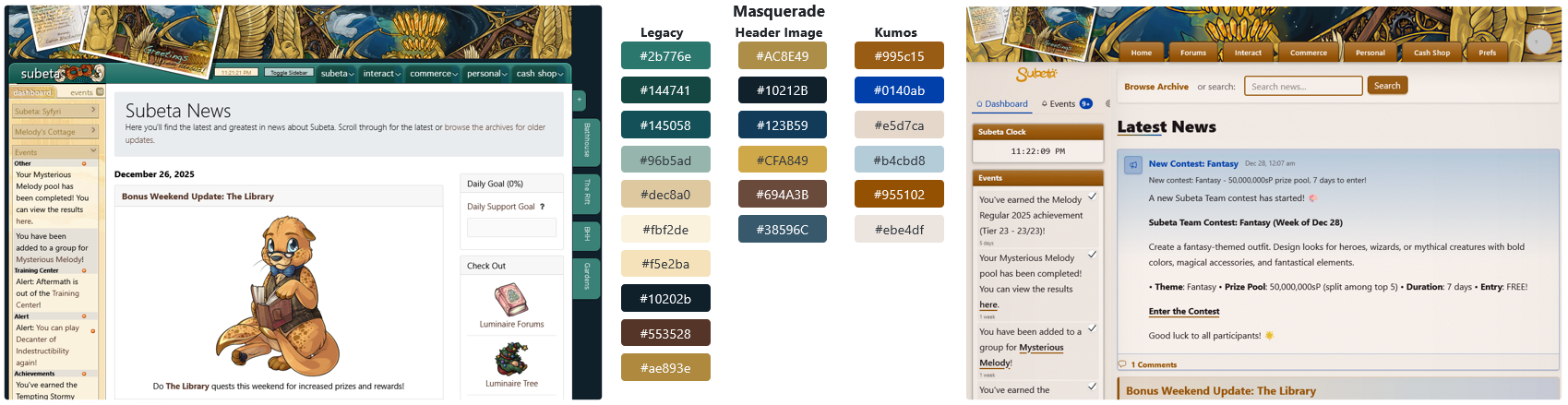
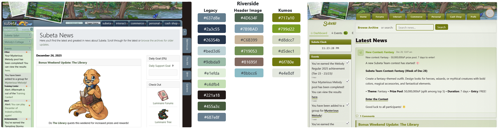
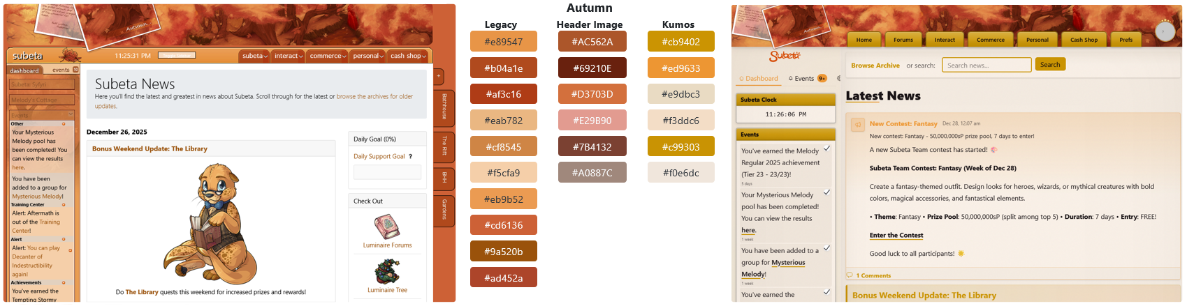
The majority of kumos layouts (centropolis/default, delphi beach, masquerade, riverside, and autumn) are using colors that are roughly similar to the header/legacy colors, but are actually very different shades. For example, the centropolis header image contains several different shades of green which are all quite muted and more natural looking. Meanwhile, the green used on its corresponding kumos layout is incredibly saturated & bright and not represented in the header image whatsoever.
Most of the remaining layouts (darkside, shadowglen, luminaire, and morostide) are using random colors that have almost no basis in the header image/legacy layouts. On top of this, these layouts are repetitive in color choice, with shadowglen & luminaire both using lavender and darkside & morostide both using red, despite the fact that none of these images include either of those colors. Additionally, darkside and morostide are essentially indistinguishable apart from the header images.
Lastly, all three of the dark theme layouts are using incredibly bright colors as the primary accents - it seems to me like that somewhat defeats the purpose of a dark mode?
I also think kumos may not be using enough colors. The layouts essentially comprise of three colors: a bright primary accent color, a bright secondary accent color, and a muted background color. This leads to a lack of contrast and focus on a lot of pages.
Overall Styling: I personally think that the way gradients and drop shadows are being used within the kumos layout does not mesh well with the much simpler cel shaded art that makes up the whole site. To me, this feels the most noticeable with the dropdown menu buttons on the header, which look wildly out of place against the header image. But honestly almost everywhere that regular Subeta art appears, it does not feel like it belongs. (Not having white backgrounds on pages doesn't help with this either, since all non-clothing art has a white background that makes it feel quite... clumsy on a page with a colored background.)
Dropdown Button Styling
Similar to the color breakdown above, I wanted to provide a visual comparison of the effect style & color can have on the page. I focused exclusively on the dropdown section just to make this easier on me, though obviously I feel that the styling of the entire page needs to be overhauled.
First, the current kumos look.
Most important: change colors to better match header image. Also, remove drop shadows from underneath the header.
The excessive padding doesn't feel like it's serving a good purpose here, so reduce the size. Plus, add arrows to indicate that these are dropdown buttons.
Add a second color for some additional visual interest. This is also a throwback to the legacy style.

Speaking of the legacy style, here it is (plus the legacy colors) - just to see how it looks.
My personal conclusion is that it's not going to be easy to make the buttons look good on top of the image. Since we've already got the legacy style applied, here's the full legacy look with the separate banner.
However, I understand that the intention is not to perfectly recreate the legacy site, so I wanted to come up with some other fully styled dropdown looks that I think could work. Here's one option, with more of a button style for the dropdown links and a tab style top to the sidebar that gives focus to the Subeta logo.
And a different style option: here I've shrunk the banner in size and used simpler flat colors with some solid drop shadows for additional contrast. Plus I've added some icons to the menu, which could even be bespoke - in this case, we've got a custom kumos-esque head for the 'home' link and a... well, certainly not Earth globe for 'interact.' (I tried my best to make these match the kumos & Subeta map, respectively, but I could not fully succeed at this small size haha.)
The overall takeaway I'm hoping to convey here is that it's important to look at both the little details and the big picture when designing. Unfortunately, at the moment, kumos feels like it is lacking both detail and cohesion in its design. And maybe this degree of styling is usually something that would be done closer to the end of a project, but since we've already had several features fully moved over to kumos (& not to mention the fact that there is no clear indication that kumos is a beta site for all the newer & more casual users who are logging in over there), I think it needs to be done now. I really believe that a good portion of the users who are reactively balking at kumos entirely are doing so because it is, at worst, aesthetically unpleasing and, at best, incredibly bland.
Mobile Version: And to finish up, some actual, definitive issues:
- I don't know if I'm just missing something, but on mobile there is no way to see the sidebar. This practically renders the whole thing useless - you can't see any of your events, how much sP/csc you have on-hand (without being on a page to buy something), or anything else an individual user might deem important enough to have on their sidebar.
- The HA headshot on the header doesn't show up on mobile; this shouldn't matter, but there are still some dropdown menu options weirdly separated under the headshot instead of the regular dropdowns. So on mobile, the only way I can see to access your account settings is to click on the "theme settings" link in the footer and back into settings from there.
- The mobile dropdown menu does not stretch the page, so on short pages you cannot see all of the options since the list is incredibly long. Honestly, the fact that it's so long isn't great in & of itself because it makes navigation feel a bit tedious/overwhelming.
- Lastly, the button for the mobile dropdown menu is not correctly aligned. I assume it's supposed to be on the header like on the desktop version, but the entire thing is about 20 pixels beneath the header.
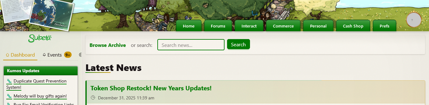
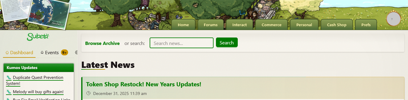
Hey everyone!
This should help with the "things look off" feeling on the main light themes. Based on feedback around themes feeling too saturated/beige and item images clashing with colored backgrounds, I've made some updates:
Changes:
- Default/Centropolis: Clean white background instead of the beige/cream that was causing item images to look harsh. Kept the vibrant green accents.
- Delphi: Same treatment - clean white base with vibrant turquoise accents.
The approach now is: white backgrounds + vibrant accent colors - so item images (which have white backgrounds) blend naturally, while buttons/headers/widgets still pop with color.
Let me know how these feel! Specifically curious:
- Does the white background feel better with item images?
- Are the green/turquoise accents still vibrant enough, or too bright?
I haven't touched the dark themes yet - those need their own pass.
💖 ✨ 🤗
also I really appreciate this level of detailed feedback - and especially some considerations for places to go. I am Not A Designer by any stretch of the imagination!
💖 ✨ 🤗
A couple of sitewide layout/etc suggestions/issues:
Theme settings doesn't seem to work properly: it says it should be saved to my account but it keeps swapping back to the default (after a few hours, I think, but it could also be if I get logged out; I'm unsure.) The theme I'm trying to use is Masquerade, if that makes a difference.
The Human Avatar widget in the sidebar only shows the headshot rather than the full HA--part of why I dress up my HA is so [b]I[/b[ can see it, which means I want to see the whole thing.
I would love a way to hide the activity feed on the forums, or to move it to below the Browse section: it takes up the whole of my screen until I scroll and I imagine it's worse for players with smaller screens! Plus, new posts constantly popping up there is a huge distraction.
The Events page is impossible to navigate--I'd love a way to see "read" events, and a button to mark all as read (for a while I had 60+ dancing events from Masq sitting there and it wasn't fun clicking the checkmark for each one by hand.)
Blank Events Page

I'd love it if Locked items could be separated out in the inventory like they are in the current system, instead of being intermingled with everything else.
The colors on the Cash Shop page are...not great. The main yellow bar is too bright for me, and the red-blue-red-red-green just looks discombobulated rather than unified. The icon for Subscriptions is a broken image.
The Main Shop boxes all have a little square of color in the corner, and the "visit" button cuts off the corner of the frame for some of them. It would also be great if the whole box was clickable, rather than having just the little button in the corner--it feels more intuitive that way.
Main shops

Less layout issues, more bugs: Some links lead to 404 or blank pages for me: -Clicking "Open your gifts" at the top of the news leads to a 404 page -Trying to log out (either through Home or through clicking my avatar) leads to a 404 page (and doesn't log me out) -Navigating to sMail leads to a blank page -Navigating to Friends leads to a blank page -The "Edit Profile" link under Prefs leads to a legacy frame rather than the new profile system linked under Personal.
ETA: Also, my spoiler tags aren't working on legacy for some reason! pardon the images.
 they/them/theirs, please.