New sCode Reference Page
Filter
Show Official Posts OnlyReplies
Yeah haha that certainly threw me off. But I have to admit this was my bad. I barely glanced at the new page to make sure it would be usable, I just kinda assumed that it would be since it's like THE OFFICIAL EMOJI WEBSITE ....but that was obviously a poor assumption!
🐝 ☕ bug (he/him) | your friendly neighborhood code wrangler. stay in the loop! join and check out the latest admin post highlights
Ahaha I see~ Thank you for your work! Love your HA! ❤
yeah, i was really surprised by how clunky the site was, haha. but i guess it's more a record of emoji than anything else, so it... sort of makes sense p: thank you for the update!
I like it! It has way more information than the last one and seems a little cluttered at first but taking a second look, it's actually much nicer to look at.
I like the new page. It's way more informative and a much better reference.

I actually really like the new page (and am glad the emoji link is being updated!).
The only thing I'd prefer is if the previews lined up with their code. It might be as simple as putting in a row for the "title" of each section that goes across the whole table so that the code/preview line up horizontally with each other instead of being off-set?
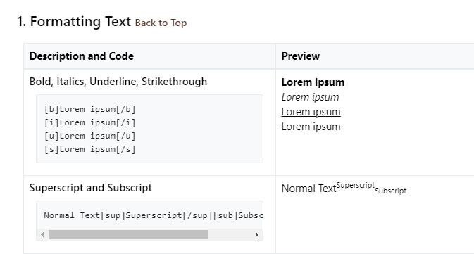
So in that sample, if "Bold, Italics, Underline, Strikethrough" had its own full row, I think that would fix it so the previews line up with their code.
Still totally usable as is, but for me that would make it a lot easier to follow!

[font=tahoma]Art by , gifted by || Signature icon by MidnightShadow[/font]
I tried to open the new emoji page/site in a new tab and it caused Firefox to implode and nearly took out the whole computer I was on. :x Poor FireFox crashed so hard it couldn't even generate a crash report. I'm posting this from my phone because the computer is still a bit wonky and may have to be restarted.
I've already said I will change the link. I don't know why you pinged me about this, because that page has nothing to do with Subeta, it's literally the official unicode website. They have some contact info here if you want to report it to them.
🐝 ☕ bug (he/him) | your friendly neighborhood code wrangler. stay in the loop! join and check out the latest admin post highlights
I'm glad it's not only me who had an "argh what" reaction to the emoji page! Thank goodness for bookmarks, because "U+1F600" is not very helpful to me. Thank you, , for saying you'll change it. :)
Emoji Cheat Sheet
there's the old, easy link for anyone looking for it!I do like the fuller explanations in the new sCode page, but I agree with that aligning the previews and their code would make it clearer. Adding an extra linebreak at the top of each most cells in the right hand column would be helpful. Or maybe a blank Header row in each right cell, to align it with the left cells? I think the row height in the two columns might be different, though ... difficult.

Also, I am a big fan of whitespace, so I'd be even happier if there was more space between each thing, especially when there is more than one code in each code block.
Example: the Superscript and Subscript section, I'd prefer to see it as
Normal [sup]Superscript[/sup]
Normal [sub]Subscript[/sub]
Example: the whole Custom Icons block. If I didn't already know what the icons meant, there's no way that I'd ever use those -- counting down to icon 12 and code 12 will give me :dmg:magma: but it will be so easy to miscount and lose my place in there. Especially with the way that the row heights are different and they're not aligned!

My suggestion for that: reformat that block entirely. Start by explaining the DMG:TYPE and BLOCK:TYPE thing, then list the TYPES (Dark, Earth, Fire etc). Then, show all the DMG on one line and all the BLOCK on another line. Then put the remaining icons at the end.
:dmg:dark: :dmg:earth: :dmg🔥 :dmg🧊 :dmg:light: :dmg:magma: :dmg:physical: :dmg:water: :dmg:wind:
:block:dark: :block:earth: :block🔥 :block🧊 :block:light: :block:magma: :block:physical: :block:water: :block:wind:
:heal:
🦋
❤️
Yes, these suggestions will spoil the consistency of the sCode page, and they will put some things out of alphabetical order! :o Oh no! Still, I think that ease of use is more important than those.
useful threadsThe Giant List of Usability and Random Improvement 2.0 Comprehensive Guide to Battle Opponents (v2) [topic not found]
|
[topic not found] |
One thing that hasn't been mentioned that I'd like to see; instead of this:
Lorem ipsum Lorem ipsum Lorem ipsum Lorem ipsum
have it: Text Bold Text Italic Text Underline Text Strikethrough
And the same for font size and color. Maybe it's just me but I find that a bit better at realizing what the code does over it having random text. (mostly because I end up paying attention to the random text instead of the code)
"Just because I don't care doesn't mean I don't feel Just because I don't feel doesn't mean I don't understand" IAMX- The Unified Field ....... "Plastic people don't got nothing to say They're judging me, I'm judging you We ain't got nothing else to do" Palaye Royale - No Love In LA | | |
I don't think it's worth the extra space to make a separate entry for bold, italics, etc. I can consider the superscript/subscript suggestion, I think that's a lot clearer to read. For the icons, putting a bunch on one line will make it even harder to read. I have some ideas for improving it though, I know it's currently not ideal.
I like the idea of adding a bit of top padding the the previews so they align more! I'll definitely look into that if I have time.
That's a good suggestion with no downside that I can see. I'll add that to my list!
🐝 ☕ bug (he/him) | your friendly neighborhood code wrangler. stay in the loop! join and check out the latest admin post highlights
I wasn't suggesting they each have their own entry? Just that the title row extend into both columns so that the examples line up horizontally with the corresponding code.
Sounds like the padding thing will do it though! c:
[font=tahoma]Art by , gifted by || Signature icon by MidnightShadow[/font]