Can we talk about the login page?
Filter
Show Official Posts OnlyReplies
I totally agree that the login page needs a good revamping. The boxes being misaligned and updating the HA and pet art used to showcase the site would be good, and I also agree that the option to join the site should be front and center compared to where it's at now. I think is right that removing frozen users from the spotlight is a good idea, and if it's possible perhaps it would also be good to add in parameters to ensure that the HAs that are shown don't come up naked? It just doesn't show off the site's HA functions at all when that happens, and Subeta is known for doing that best out of all their competitors from my understanding.
Spotlighting more site features would be good too since not everyone is into pets and the wardrobe alone. Collections, battling, the forums, annual events, restocking, vending, fragging, gifting, contests, and many other activities could potentially be portrayed as well to show how the site caters to many types of users. While there is the live feed for news and forum topics to help show off some of these features, the little blurbs that link to various posts aren't very informative or eye catching for people who are seeking to potentially join the site. "Recycle Beast: Chibi Mallarchy Zipper Pull" doesn't make much sense to someone who hasn't been on Subeta before and doesn't do much to make that person want to spend time learning more about it when all they're seeing is just a random hyperlink blurb in a box with no other context or visuals to associate with it.
I remember Keith saying once that their script takes that into account. It only shows HAs with more than X items or something, so it shouldn't be showing naked avatars.

and if it&;s possible perhaps it would also be good to add in parameters to ensure that the HAs that are shown don&;t come up naked?
I remember Keith saying once that their script takes that into account. It only shows HAs with more than X items or something, so it shouldn't be showing naked avatars. Although now I'm imagining someone with all their background/foreground/ground/finger/head/face layers dressed up and nothing else on, lol.
Good to know. I just remembered seeing naked ones (or maybe they were just nearly naked?) awhile back on the HA spotlight, but it's been over a year since I've really been on that page too. Glad to hear they worked that out. :)
omg what is level 3 even.
Front page is on our agenda, but not on it's own :)
💖 ✨ 🤗
I think the front page is just cluttered. It's not that the pet spotlight and avatar spotlights aren't important, but I don't think they should be the driving force of the page.
And the avatar spotlight seems to always feature a really /ugly/, cluttered, under-representative avatar that does not do HA makers justice. How is that actually decided?
I think the 'forum topics' tab should be updated to say something like 'recent' or 'newest' forum topics, because as it is it makes it seem like those are the only forums? or like, the main ones or something? idk
Also, there are 2 places for 'joining,' both of which are slightly hidden. I'd try to put one of them in a visible space.
The changing graphic on the top left also needs to be slowed down a looot imo. Like, reading it in 2.5 seconds isn't the problem - it's trying to look at what's going on, especially for the avatar section. I agree with what people said with the avatars being changed, and I don't get why the is there? Like, yes it matches that color scheme, but I don't think it really has a place /right there/. or that flower thing. The way it changes too is a little disorienting I think. I'd say to have a straight fade or some other transition. idk.
The 'subeta - news - forums' buttons don't really make sense either? subeta / news take you to the same place, and the forums don't need to appear twice if there's already another tab dedicated to them. And you can't post on them anyway?
I don't use the rss feed and I don't know a lot of people that do either, so that button on the 'news' tab seems out of place.
And since I want to wrap this up, I think the 'starter kit of cool items' is kind of misleading. I'd just say that you're getting an outfit in the wardrobe, since none of the items have any other uses.

actually can we also talk about the header on that page

I feel like it has like 5 different perspectives and I'm getting kind of disoriented trying to figure it out.
he/him / 31 / EST |  | My best friend is |
yeah the login page needs a revamp. Most of the people I've recommended this site to have gotten confused when first signing up and logging in, but I agree that the login page isn't the highest priority either
Another fun story: I changed my password last night through the dashboard. When you do that, it takes you to a page that says something like "You've changed your password. Please log in again." And that's it. There's no link to log back in, and the Subeta tab still has the link to logout. (Why does it always say logout, even when you're already logged out?)
Having to navigate back to the login page yourself isn't a big deal, but it's really disorienting to just be left there to figure it out on your own.
Level 3 will most definitely become a thing now.
Not so much the login page but when subeta randomly half-logs me out (like I can see stuff you have to be logged in for but my sidebar dies) and I have to log out and back in just alsjdad'ksdkd. I hate you login lady. So hard.
As I have a pin set, everytime I log in I'm confronted by this vision of beauty:
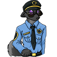
I won't even go into critiquing this artwork (aside from being impressed at the sheer number of ways its shirt is wonky). This may not be a problem for new users, but it doesn't exactly psyche me up to play Subeta.
🌂
My beef: the login and password are white and small. Highlighting doesn't seem to help with this. I leave myself logged in but when I've had browser problems and had to dump the current history or even uninstall and reinstall to get them to work properly I can't see what I'm typing here. I end up typing it elsewhere and pasting it in.