New Hovers
Filter
Show Official Posts OnlyReplies
I'm not sure why the new hovers seem harder to read to me. Something about the font, maybe, or the increased white space, or both.
The font seems too small and oddly shaped, although maybe that's an effect of the increased white space around it. I also wish there was a bit more space between rarity, description, and the following detail lines. My eye smushes all that information together and I'm having a tough time deciphering what I'm looking at.
Overall, I think it's an improvement! I really like the item hovers now, no complaints there.
I do like Speiro's idea for user hovers better, with the spacing. I would like to see the username on there somewhere too, including the normal/GA/staff icon.
Like someone else said, I don't know why trophies are still included. They make it look really cluttered, and if you're moving away from trophies, what's the point of showing them if they're all from years ago?
I like how it shows a loading thingy if it's loading. When the site is laggy, I'm never sure if the hover is actually loading or not. Sometimes I have to wiggle my mouse around to make the hover appear, which is pretty annoying.
However, the loading thingy is slightly annoying, like was mentioned. Maybe it could wait a second or half-second before showing the loader/hover? I would probably also like it better if instead of the spinny circle, it would just say Loading... or something, like adding stuff to wishlists.
🐧🐧
It's... ugly. So much white space. My active pet is in a circle. Why are you obsessed with circles lately. I hate it on the achievements page too. Why can't you put square things in squares like they belong? Oh and not to mention, the minus wishlist (-wishlist) is happening again. On items I don't have wishlisted. So it's back to double clicking just to get something to work correctly...
he/him / 31 / EST |  | My best friend is |
I like the idea of faster loading hovers, but I agree with the OP - why did they have to be bigger than they were before?
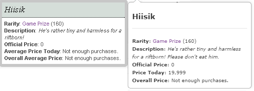
 "old" hover screenshots found on the subeta forums, next to new hover for size comparison.
Most of the size increase is down to the excess white space above the item name, before the line, and just under the line (before the rarity) - if that could be tightened up a bit, that would help make them back to the size we feel they should be ;)
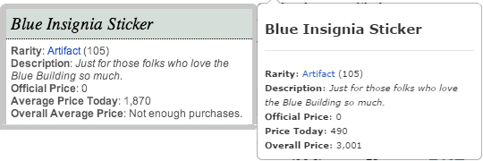
"old" hover screenshots found on the subeta forums, next to new hover for size comparison.
Most of the size increase is down to the excess white space above the item name, before the line, and just under the line (before the rarity) - if that could be tightened up a bit, that would help make them back to the size we feel they should be ;)
For the user hovers, if the trophy images could be removed, then that would help neaten the hover - at the moment, it seems really large (which is also due to the excess white space).
Overall they do seem to be loading slightly quicker than before, although user hovers seem to be quite sluggish for me at the moment.

My CW shop ~ forumset by [/font]
I love, love, love 's suggestions and agree with everyone else about the trophies. If they are being done away with like has been said many many times now, why are they still included?
I also agree the loading circle is annoying, honestly I hate that. Just saying "loading" or something would be better. Another thing, like everyone is saying, what is it with head shots and things being in a circle? Head shots are square, even children are given toys that make it to where you can't fit certain shapes in other shapes for a reason.
[edit] Also agreeing with about item previews, too much space. Something needs to be done. Why are we moving to space everywhere it just looks... bad.
[edit]Maybe if we were able to show only 5 of our trophies, like we pick the 5 we want shown, it would look better in the human avatar hover. Especially after the spacing is fixed too, I think that could look really nice.
Proud Gamer | My best friend is
Trophies aren't being done away with though?
he/him / 31 / EST | | My best friend is |
Yeah, I'm working on the item hovers now to make them not so big :) Part of the problem is that the old hovers came with a "title" segment which went on top of of the segment and made it easier to add the item now.
I'll post here when I've got something to push out :)
💖 ✨ 🤗
The padding has been reduced on the item hover, and the wishlist links are fixed :)
💖 ✨ 🤗
That would be good, too. Either the icon, or the red job title text we see on the forum.
And I still don't love the circles for pet images. They stand out because everything else on the site (items, HAs, full pet images) is square-er, and I don't think the headshots fit well in circles. That's more personal opinion though.

I think the username hovers could use some spacing adjustments, like what suggested.
I don't mind the circular pet head shots (I like circles) but a round-cornered square would probably fit better.
Otherwise, they look great. :D Much more cleaner. I love the item hovers in particular.
 Join Finesse -- A Forum Group for Artists!
I fucking love them. Site is loading very fast, and HOVERS IN TRADES CAN I GET A HELL YEAH hell yeah
It has three words, but the poet has scratched them out.
You cannot read Loss, only feel it.
The item hovers look a lot nicer since cutting back on some white space. Now if only we could get some of the white space on the user hovers trimmed back.
 There's so much extra space over and under all the info/avatar. Seems like that could be cut.
I'm another who doesn't really like the look of the rounded pet/avatar headshots. A rectangle or a rounded square would look much better, imo.
[ forum art by [userid=519517] ]
I am all in for more white space! There cannot be enough white space!
Anyway, I love the new hovers. Quicker than the old ones and I love the fact that we now have hovers in trades.
Thanks!
I like the new item hovers but I don't like the user hovers. The round headshots don't show off pets nicely, there's too much white space, and the trophies clutter the hover. I agree that usernames should be added to them too.
However those are minor complaints compared to how irritating the spinning loading graphic is.

Hover isn't working in the armory. It was nice before to be able to see weapons' stats and mod slots. Using Chrome and Windows 7, if that matters.
Paramnesia
The unmatched power of the distortion of memory, arcane magic, and artisanal cheeses!