Site Prefs Page?
Replies
I don't like the new look. There's just way too much on one page packed too close together.
I'm okay with the page, except for the fact that I really really don't care to have my friend feed and suggestions on it. When I want to look at my friend feed, I look at it on its own page, and I like it that way. I could care less about the suggestions, I absolutely never look at them, Sooo....based on that, I'd rather just have the page the way it was before? xD I don't really care one way or the other about the formatting/style of the page that it is now, I mostly just don't care about having the friend feed and suggestions there.
Well, I don't have any friends so my "feed" is empty like it should be... But the suggestions box is also empty. What's supposed to be there? It's totally blank.
As for the look of the page itself, it's not a page I look at very often so how it looks isn't a big deal to me, but why does the friend feed need to be on a page with my account statistics??? That just doesn't make any sense to me.
🐧🐧
I'm really not keen on the idea of my friend feed and 'suggestions' (what do they even do, exactly?) on my preferences page. And why does every header have a - in front of it? [IMG]http://i.imgur.com/5DL98UR.png[/IMG] [IMG]http://i.imgur.com/de7aCJ2.png[/IMG] etc.
[ forum art by [userid=519517] ]
I wish I could remove the friend feed. I have never used it and I don't care to see what my friends do every second. If it's important they can tell me if they wish! I don't use Facebook for this very reason. Same with the "Suggestions" section. I find it actually pretty funny that like my third friend suggestion is for Keith and he has friend requests turned off.
I also just really don't like the layout in general. It's strange how much of a gap there is between the line header (ie Username) and the information (ie Seerow). And then towards the bottom the sp count is off to the left without a line header and it really threw me for a minute.
Headshot by
Pings are still broken. ^^ Wardrobe is still broken. ^^ So many things are still broken. ^_^
Couldn't be happier that aesthetics are coming first. 💩
art of Zac Efron by gifted by
Okay but why adding Feed/Suggestion to the page? It's not because I have friends in common with someone else that I want to befriend this person. It's not because I talk to somone that I want to join their bazzilions ping groups. I already have a Friends Feed page, why the hell displaying it somewhere else?
The stats square is too big for nothing, waste of space. At least, leave us the freedom to hide those options.
I don't care aboutt the feed/suggestion.
Stop devamping things into making them worst and less useful than they used to be.
Lol'ing at this feature a bit, tbh. Thanks, suggestions! You're right, I should definitely add that user who has me blocked -- oh, they actually don't have me blocked anymore. So at least I could add them if I wanted to. How nice. XD
I don't mind the feed / suggestions, as I just don't bother scrolling down that far, but the font size for the main user info table is miniscule!
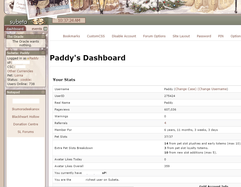
I removed all my customCSS to take that screenshot, and the font size is just way too tiny for me to read easily :( Using the latest version of Google Chrome if that matters (as I think a few updates ago, the Chrome update made all fonts appear a size or two smaller....)

My CW shop ~ forumset by [/font]
I like it because at least it's not a bunch of dead white space, which I absolutely hate. I agree about the friend feed and suggestions. If I wanted to join certain ping groups by now, I would have. I don't need suggestions on there.
I have nothing nice to say about this change. It took something that needed improvements and instead of giving it an oil change and tire rotation like it needed it was given flame decals and a spoiler....
-
Doesn't friend feed already have it's own page? And a widget? Why is it here now, too? Why would someone going to make changes to their account need to be informed of what their friends are doing?
-
Suggestions are extremely awkward and make me uncomfortable. Most of my suggestions are people I've never spoken to or private groups? Please make this go away. Why not stick it with the creeper feed instead?
-
I totally agree there was too muvh white space on that page. Here's a few suggestions to fill that void, that is more relevant than creeping on your friends/your friend's friends:
- Links to buy more pets @ pet slot breakdown.
- Elaboration of warnings.
- Link to referal Shop.
- Trophies?
- Current email
- Name & Gender options.
- Shop stats (profits/number of items).
- Collection/High Score stats.
- Account Worth + link.
- Split up account worth to literal account worth + pet worth (books, food, scrolls, minion, TC) and add a link to that.
- Achievement suggestions! (hey bro, only 5 more Pete quests until you get another achievement!)
-
WHY IS FORUM OPTIONS HERE INSTEAD OF LINKED VIA FORUMS??? I will NEVER remember it's here and will always meander aimlessly around the forums for 10 minutes like a lost puppy until I remember it's in the most unhelpful location ever.
-
WHY WHY WHY WHY IS DISABLE ACCOUNT INBETWEEN CSS AND FORUM OPTIONS??? Why is it RIGHT THERE daring you to misclick?? Can't that go somewhere else?? Or at least, be moved to the last option on that list with scary red text?
-
Why-o-why is email, name, and gender listed under PROFILE instead of idk.... account stuff? Who even changes their profile from that page??? Why does that page exist other than hiding email from unsuspecting users? I had a scare with my old email recently... hunted for where the hell to change it for a solid twn minutes before GOOGLING IT to find it.
<ol start="3">
<li>Here&;s a few suggestions to fill that void:</li>
</ol>
<ul>
<li>Links to buy more pets @ pet slot breakdown.</li>
<li>Elaboration of warnings.</li>
<li>Link to referal Shop.</li>
<li>Current email</li>
<li>Name & Gender options.</li>
<li>Shop stats (profits/number of items).</li>
<li>Collection/High Score stats.</li>
<li>Account Worth + link.</li>
<li>Split up account worth to literal account worth + pet worth (books, food, scrolls, minion, TC) and add a link to that.</li>
<li>Achievement suggestions! (hey bro, only 5 more Pete quests until you get another achievement!)
I agree with those, and especially the achievement suggestions - that would make a lot more sense than the facebook-style "hey, five people you are friends with, are friends with this person, so why not send them an unsolicited friend request" ;) It makes it a load more relevant to "user prefs" being about our own account, rather than what our friends have been up to (which is why I don't visit the friend feed page - I rarely want to know each post they've made :P) at least it's not quite as bad as the Facebook one - their friend suggestions are people who happen to live in the same county as me o.O
My CW shop ~ forumset by [/font]
This has always bothered me. It's the same for shops. It scares me every single time. :(
And I agree about a lot of the other stuff, too. All of that stuff needs some serious reorganization. I also just noticed that you don't need a password to change someone's email, and you only have to type a new PIN once when changing it. I think these are both bad decisions.
Achievement suggestions are an interesting idea, but I'd put that on the achievements page instead.

Yes yes yes, the shop one, too. Everytime I click anywhere near it I feel a surge of paranoia. I mean, yeah inb4 "blah blah blah be careful" that's like crossing the street in the middle of the night-- even if you're careful, things happen. Just because everyone should be careful crossing the street doesn't justify NOT putting a street lamp over that crosswalk.
I'd like to see both "delete" links moved to the far right and given mad colored letters. Far easier to not accidentally click these things.
Yes there should also be a space for putting in your password when changing important things such as email. Important things such as email, and PIN.
.. you're also right @ achievement suggestions haha, it would still be better suited for the achievement page -BUT- at least it's account related, I guess, which would make more sense than what we currently have. I'd really prefer actual account related things though, such as half of my feeble suggestions. I actually prefer the white space to what we have now hahaha
i'm not a fan of the suggestions bit. i keep seeing people suggested to me because we have mutual friends, or ping groups suggested because my friends are all in it. if i wanted to befriend these people or join these groups, i'd have done so already. i have my reasons for not doing this, so can we please put it to rest
likewise, i'd prefer not to be "suggested" to others (likely the same people i am seeing right now) and would absolutely prefer an opt-out
i'm not even going to go into the terrible aesthetics of the page overall because i really want the focus to be on how much i do not like suggestions.

The user dashboard area needs a lot of work (a LOT of the things you've mentioned are totally on my list!) and this was just touching on the front page.
We're trying to get rid of as many "separate" features as we can to roll things into one, which includes things like the friend feed. We can move features like that into a single place that is more trafficked :)
💖 ✨ 🤗
I would have thought the Friend Feed would be more logical if linked from the Forums. I mean it's a stalker social tool isn't it? Same for the Suggestions page.
I mean the very few times I ever wanted to look at the Friend Feed my first thought was to look for it in the forums.
"Just because I don't care doesn't mean I don't feel Just because I don't feel doesn't mean I don't understand" IAMX- The Unified Field ....... "Plastic people don't got nothing to say They're judging me, I'm judging you We ain't got nothing else to do" Palaye Royale - No Love In LA | | |
I can totally respect aiming to streamline things (as I mentioned, it's quite a pain to pinpoint where exactly some stuff is, and sometimes it's in the most unobvious of places-- cutting down on the places it could be is totally a great move)!
I just don't really feel the "do stuff" page is the right place for either of those things (and like many others I really really don't like the suggestions concept at all, I'd love to see it taken out behind the chemical shed if you know what I mean).
The idea of friend feed being linked via forums seems legit, and if nothing else the suggestions (can be renamed to something like social suggestions?) could be made a subpart of that? Preferably with an on/off toggle so unsocial people like myself can opt out of it and go about my life ignoring it forever xD; Opting out/in, as well as having anything "private" removed from it; like invite only ping groups, for example.
In terms of suggestions, I wouldn't mind it being like.. expanded upon, though. Like "friends", ping groups (that aren't private) (I imagine this might be helpful for CW groups primarily), achievements you've almost obtained (75% completed+), things you did a lot once and then stopped doing (maybe like a game-- people do forget about stuff), maybe even challengers your active pet hasn't maxed out yet? I dunno, I'm sure someone else could be more creative with that than I can be.