Nico's revamp
Replies
I must admit that I thought Nico looked different. He looks amazing! A revamp that really looks terrific! 😄 Well done! I love the fact that he has legs, now, and that his equipment looks a lot more identifiable lol! That pink and white thing actually looks like a computer tower now instead of a box XD

At least he's no longer a floating torso.

LOL Nico is still so damn adorable.
| [flower=Damon] | [tot=Damon]
Eh, probably just 'cos it's so small and I like face moles so that's what I saw.
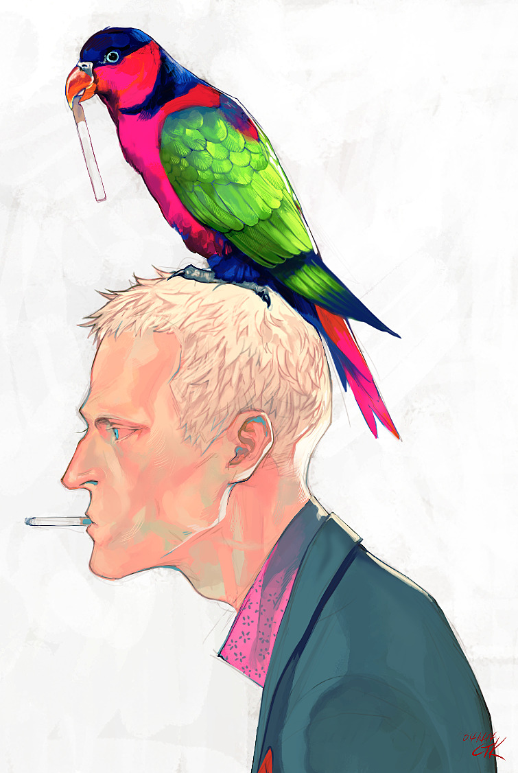
Colourful can still be managed with varying your colours to shade, in fact it works better. Isn't the point of a update to make things look new and better, why try to emulate older art without correcting an issue. The reason they all look so similar and bright is that they've been chosen in the wrong direction on the colour pallette, now the exact colours are always up to the artist anyway, but presuming some look of realism is being aimed for (not surreal or inverted or etc... ) then the less light the bluer and less saturated the colour: less light being less light entering the eye, be it in more shadow, or farther away. Shadows are bluer, distant hills are bluer etc... (in the same way as warmer or cooler greys that is, not meaning that the colour per se needs to be blue to look at, just to feel 'cooler' in comparison to the illuminated areas).
quick doodle
Left is the colour picked colours from the current image, while the colour itself is changing (going from yellow towards green, it then suddenly jumps back to orange, rather than going to greyer greenish-yellow, which is probably what's making my eyes cross atm the colours are WARM-WARM-COOL-WARM and that last 'warm' doesn't flow or appear when my brain is expecting it to).
The right hand is just a quick mock up of how I'd personally approach, it now, specific colours aside (it's not a secret that I prefer lower saturation so my personal style isn't a match for subeta's at all in that way) the colours follow a continuous trend from warm to cool (orangey-yellow leading into greenish-yellow).
A more 'Subeta friendly' example is probably this:

 While heavily exaggerated you can still see the trend towards cooler colours into the shading, eventually reaching blue on the edge, with purple in the middle.
Or the hair on the second one: Where the light hits it directly it is 'warm' reds but the shadows are 'cool' purples.
While heavily exaggerated you can still see the trend towards cooler colours into the shading, eventually reaching blue on the edge, with purple in the middle.
Or the hair on the second one: Where the light hits it directly it is 'warm' reds but the shadows are 'cool' purples.
Ah is it clear what I mean? If the shadows faded out into the bluer hues then those areas of the image would fade more into the background, currently the dark and highly saturated shirt front is very demanding, it's trying to appear in front of the stuff he's holding and making it appear cluttered, rather than acting as a dull background, by all rights a shirt like that should help the items pop out (see Deviantart's background for example) dark greenish-blues are often used as neutral colours upon which art looks good, it shouldn't dominate the image, and in this case the shirt is acting as that background and failing at it, drawing the attention away from the items (which are beautifully drawn I might add, that is one HELL of an improvement).
The skin suffers the same issue, shadows on skin pick up a lot of greens and blues, not darker reds.
As with the above doodle this has my own colour preferences projected onto it, but this was what I showed to a friend to explain to them what was bothering me quick PS edits
 Heh, it's probably worth also mentioning I don't like heavy shading on hair as I think it makes it look 'tentacle' like or oily, but again that's a personal preference, and that's the only reason I really messed with that.
a couple of other examples that I particularly think illustrate this but in less subeta friendly styles
 Illuminated: yellow-greens
Shadowed: blue-greens
Illuminated: yellow-greens
Shadowed: blue-greens
 Illuminated: higher saturation -- warm
Shadowed: lower saturation -- cool
Illuminated: higher saturation -- warm
Shadowed: lower saturation -- cool
I don't mean to come over as harsh on this update, I do think it's great (and yeah it's nice to see some legs), but I do think the colour theory behind it needs a bit of work and it'd pay off in the future, particularly with complex images like this where it needs to avoid clutter.
Either he has a very thick patch of hair on his right side (our left), or an oddly shaped head. And his finger shouldn't be under the PC, it'd fall over very quickly. He's still an adorable little shit. Glad his ears aren't showing, his neck isn't tiny compared to his head, and his forehead isn't massive/oddly shaped. Overall good and needed. And I love his mouth, can we have an item like it please ?

I like his revamp but if he keeps telling me "DOES THIS LOOK LIKE A CAMERA TO YOU? GO BACK AND DO IT RIGHT" he's gonna be legless again.
I adooore this revamp; he looks so much better now. I like that his grumpiness shows through a bit more now--in the old art he just looks like an awkward, sweaty dude (well, floating torso rather than entire dude, but you get what I mean). And the items he's holding also look 1000x better.
Awh he's such a cutie pie! 💕
[flower=SEA]
I really like the update. I'm glad the pose was kept... it looks great. :)
Personally I interpreted the dot on his face as a anime-style sweat as well.
Holiday Things
NOT FLOATING ANYMORE. He has legs, wooow.
The tweaked shadows that Shala posted really make a nice difference, especially with Nico's skin. I guess what bugs me the most is what appears to be a core shadow on his eyeballs, which makes them look like they're bulging out of his head. A well placed eyelid crease could work wonders. Also, Muerte brings up a good point with the placement of his left hand. I'll get used to the new Nico eventually, but I do miss that flush to his cheeks. He's still a cutie covered in cables
It's more detailed and so on (legs!), but that face is waaay worse. Prefer the old one's face.
- -
Looks good. I like the revamp. He still has the same character as before, just cleaned up.
Nico really needed that revamp and LEGS!
- - - - [tp=Linsley] - [egg=Linsley] [B][Url=http://style-file.org/index.php?page=search&search=Linsley]My Style File[/url][/b] [Tree=linsley]
Ah man, this revamp is amazing! Never been a big fan of the style his old art was drawn in, but he's super cute now! I really love his expression oh man, I love how the old one was kept but he has so much more personality now... And I'm sure that getting legs was a big thing for him. :')

[flower=lea]
LOL! Most people say that you normally grew a backbone...but this time he grew legs instead XD